This feature is available only under a commercial or evaluation license.
In the Code Frequency tab you can see the Code Frequency graph that shows the project dynamics in terms of lines of code.
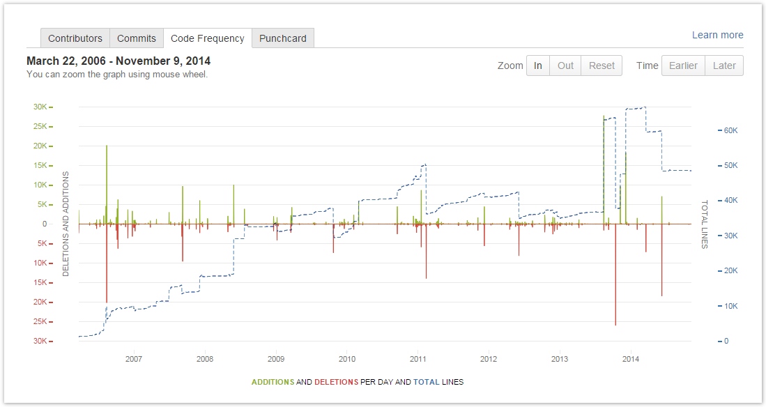
The green and red graphs with the left-hand scale show added and deleted lines of code per week respectively. The dotted blue line with the right-hand scale represents the total number of existing lines. The graph covers the whole project from its start to the current week.
Navigating the Graph
You can use mouse wheel to zoom the graph, alternatively, use the buttons In or Out above the graph. Click Reset to go back to the initial complete view. When zoomed in, use the buttons Earlier and Later to move along the timeline.
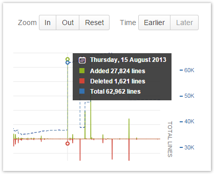
Pop-Up Tip
Hover over a specific day in the graph to view detailed statistics for it in a pop-up tip.