Download PDF
Download page How to Use Handy Cards.
How to Use Handy Cards
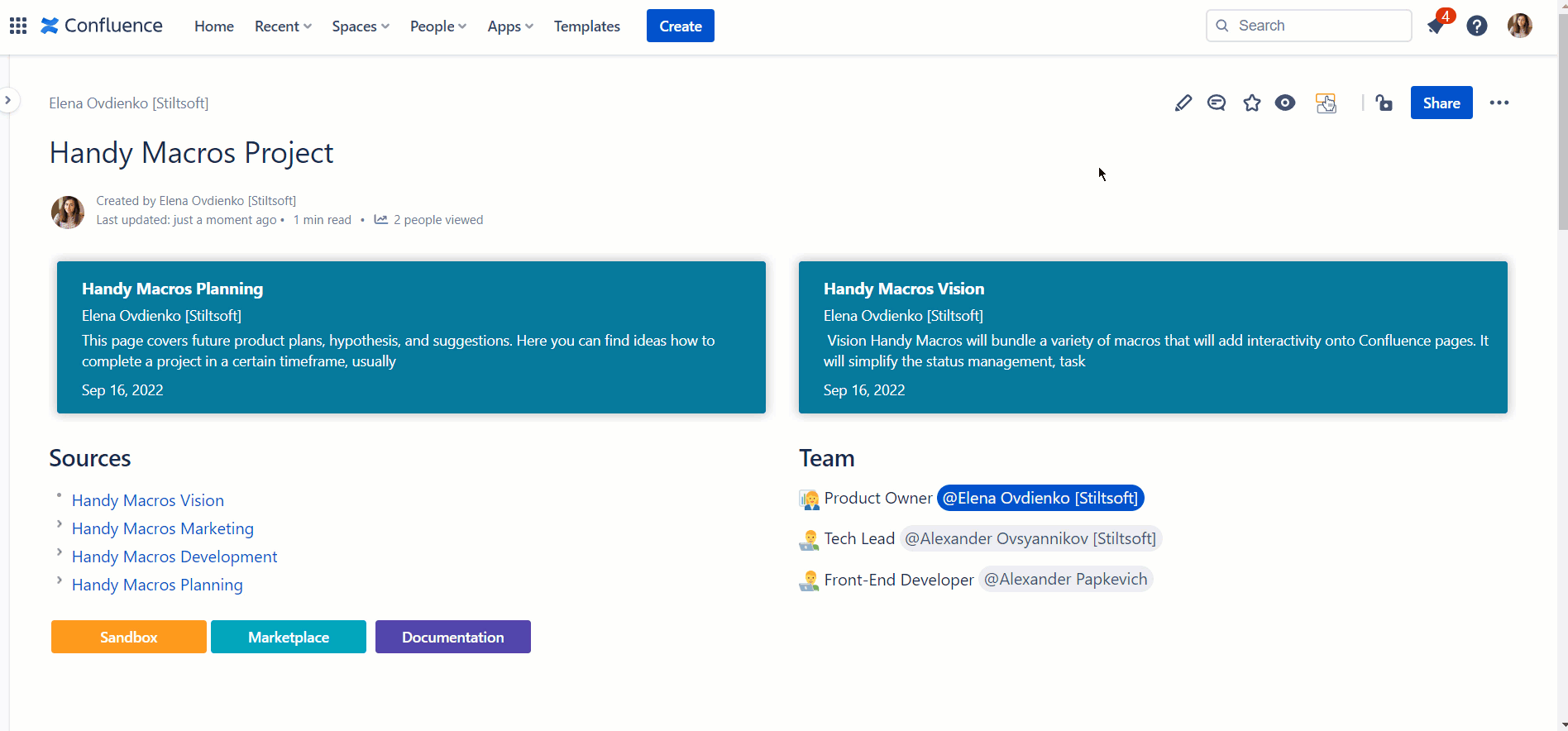
Insert Handy Cards
Go to the edit mode.
- Position the mouse pointer in the appropriate place on the page.
| Option 1 | Option 2 |
|---|---|
|
|
Configure Handy Cards
You can specify the look and feel for Handy Cards when inserting or editing the macro. In the macro editor you have two tabs for doing that:
- Configuration
- Design
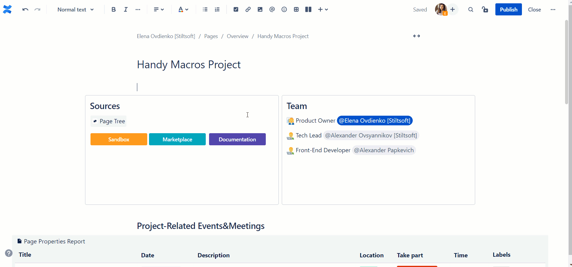
Configuration tab
Use this tab to configure the content and other information for Handy Cards.
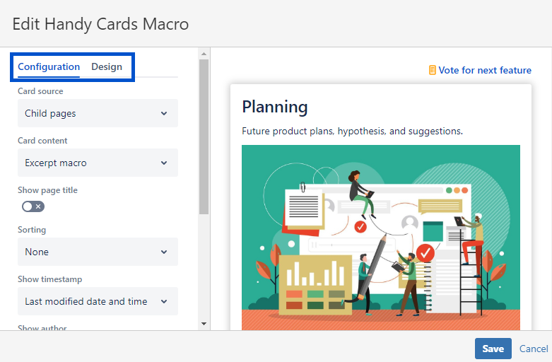
Card Source
Use this parameter to select the pages from which you will create Handy Cards. Choose between:
- Child pages (create cards from the first level of child pages for the current page)
- Pages by labels (create cards from the pages with a certain label/labels)
- Child pages with labels (create cards from the first level of child pages for the current page with a certain label)
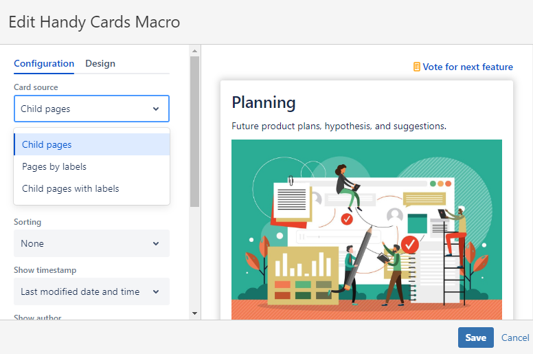
Specify labels
Use this parameter to select the labels for pages from which you will create Handy Cards. In this case, Handy Cards will use all the pages with the corresponding labels as the card source.
- Locate the Specify labels field.
- Start typing the page label you want to create Handy Cards for.
- Choose the label from the prompted variants.
- Add some more labels if needed.
Label logic
- Locate the Label logic field.
- Choose AND or OR logic for labels to create cards:
- For AND logic - all the labels specified need to be present on a page to create a card from it
- For OR logic - any of the labels specified need to be present on a page to create a card from it
Card Content
This parameter allows you to select the source for generating previews displayed on Handy Cards.
You can choose to display out of 2 options:
- Top of the page (content will be generated automatically using the specified number of characters and the image from the beginning of pages)
- Excerpt macro (content will be taken from the Excerpt macro on a source page). If a child page has no Excerpt macro when the Excerpt macro is selected as the content source for Handy Cards, the page preview for this page is generated automatically using the first image and 250 characters of text from it.
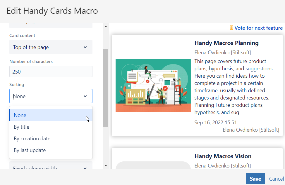
Number of characters
Type the number of the characters in the output. This parameter is available only for cards from the top of the page.
 Handy Cards can display from 1 to 500 characters as a page preview. If not specified, the default number of characters will be used. It's 250 characters.
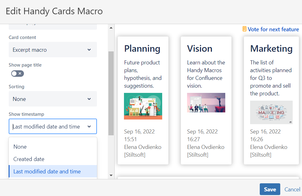
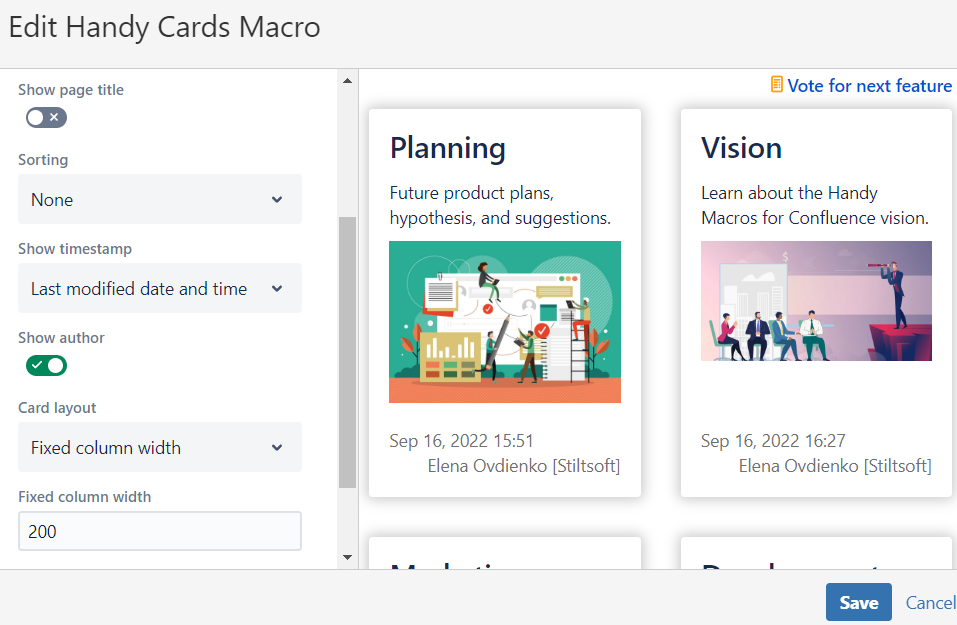
Show page title
Tick the Show page title checkbox to add it to your cards.
Sorting
This parameter allows you to choose the sorting order for Handy Cards. You can choose between the following options:
- None (the default value when Handy Cards will display the source pages randomly)
- By title (cards will be sorted alphabetically)
- By creation date (cards will be sorted in the descending order of the source pages creation)
- By last update (cards will be sorted in the descending order of the source pages update)
Show timestamp
This parameter allows you to add the timestamp to your Handy Cards. You can choose between the following options:
- None (the default value when Handy Cards has no timestamp on them)
- Created date (the date of the source page creation will appear on Handy Cards)
- Last modified date and time (the date and time of the source page last update will appear on Handy Cards)
Show author
This parameter allows you to add the author name to your Handy Cards. You can enable or disable the toggle for the configuration of this parameter. The default value is disabled.
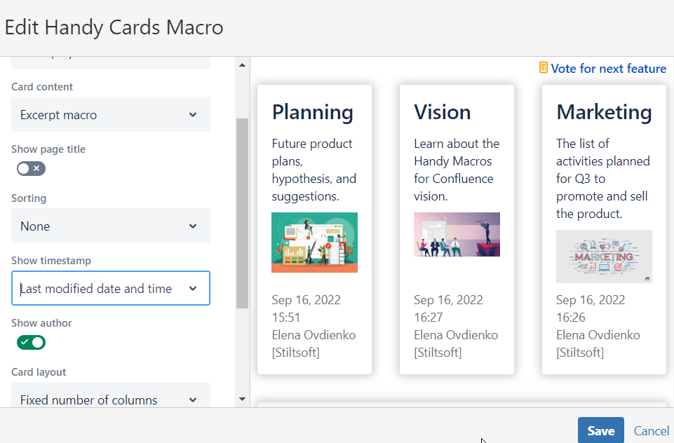
Card Layout
This parameter allows you to specify the way your Handy Cards are organized on a page. You can choose between the following options:
- Fixed number of columns (default value). You will always have the same name of columns despite the screen size. Handy Cards will adopt their size to correspond with the set value of columns.
- Fixed column width. You will always have the same width of Handy Cards. Their number in a row may vary depending on your screen size.
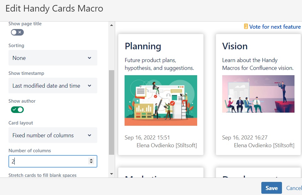
Number of columns
This parameter allows you to specify the number of Handy Cards you need on a page. This parameter is available for Handy Cards having the fixed number of columns.
You can select the number from 1 to 20. The default value is three.
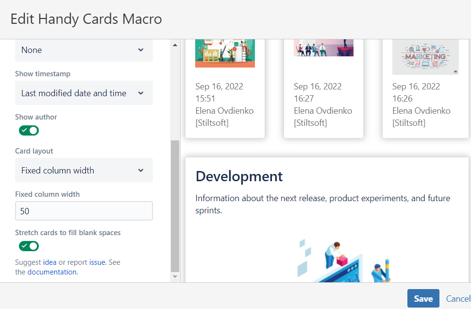
Fixed column width
This parameter allows you to specify the width of Handy Cards you need on a page. This parameter is available for Handy Cards having the fixed column width.
You can select the value in px from 50 to 3000. The default value is 50.
Stretch cards to fill blank spaces
You can enable the Stretch cards to fill blank spaces toggle to automatically fill the empty spaces in the last row of cards. If enabled, the Handy Cards in the last row will be stretched to occupy the full row. If disabled, the Handy Cards in the last row will retain the settings configured for the rest of your cards.
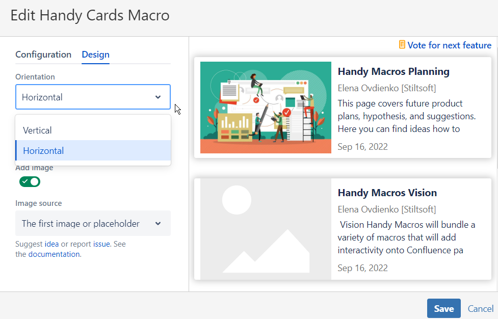
Design tab
Use this tab to configure the look and feel of the content on Handy Cards.
Orientation
This parameter allows you to specify the orientation of your Handy Cards on a page. You can choose between the following options:
- Vertical (default value). Handy Cards will appear as vertical cards (corresponding with the parameters you've specified on the Configuration tab).
- Horizontal. Handy Cards will appear as horizontal cards (corresponding with the parameters you've specified on the Configuration tab).
Note that this parameter is only available for Handy Cards created from the top of the page. If you create Handy Cards from the Excerpt macro, they will be vertical by default (with no horizontal option available).
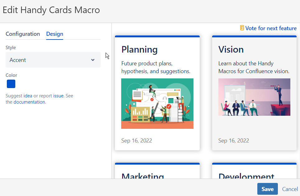
Style
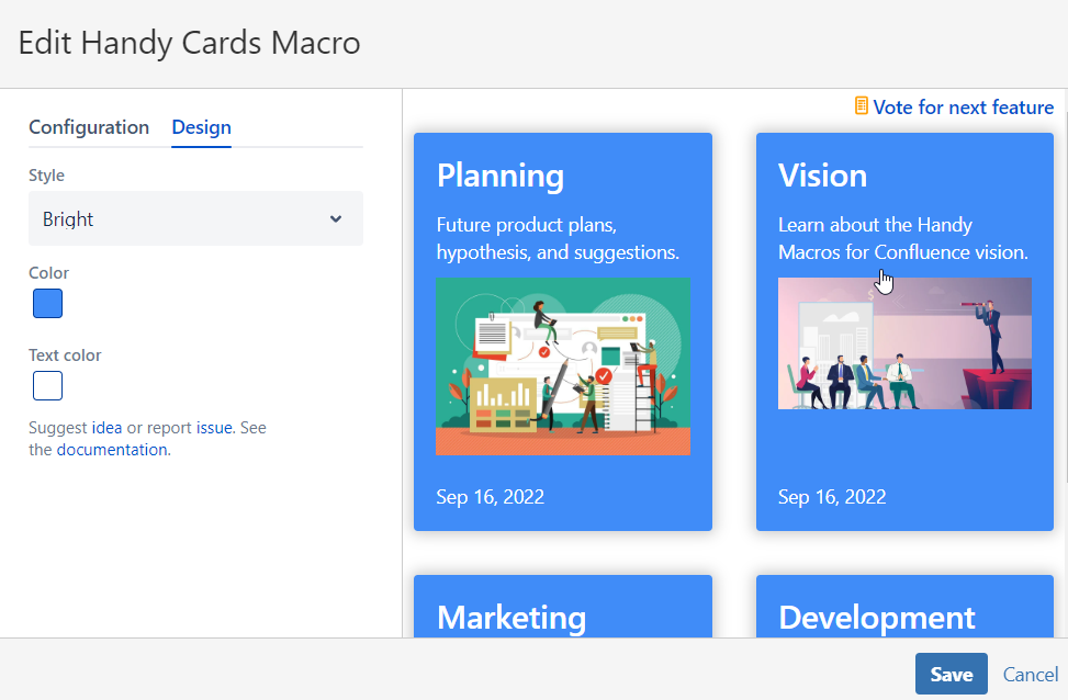
This parameter allows you to specify the color configuration of your Handy Cards on a page. You can choose between the following options:
- Simple (default value). Handy Cards are white with black text color and grey information text color.
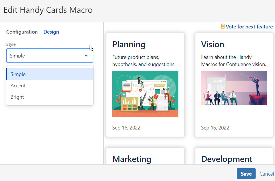
- Accent. Handy Cards are white with the color line on top of them. You can select the accent color in the Color parameter.
- Bright. Handy Cards have the background color you select in the Color parameter. You can also select the text color for the bright style of Handy Cards in the Text color parameter.
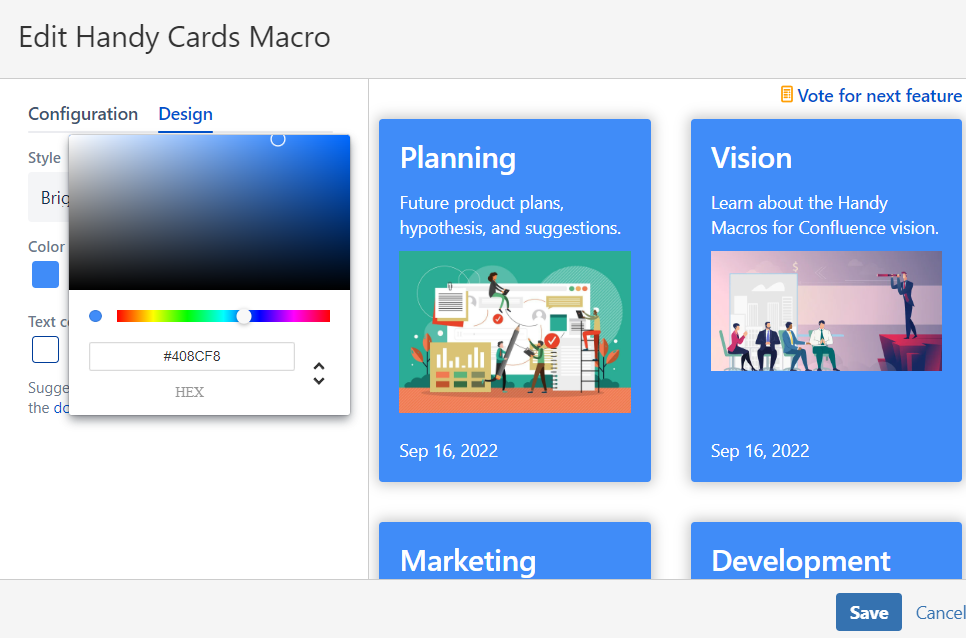
Color
This parameter allows you to specify the color of your Handy Cards. It is available for the accent and bright style of Handy Cards. You can choose the color using the color picker. The default value for the Color parameter is blue (#0052CC HEX).
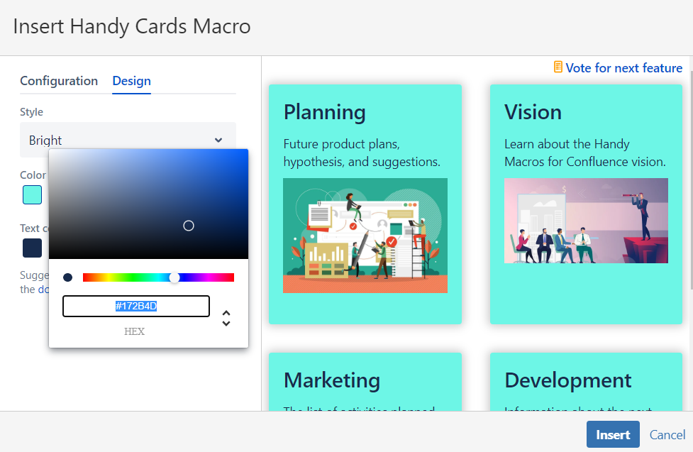
Text color
This parameter allows you to specify the text color of your Handy Cards. It is available for the bright style of Handy Cards. You can choose the color using the color picker. The default value for the Color parameter is dark blue (#172B4D HEX).
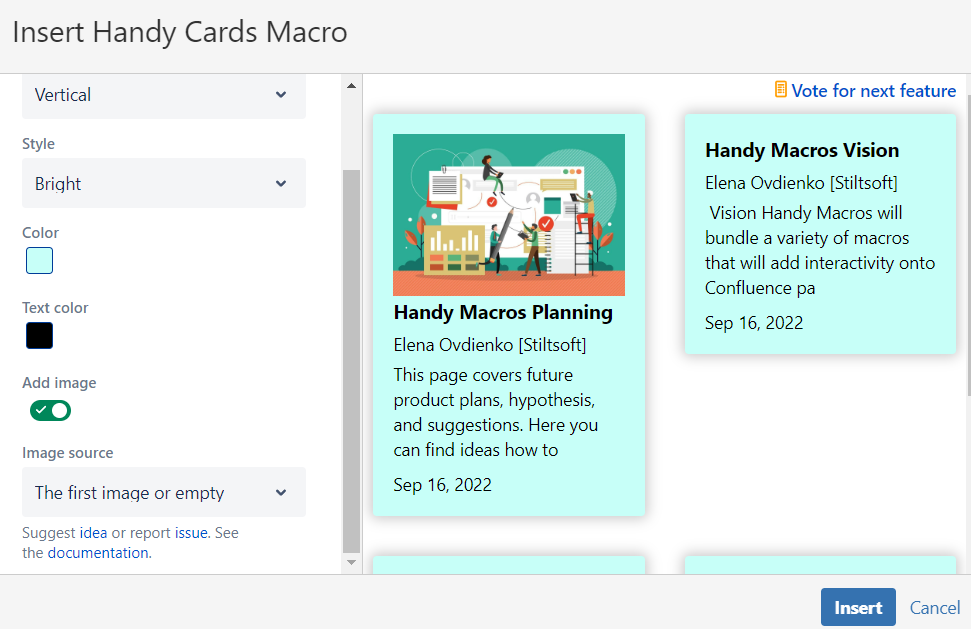
Add image
This parameter allows you to add the image from the source page to your Handy Cards. You can enable or disable the toggle. The default value is enabled.
If enabled, Handy Cards will automatically have the first image from the source page depicted on them. Please note that it's the first image from the page regardless of the page attachments. If you need any other functionality, feel free to leave your suggestion in our form or contact us.
If disabled, Handy Cards will have no image depicted on them.
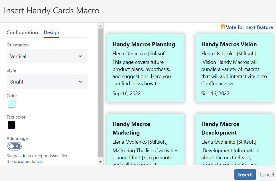
Image source
This parameter allows you to specify the way an image appears on your Handy Cards. You can choose between the following options:
- The first image or placeholder. Handy Cards will use the first image from the source page. If no image available, the default image will be used. It will be replaced once an image is added to the source page. With this option selected, all the cards will be of the same height and the space for the image placeholder will be reserved for the Handy Cards consistency in size.
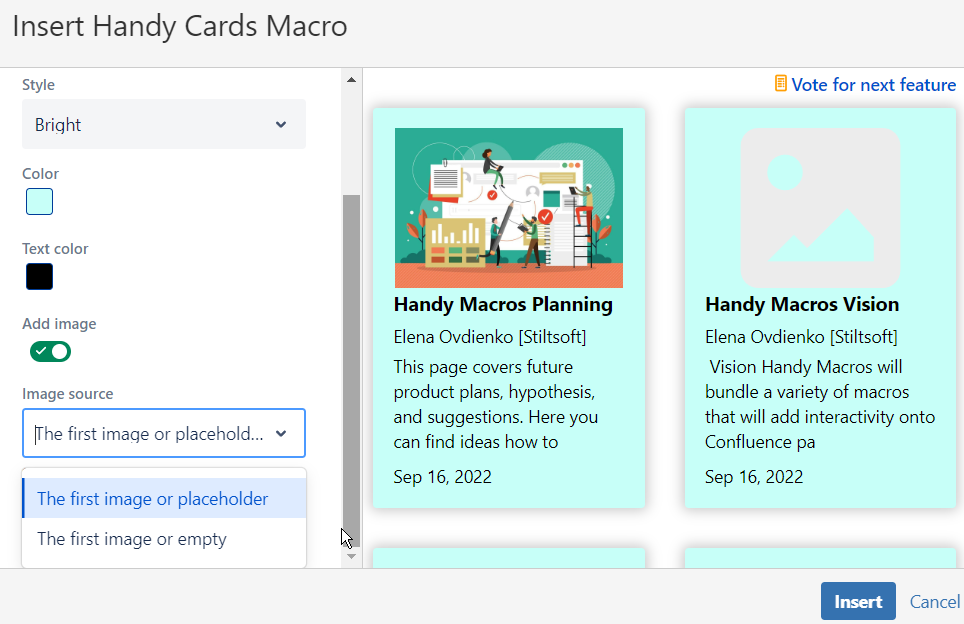
- The first image or empty. Handy Cards will use the first image from the source page. If no image available, no image will be used. With this option selected, all the cards will retain the minimum height possible to depict an image from the source page. The default image is absent. Note that if you have images of different sizes on your source pages, Handy Cards will have the different height (the minimum possible for each card).
Edit Handy Cards
Go to the edit mode.
- Position the mouse pointer to the Handy Cards macro that you want to change and click it.
- Click the edit macro button.
- Change the macro configuration the way you want.
- Click Save. If you want to discard the changes, click Cancel.
Delete Handy Cards
Go to the edit mode.
- Position the mouse pointer to the Handy Cards macro that you want to delete.
- Click the bucket button.
Known issues
- For Handy Cards migrated from the Server or Data Center version of the app, Confluence Cloud shows the wrong author on Handy Cards.
- The images that were generated on source pages from the external link in Confluence Server/Data Center won't be depicted on Handy Cards in Confluence Cloud due to the Content Security Policy limitations.
- Handy Cards created from the external content using the combination with the Handy Cards Content macro in Confluence Server and Data Center, won't be migrated to Confluence Cloud due to technical limitations. Currently, Handy Cards in Confluence Cloud can only be used to generate preview for your internal Confluence Content. If you need any other functionality, feel free to leave your suggestion in our form or contact us.