...
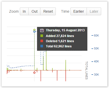
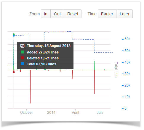
The Code Frequency graph shows the project progress in terms of lines of code.
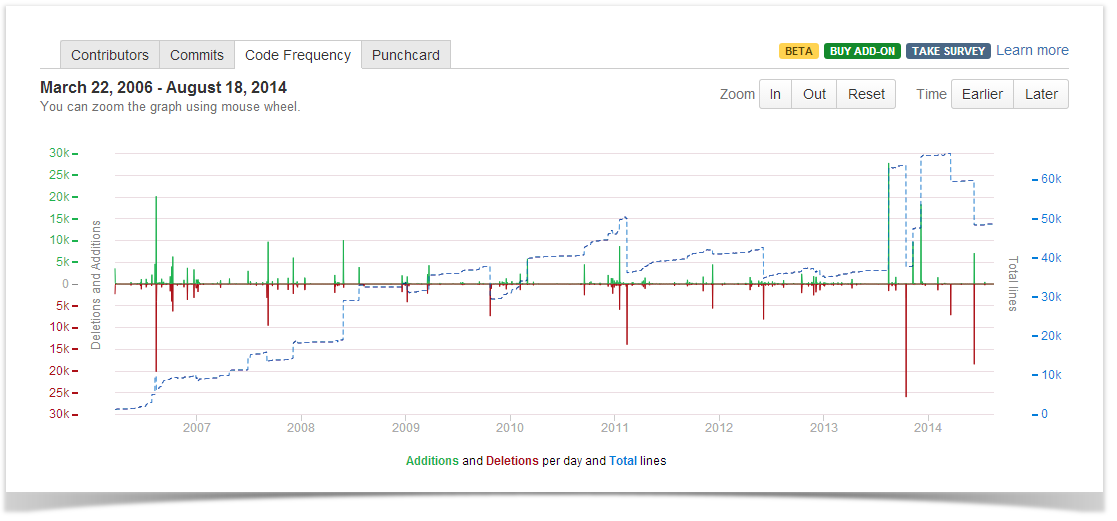
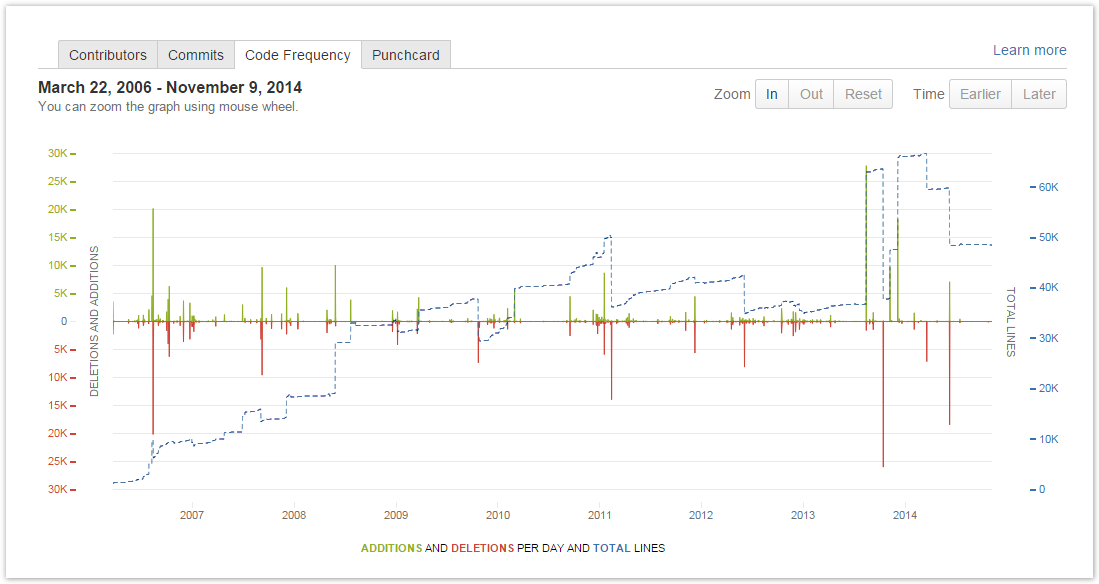
The green and red graphs with the left-hand scale show added and deleted lines of code per week respectively. The dotted blue line with the right-hand scale represents a total. The graph covers the whole project from its start to the current week.
...
Hover over a specific day in the graph to view detailed statistics for it in a pop-up tip.