| Parameter | Default | Compatible with | Description |
|---|
| Labels Column | None | - Pie
- Donut
- 3D Donut
- Column (Stacked)
- Bar (Stacked)
- Gantt
| The column containing labels for data values. |
| Values column | None | - Pie
- Donut
- 3D Donut
- Column (Stacked)
- Bar (Stacked)
- Bubble Pie
- Time Line
- Time Area
- Stacked Time Area
- Gantt
| The column containing numerical values for chart generation. |
| X-axis value column | None | - Line
- Area
- Stacked Area
- Bubble Pie
| The column containing numerical values for chart generation. |
| Y-axis value column | None | - Line
- Area
- Stacked Area
- Bubble Pie
| The column or columns containing numerical values for chart generation. |
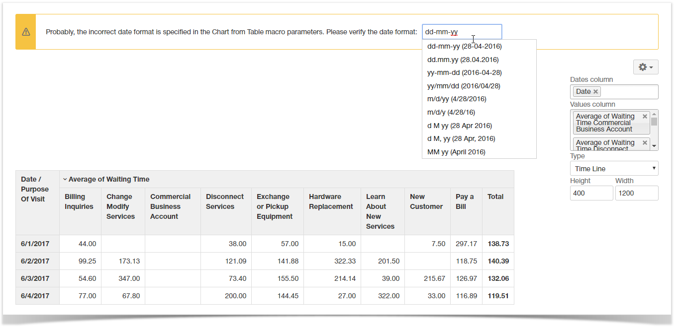
| Dates column | None | - Time Line
- Time Area
- Stacked Time Area
| You can select the column with dates for chart generation. |
| Date Format | yy-mm-dd | - Time Line
- Time Area
- Stacked Time Area
- Gantt
- Bubble Pie
| You can specify the date format used in the column with dates. |
| Type | Pie | Global | You can select the appropriate chart type. |
| 3D | Disabled | - Pie
- Donut
- Column (Stacked)
- Bar (Stacked)
| You can select the display of the chart in 3D view. |
| Decimal Separator | Point | Global | You can select the decimal separator (either point or comma). |
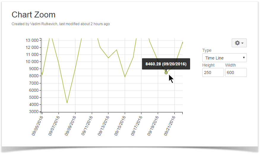
| Height | None (dependable on screen area) | Global | You can define the height of the generated chart. |
| Width | None (dependable on screen area) | Global | You can define the width of the generated chart. |
| Hide the source table | Disabled | Global | You can hide the table with data and enable display of the chart only. |
| Hide chart controls | Disabled | Global | You can hide the chart controls when you need just to display the chart without a necessity to update its view. |
| Show grid | Enabled | - Line
- Area
- Time Line
- Time Area
- Stacked Time Area
- Bubble Pie
| You can enabled display of the grid on the generated chart. |
| Chart Title | Disabled | Global | You can specify the title of the chart. |
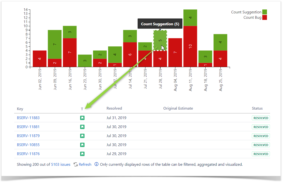
| Show data labels | Percentage | - Pie
- Donut
- Column
- Bar
- Stacked Column
- Stacked Bar
- Bubble Pie
| You can specify the way to show data labels (none, value, percentage, value (percentage), percentage (value)). |
| Align chart | Enabled | Center | You can define the appropriate alignment for the chart. |
| X-axis label | Disabled | Global | You can specify the label for X axis of the chart. |
| Y-axis label | Disabled | Global | You can specify the label for Y axis of the chart. |
| Minimal Value | Disabled | - Column
- Bar
- Stacked Column
- Stacked Bar
- Gantt
- Bubble Pie
| You can specify the minimal value for showing only data values greater than the specified minimal value. |
| Maximal Value | Disabled | - Column
- Bar
- Stacked Column
- Stacked Bar
- Gantt
- Bubble Pie
| You can specify the maximal value for showing only data values not greater than the specified maximal value. |
| Scale Step | Disabled | - Column
- Bar
- Stacked Column
- Stacked Bar
- Gantt
- Bubble Pie
| You can specify the required scale step for showing the chart. |
Minimal X Value |
| - Line
- Area
- Stacked Area
- Time Line
- Time Area
- Stacked Time Area
- Bubble Pie
| You can specify the minimal value for X axis for showing only data values greater than the specified minimal value. |
| Maximal X Value |
| - Line
- Area
- Stacked Area
- Time Line
- Time Area
- Stacked Time Area
- Bubble Pie
| You can specify the maximal value for X axis for showing only data values not greater than the specified maximal value. |
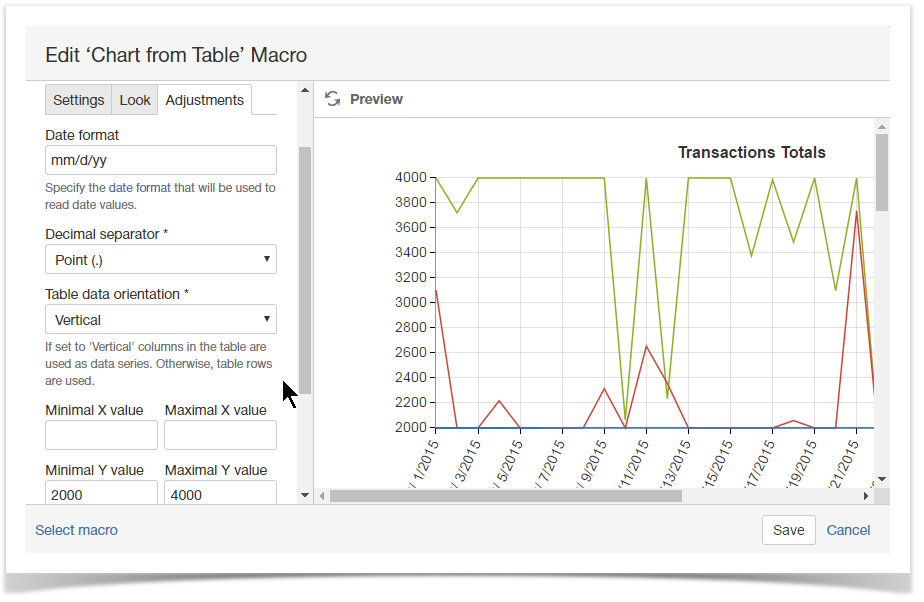
| Minimal Y Value |
| - Line
- Area
- Stacked Area
- Time Line
- Time Area
- Stacked Time Area
| You can specify the minimal value for Y axis for showing only data values greater than the specified minimal value. |
| Maximal Y Value |
| - Line
- Area
- Stacked Area
- Time Line
- Time Area
- Stacked Time Area
| You can specify the maximal value for Y axis for showing only data values not greater than the specified maximal value. |
| Scale X Step |
| - Line
- Area
- Stacked Area
- Time Line
- Time Area
- Stacked Time Area
- Bubble Pie
| You can specify the required scale step of X axis for showing the chart. For Time Line and Time Area charts you can specify the appropriate number of days (Xd), months (Xm) or years (Xy) where the 'X' is the digit, as follows: - 10d = 10 days as a scale step
- 1m = 1 month as a scale step
- 2y = 2 years as a scale step
|
| Scale Y Step |
| - Line
- Area
- Stacked Area
- Time Line
- Time Area
- Stacked Time Area
| You can specify the required scale step of Y axis for showing the chart. |
| Logarithmic scale Y | Disabled | | You can enable this option for very small or very large numeric values that cannot be properly aligned on the standard arithmetic scale. |
| Logarithmic scale X | Disabled | | You can enable this option for very small or very large numeric values that cannot be properly aligned on the standard arithmetic scale. |
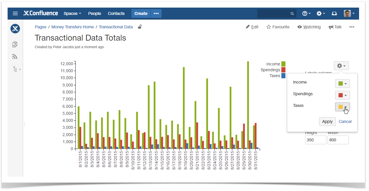
| Select colors |
| Global | You can select the appropriate colors for charts and graphs instead of using the automatically assigned colors. |
| Line settings | Solid 1.5 px | | You can select the line type (solid, dash, dot) and set its width for each line in your charts. |
| Logarithmic Scale | Disabled | - Column (Stacked)
- Bar (Stacked)
- Time Line
- Time Area
- Stacked Time Area
| You can enable this option for very small or very large numeric values that cannot be properly aligned on the standard arithmetic scale. |
| Interpolation | - Linear
- Step
- Natural cubic
- Monotone X cubic
- Monotone Y cubic
- Cubic Catmull-Rom
- Cubic cardinal
- Cubic basis
- Straightened cubic basis
| - Line
- Area
- Stacked Area
- Time Line
- Time Area
- Stacked Time Area
| You can select the interpolation method for each line in your charts. |
| Table Data Orientation | Vertical | Global | You can define the appropriate orientation of values in your data table. |
| Show inner labels | Enabled | - Pie
- Bar
- Column
- Stacked Column
- Stacked Bar
| You can enable or disable display of data values (including percents) on the charts. |
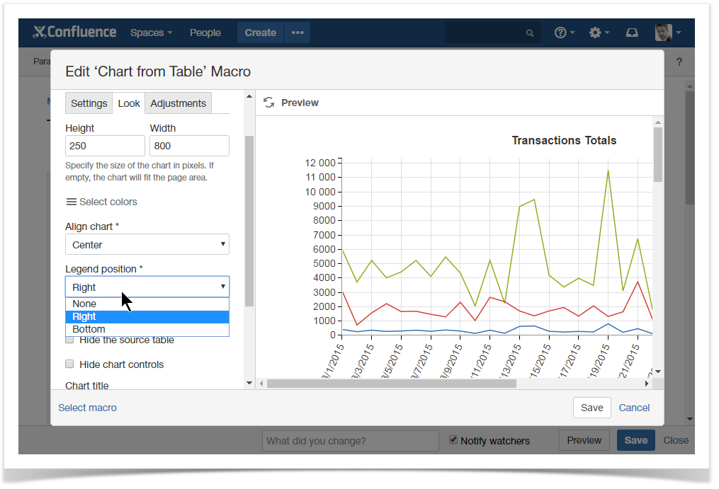
| Legend position | Right | - Bar
- Column
- Stacked Column
- Stacked Bar
| You can regulate the position of showing the legend for a specific chart. You can also hide the legend or show it below the chart. |
| Show trendline | Disabled | - Line
- Area
- Stacked Area
- Time Line
- Time Area
- Stacked Time Area
- Column
- Stacked Column
- Bar
- Stacked Bar
| You can enable display of the trend line for each label of your chart. |
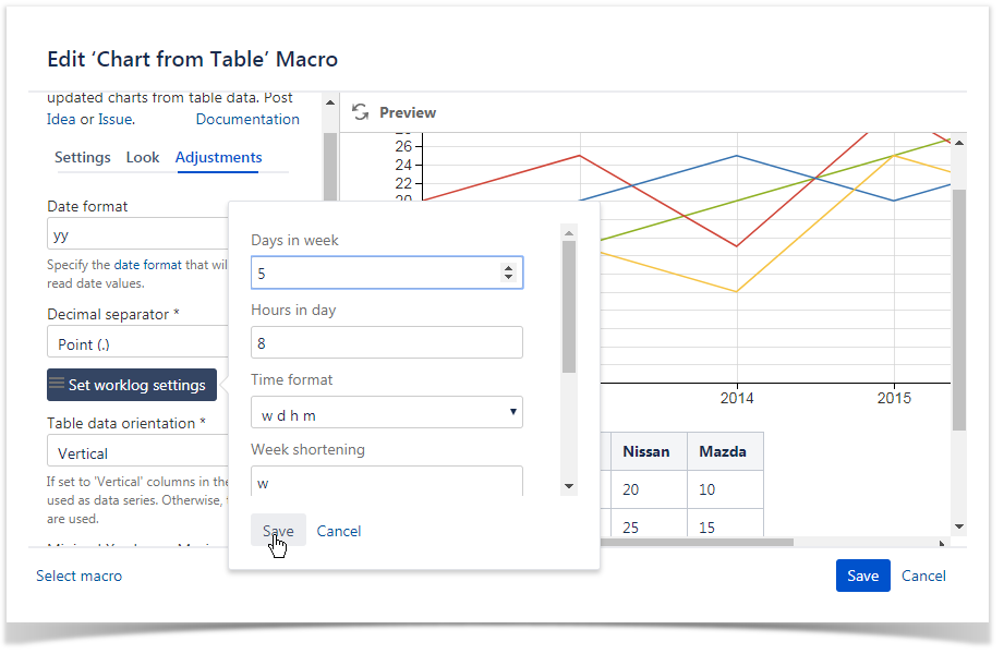
| Days in week | 5 | Global | You can enter the number of business days in a week. |
| Hours in day | 8 | Global | You can enter the number of working hours in one business day. |
| Output format | w d h m | Global | You can select the appropriate output format for worklog values. |


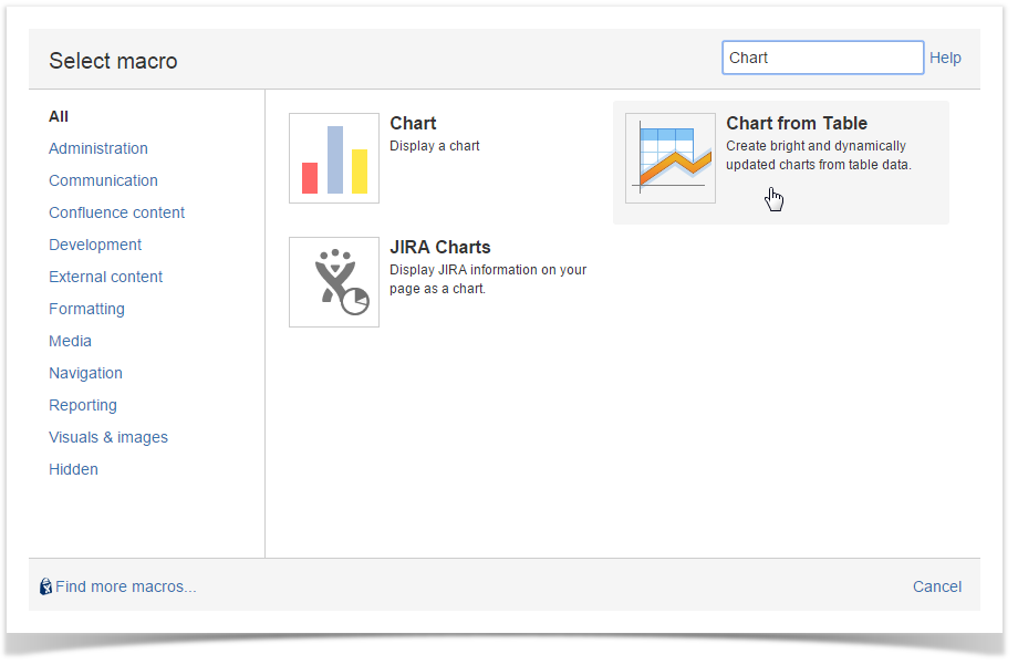
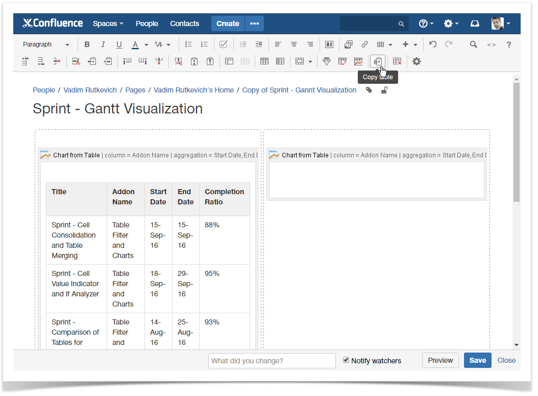
 icon.
icon.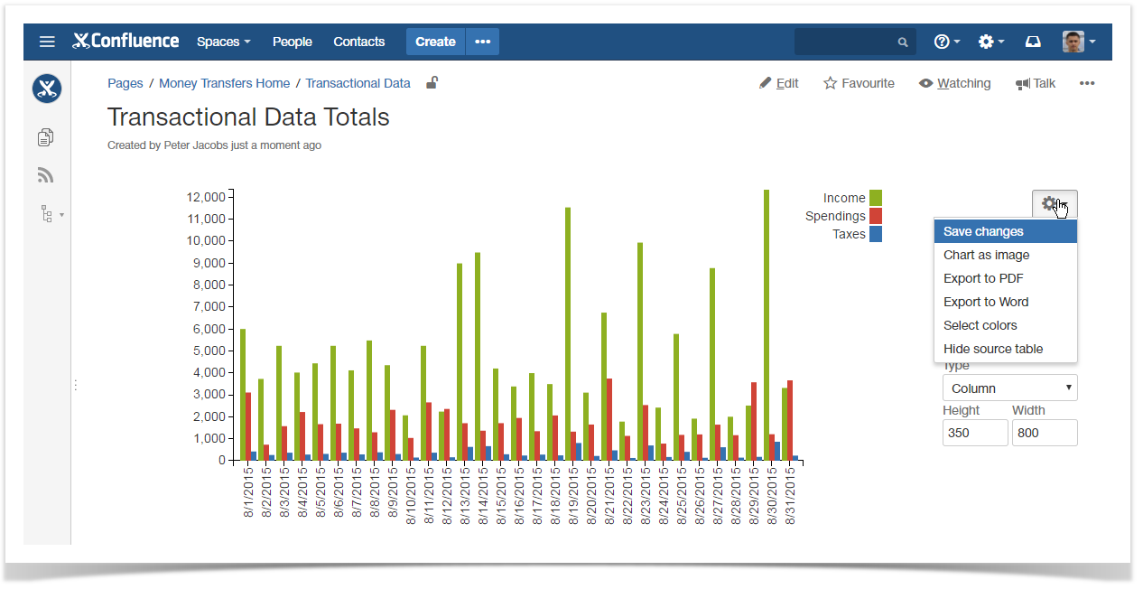

 icon on the editor pane.