Page tree

Versions Compared

Key

  • This line was added.
  • This line was removed.
  • Formatting was changed.
Panel
bgColorwhite
titleBGColor#f5f5f5
titleManaging Dynamic Charts from Table Data

Table Filter for Confluence add-on allows you to visualize your table data and create dynamic charts that you can configure and update on the fly while viewing Confluence pages. You can select the column containing labels and set one or multiple columns containing number values used for chart creation. Additionally, you can select the appropriate chart or graph type (pie, donut and 3D donut, column, bar, line, area, time line and time area). Optionally, you can set the decimal separator, specify the dimensions of the chart, and enable the hiding of the source table. You can modify settings of your charts and save modifications in the macro body while viewing the page.

Table of Contents
maxLevel2

Widget Connector
width432
urlhttps://www.youtube.com/watch?v=eiVywX8Hmp4
height243

Starting from version 3.0.0 Table Filter add-on allows you to generate charts based on values from your data tables. The add-on supports the following types of charts:

Chart Parameters

These parameters determine the procedure of chart generation on Confluence page.

Expand
titleClick here to expand the available parameters of the Chart from Table macro...
ParameterDefaultCompatible withDescription
Labels ColumnNone
  • Pie
  • Donut
  • 3D Donut
  • Column (Stacked)
  • Bar (Stacked)

The column containing labels for data values.

Values columnNone
  • Pie
  • Donut
  • 3D Donut
  • Column (Stacked)
  • Bar (Stacked)
  • Time Line
  • Time Area

The column containing numerical values for chart generation.

X-axis value columnNone
  • Line
  • Area
The column containing numerical values for chart generation.
Y-axis value columnNone
  • Line
  • Area
The column or columns containing numerical values for chart generation.
Dates columnNone
  • Time Line
  • Time Area
You can select the column with dates for chart generation.
Date Formatyy-mm-dd
  • Time Line
  • Time Area
You can specify the date format used in the column with dates.
TypePieGlobalYou can select the appropriate chart type.
Decimal SeparatorPointGlobalYou can select the decimal separator (either point or comma).
Height

None

(dependable on screen area)

GlobalYou can define the height of the generated chart.
Width

None

(dependable on screen area)

GlobalYou can define the width of the generated chart.
Hide the source tableDisabledGlobalYou can hide the table with data and enable display of the chart only.
Hide chart controlsDisabledGlobalYou can hide the chart controls when you need just to display the chart without a necessity to update its view.
Show legendDisabledGlobalYou can hide the legend for the generated chart.
Show gridEnabled
  • Line
  • Area
  • Time Line
  • Time Area
You can enabled display of the grid on the generated chart.
Chart TitleDisabledGlobalYou can specify the title of the chart.
Align chartEnabledCenterYou can define the appropriate alignment for the chart.
X-axis labelDisabledGlobalYou can specify the label for X axis of the chart.
Y-axis labelDisabledGlobalYou can specify the label for Y axis of the chart.
Minimal ValueDisabled
  • Column
  • Bar
  • Stacked Column
  • Stacked Bar
You can specify the minimal value for showing only data values greater than the specified minimal value.
Maximal ValueDisabled
  • Column
  • Bar
  • Stacked Column
  • Stacked Bar
You can specify the maximal value for showing only data values not greater than the specified maximal value.
Scale StepDisabled
  • Column
  • Bar
  • Stacked Column
  • Stacked Bar
You can specify the required scale step for showing the chart.

Minimal X Value

 
  • Line
  • Area
  • Time Line
  • Time Area
You can specify the minimal value for X axis for showing only data values greater than the specified minimal value.
Maximal X Value  
  • Line
  • Area
  • Time Line
  • Time Area
You can specify the maximal value for X axis for showing only data values not greater than the specified maximal value.
Minimal Y Value  
  • Line
  • Area
  • Time Line
  • Time Area
You can specify the minimal value for Y axis for showing only data values greater than the specified minimal value.
Maximal Y Value  
  • Line
  • Area
  • Time Line
  • Time Area
You can specify the maximal value for Y axis for showing only data values not greater than the specified maximal value.
Scale X Step 
  • Line
  • Area
  • Time Line
  • Time Area

You can specify the required scale step of X axis for showing the chart.

For Time Line and Time Area charts you can specify the appropriate number of days (Xd), months (Xm) or years (Xy) where the 'X' is the digit, as follows:

  • 10d = 10 days as a scale step
  • 1m = 1 month as a scale step
  • 2y = 2 years as a scale step
Scale Y Step  
  • Line
  • Area
  • Time Line
  • Time Area
You can specify the required scale step of Y axis for showing the chart.
Logarithmic scale YDisabled
  • Line
  • Area
You can enable this option for very small or very large numeric values that cannot be properly aligned on the standard arithmetic scale.
Logarithmic scale XDisabled
  • Line
  • Area
You can enable this option for very small or very large numeric values that cannot be properly aligned on the standard arithmetic scale.
Colors GlobalYou can select the appropriate colors for charts and graphs instead of using the automatically assigned colors.
Logarithmic Scale 
  • Pie
  • Donut
  • 3D DonutDisabled
    • Column (Stacked)
    • Bar (Stacked)
    • Time Line
    • Time Area
    You can enable this option for very small or very large numeric values that cannot be properly aligned on the standard arithmetic scale.


    Inserting Chart from Table macro

    There exist three ways to insert the Chart from Table macro on the page.

    Macro InsertionInstructionsSupported Data
     Inserting the macro through the action icon on the editor pane
    1. Switch Confluence page to the edit mode.
    2. Position the mouse pointer within the table.
    3. On the editor pane, click the Create a chart from table icon.
    Info

    This option is available in Confluence Server only.

    •  Manually created and copied tables
    Manual entry of the {Chart from Table} query on the page
    1. Switch Confluence page to the edit mode.
    2. Position the mouse pointer in the appropriate place on the page.
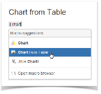
    3. Start entering {Chart from Table}.
    4. From the prompted list of macro choices, select Chart from Table.
    • Manually created and copied tables
    • Macros outputting table data
    Selection of the Chart from Table macro in the Select Macro form
    1. Switch Confluence page to the edit mode.
    2. Position the mouse pointer in the appropriate place on the page.
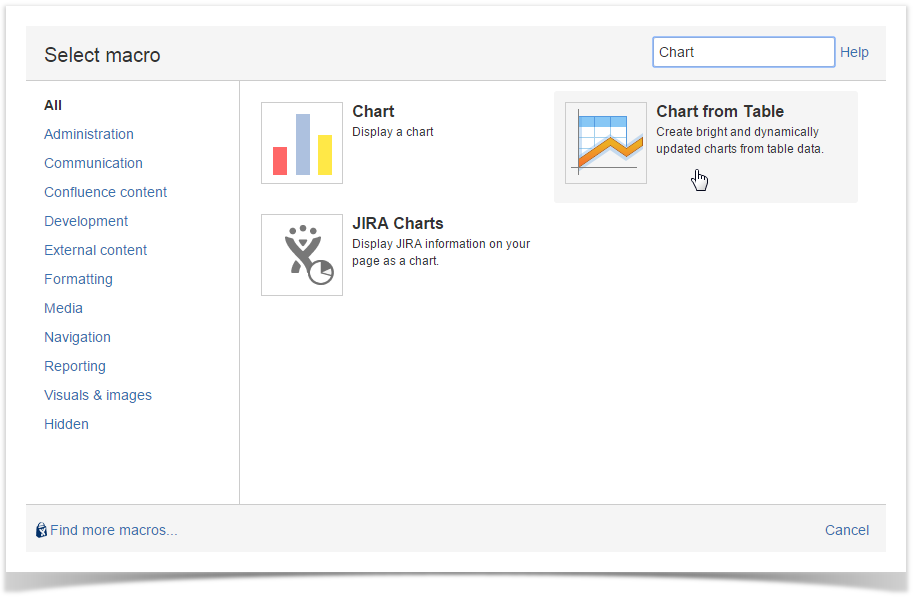
    3. On the editor pane, click Insert.
    4. In the Select Macro form, locate the Chart from Table macro and insert it on the page.
    5. Place the table within the macro.
    • Manually created and copied tables
    • Macros outputting table data

    Configuring Table chart macro

    1. On the Confluence page opened in the edit mode, click the Chart from Table macro.
    2. Click Edit.
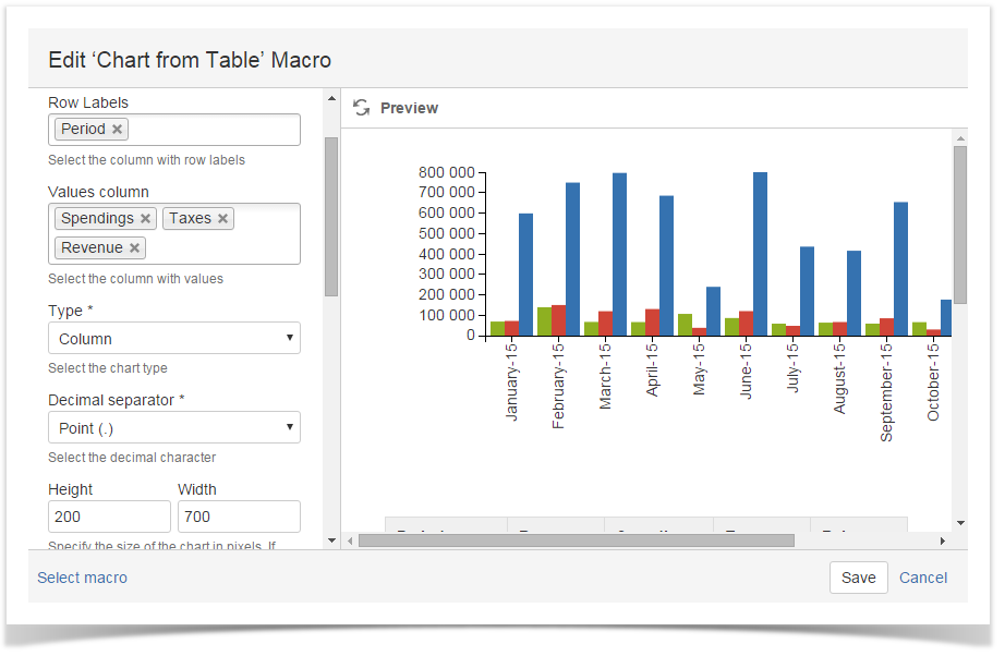
    3. In the Edit Table chart Macro form, define parameters of the macro.
    4. Click Save.

    Managing Charts in the Page View Mode

    Once you have defined settings of the Table chart macro and saved the page, you get a page with the generated chart.

    To the right side of your chart, you can locate the chart management sidebar. It allows you to alternate the following parameters of Chart table macro:

    • Row Labels - change the column with labels for another one.
    • Values column - change the column with data values. The chart will be automatically re-generated. Depending on the used chart type you may select column with numerical through Values column X and Values column Y fields.
    • Dates column - change the column with dates. The chart will be automatically re-generated. This select box is shown for Time Line and Time Area charts only.
    • Type - change the chart type for another one. You may need to re-select the table columns when changing the chart type.
    • Height/Width - specify the required dimensions of the chart.

    To save new parameters in the macro body:

    1. Click the Cogwheel  icon.
    2. Select Save changes.

    To export the chart:

    1. Click the Cogwheel  icon.
    2. Select Export to PDF or Export to Word.

    To save the chart as image:

    1. Click the Cogwheel  icon.
    2. Select Chart as image.

    To update the colors used for charts and graphs:

    1. Click the Cogwheel  icon.
    2. Click Select colors.
    3. Click the color picker and select the appropriate color on the palette. 
    4. Click Apply to use the selected colors and redraw your chart or graph.

    Info

    For the line and area charts, you will have to select the columns with numbers (Values Axis X and Values Axis Y)

    Chart Examples

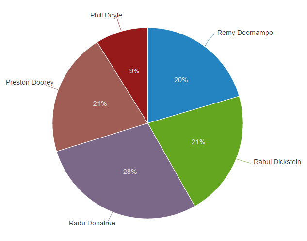
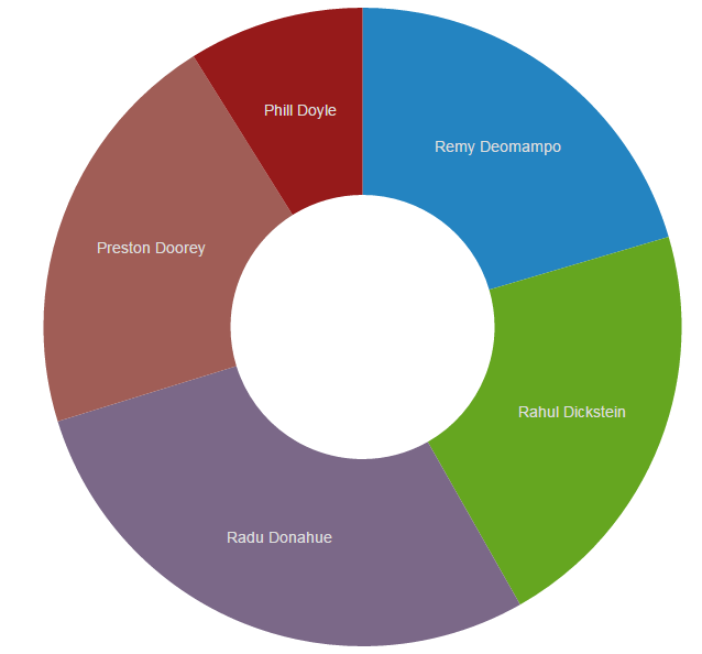
    Pie chart

    Parameters in Macro BrowserData Table in Macro PlaceholderRendered Chart
    Row LabelsAgent
    Values columnTickets per Hour
    TypePie
    Decimal separatorPoint (.)
    HeightDefault
    WidthDefault
    AgentTickets per HourAverage Time per Ticket (min)Calls per Hour
    Remy Deomampo4.65.14.2
    Rahul Dickstein4.81.61.3
    Radu Donahue6.45.61.5
    Preston Doorey4.71.31.6
    Phill Doyle2.03.42.7


    Donut / 3D Donut chart

    Parameters in Macro BrowserData Table in Macro PlaceholderRendered Chart
    Row LabelsAgent
    Values columnTickets per Hour
    TypeDonut / 3D Donut
    Decimal separatorPoint (.)
    HeightDefault
    WidthDefault
    AgentTickets per HourAverage Time per Ticket (min)Calls per Hour
    Remy Deomampo4.65.14.2
    Rahul Dickstein4.81.61.3
    Radu Donahue6.45.61.5
    Preston Doorey4.71.31.6
    Phill Doyle2.03.42.7


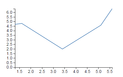
    Line chart

    Parameters in Macro BrowserData Table in Macro PlaceholderRendered Chart
    Row LabelsTickets per Hour
    Values columnAverage Time per Ticket (min)
    TypeLine
    Decimal separatorPoint (.)
    Height200
    Width

    400

    AgentTickets per HourAverage Time per Ticket (min)Calls per Hour
    Remy Deomampo4.65.14.2
    Rahul Dickstein4.81.61.3
    Radu Donahue6.45.61.5
    Preston Doorey4.71.31.6
    Phill Doyle2.03.42.7


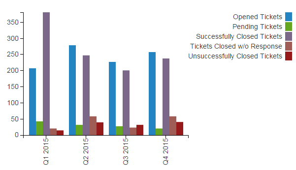
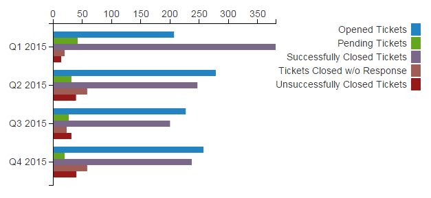
    Column chart

    Parameters in Macro BrowserData Table in Macro PlaceholderRendered Chart
    Row LabelsPeriod
    Values column
    • Opened Tickets
    • Pending Tickets
    • Successfully Closed Tickets
    • Tickets Closed w/o Response
    • Unsuccessfully Closed Tickets
    • Total Tickets
    TypeColumn
    Height300
    Width600
    PeriodOpened TicketsPending TicketsSuccessfully Closed TicketsTickets Closed w/o ResponseUnsuccessfully Closed TicketsTotal Tickets
    Q1 2015207423812014664
    Q2 2015278312475839653
    Q3 2015227272002331508
    Q4 2015257202375840612

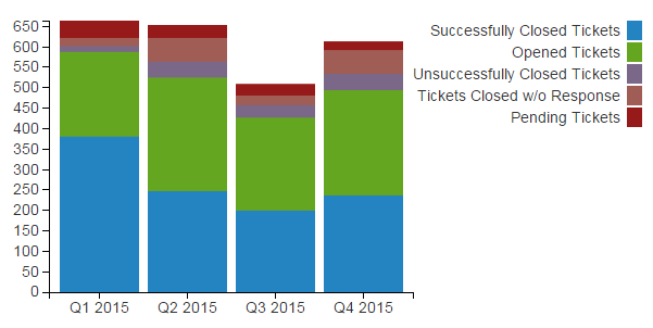
    Stacked Column chart

    Parameters in Macro BrowserData Table in Macro PlaceholderRendered Chart
    Row LabelsPeriod
    Values column
    • Opened Tickets
    • Pending Tickets
    • Successfully Closed Tickets
    • Tickets Closed w/o Response
    • Unsuccessfully Closed Tickets
    • Total Tickets
    TypeStacked Column
    Height300
    Width

    600


    PeriodOpened TicketsPending TicketsSuccessfully Closed TicketsTickets Closed w/o ResponseUnsuccessfully Closed TicketsTotal Tickets
    Q1 2015207423812014664
    Q2 2015278312475839653
    Q3 2015227272002331508
    Q4 2015257202375840612

    Bar chart

    Parameters in Macro BrowserData Table in Macro PlaceholderRendered Chart
    Row LabelsPeriod
    Values column
    • Opened Tickets
    • Pending Tickets
    • Successfully Closed Tickets
    • Tickets Closed w/o Response
    • Unsuccessfully Closed Tickets
    • Total Tickets
    TypeBar
    Height300
    Width400
    PeriodOpened TicketsPending TicketsSuccessfully Closed TicketsTickets Closed w/o ResponseUnsuccessfully Closed TicketsTotal Tickets
    Q1 2015207423812014664
    Q2 2015278312475839653
    Q3 2015227272002331508
    Q4 2015257202375840612


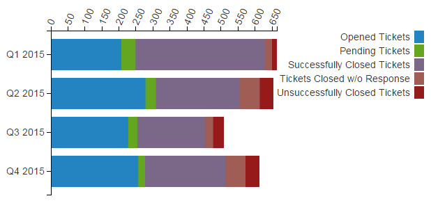
    Stacked Bar chart

    Parameters in Macro BrowserData Table in Macro PlaceholderRendered Chart
    Row LabelsPeriod
    Values column
    • Opened Tickets
    • Pending Tickets
    • Successfully Closed Tickets
    • Tickets Closed w/o Response
    • Unsuccessfully Closed Tickets
    • Total Tickets
    TypeStacked Bar
    Height300
    Width

    600

    PeriodOpened TicketsPending TicketsSuccessfully Closed TicketsTickets Closed w/o ResponseUnsuccessfully Closed TicketsTotal Tickets
    Q1 2015207423812014664
    Q2 2015278312475839653
    Q3 2015227272002331508
    Q4 2015257202375840612

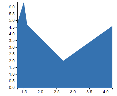
    Area chart

    Parameters in Macro BrowserData Table in Macro PlaceholderRendered Chart
    Row LabelsTickets per Hours
    Values columnCalls per Hour
    TypeArea
    Decimal separatorPoint (.)
    Height300
    Width400
    AgentTickets per HourAverage Time per Ticket (min)Calls per Hour
    Remy Deomampo4.65.14.2
    Rahul Dickstein4.81.61.3
    Radu Donahue6.45.61.5
    Preston Doorey4.71.31.6
    Phill Doyle2.03.42.7


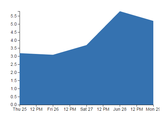
    Time Line / Time Area chart

    Parameters in Macro BrowserData Table in Macro PlaceholderRendered Chart
    Values ColumnAverage Time per Ticket (min)
    Dates columnDate
    TypeBar
    Decimal separatorPoint (.)
    Date formatdd.mm.yy
    Height300
    Width400
    DateTickets per HourAverage Time per Ticket (min)Calls per Hour
    25.06.20157.33.23.3
    26.06.20158.53.11.8
    27.06.20155.03.74.5
    28.06.20152.25.82.7
    29.06.20152.03.42.7


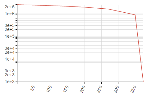
    Line / Area chart (Logarithmic scale)

    Info

    Instead of using the default arithmetic scale, you can use the logarithmic scale that is convenient for too large or too small numbers.

    Parameters in Macro BrowserData Table in Macro PlaceholderRendered Chart
    X-axis value columnTemperature (Celcium degree)
    Y-axis value columnEvaporation heat, Joule/kg
    TypeLine
    Logarithmic scale YEnabled
    Temperature (Celcium degree)Evaporation heat, Joule/kg
    0.52.500E+6
    75.42.322E+6
    142.92.137E+6
    200.41.930E+6
    270.01.605E+6
    3500.893E+6
    374.150.001E+6


    Removing Chart from Table macro for Tables

    1. Switch Confluence page to the edit mode.
    2. Select the Chart from Table macro with the table or macro outputting the table.
    3. Click Unwrap.