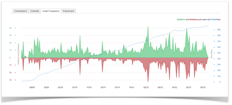
The Code Frequency graph gives you the idea of how your project is evolving in terms of code lines.
The green and red graphs with the left-hand scale show added and deleted code lines per week respectively. The dotted blue line with the right-hand scale represents a total. The graph covers the whole project from its start to the current week.
| Talk | ||||||
|---|---|---|---|---|---|---|
|
| Note | ||
|---|---|---|
| ||
This feature is available only under a commercial or evaluation license. |