...
Once configuration is done, you will see something like this:
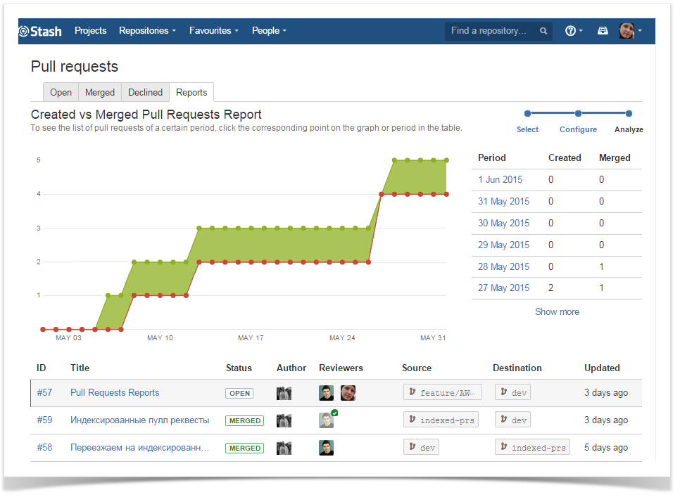
The graph is created by the cumulative total pattern, which means data is progressively added to the preceding period. Graphs' areas in red show periods where more pull requests were created than merged. Areas in green show periods where more pull requests were merged than created. The graph is created by the cumulative total pattern, which means data is progressively added to the preceding period.
To the right of the graph, there is a table showing the number of created and merged pull requests that correspond to each period.
...