Download PDF
Download page Pie and Donut chart tyрes.
Pie and Donut chart tyрes
Overview
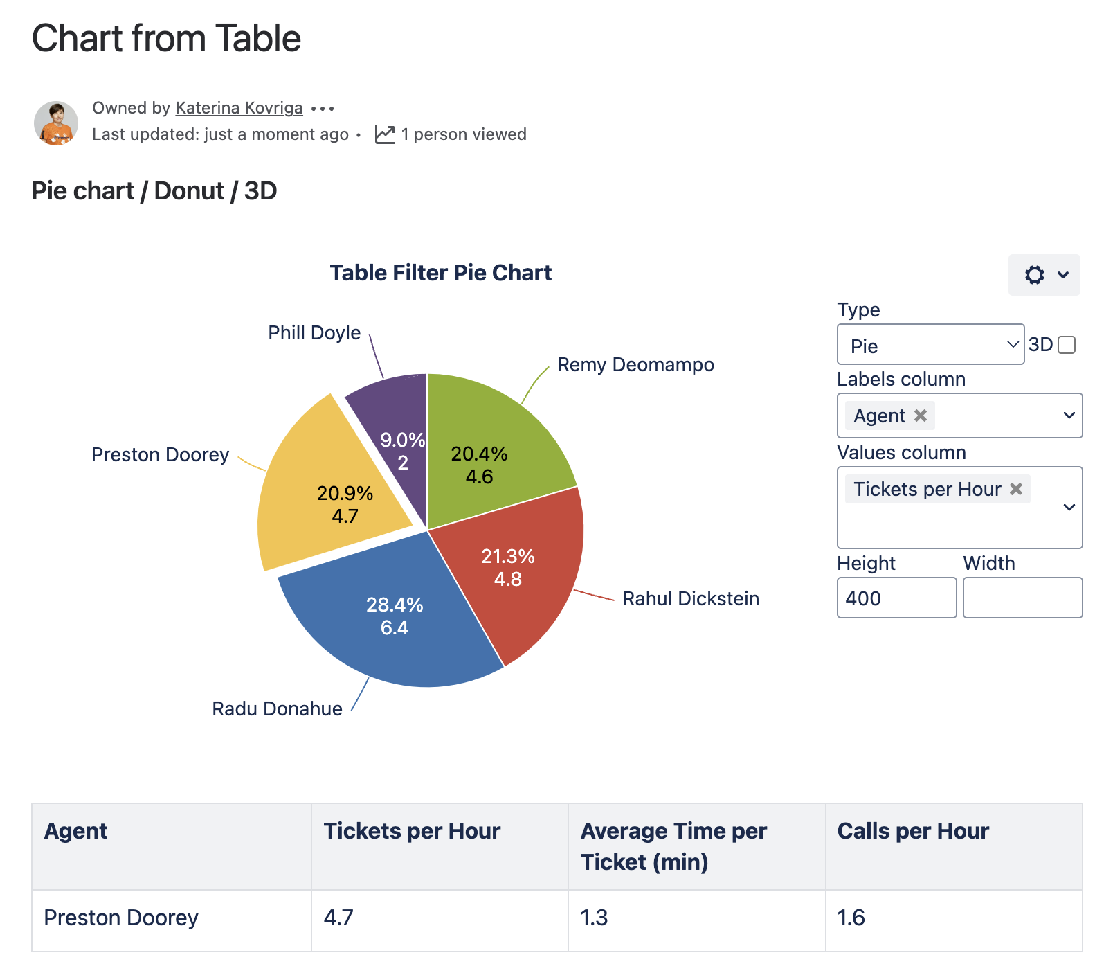
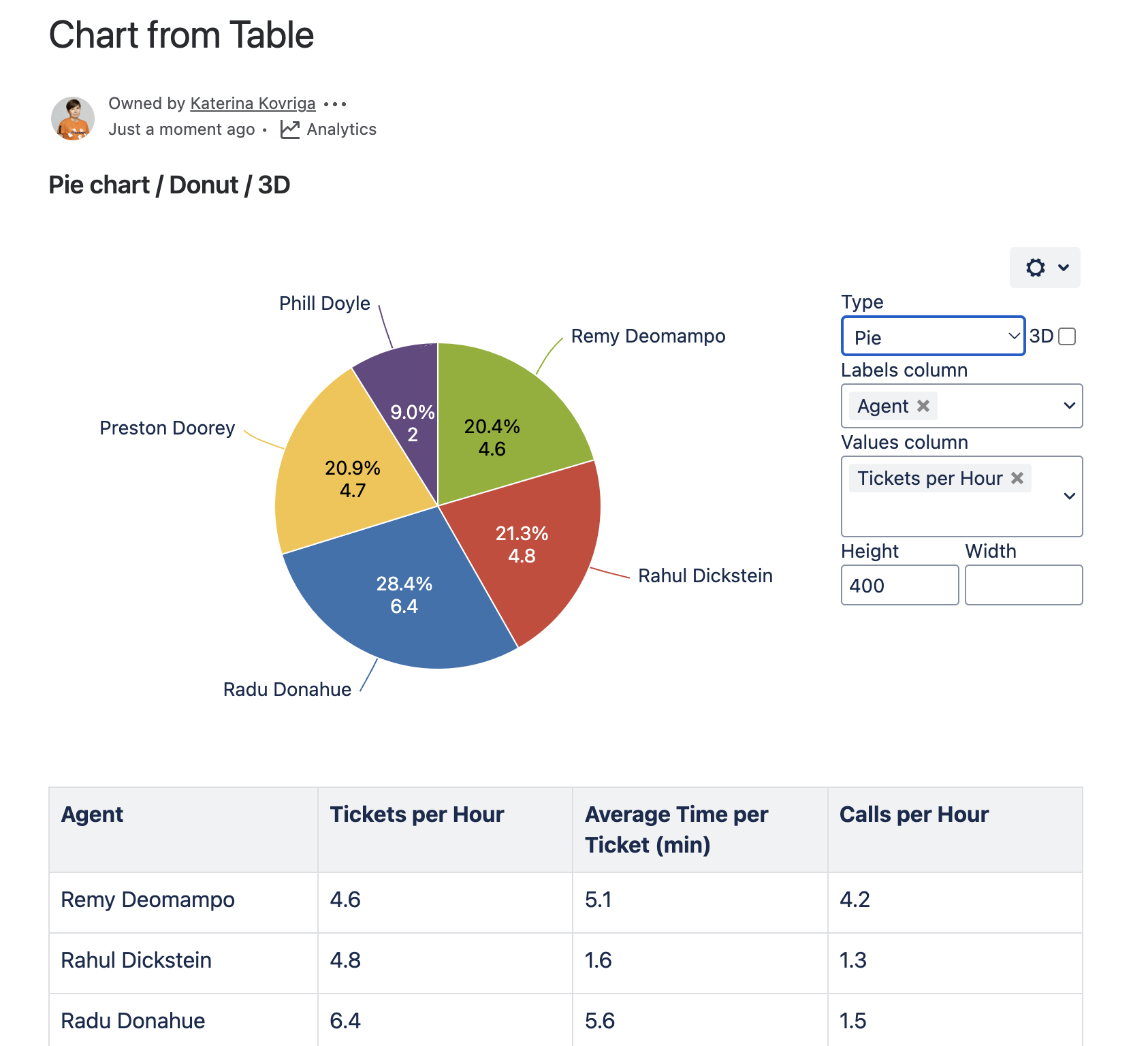
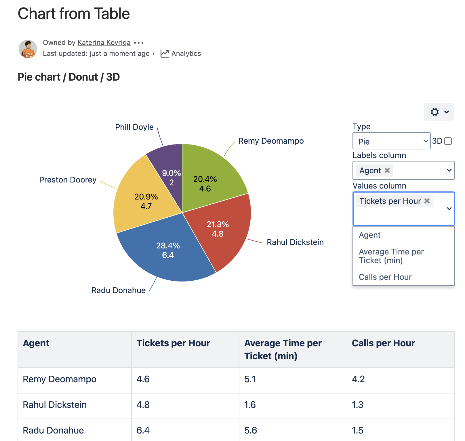
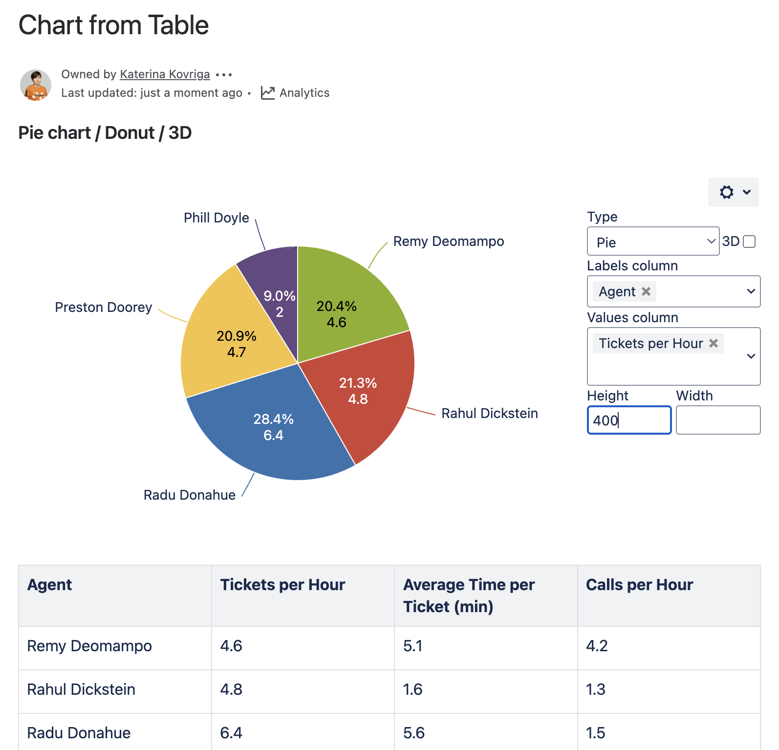
Rendered Chart
Parameters in Macro Browser
| Type | Pie / Donut |
|---|---|
| Labels column | Agent |
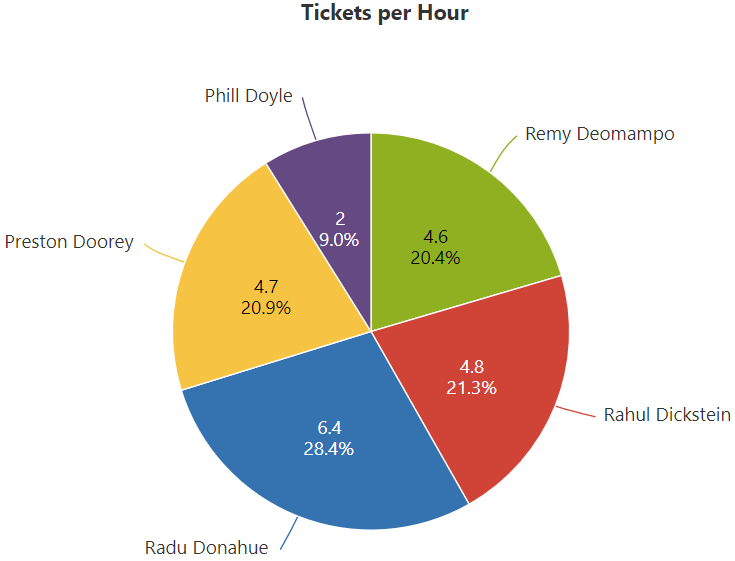
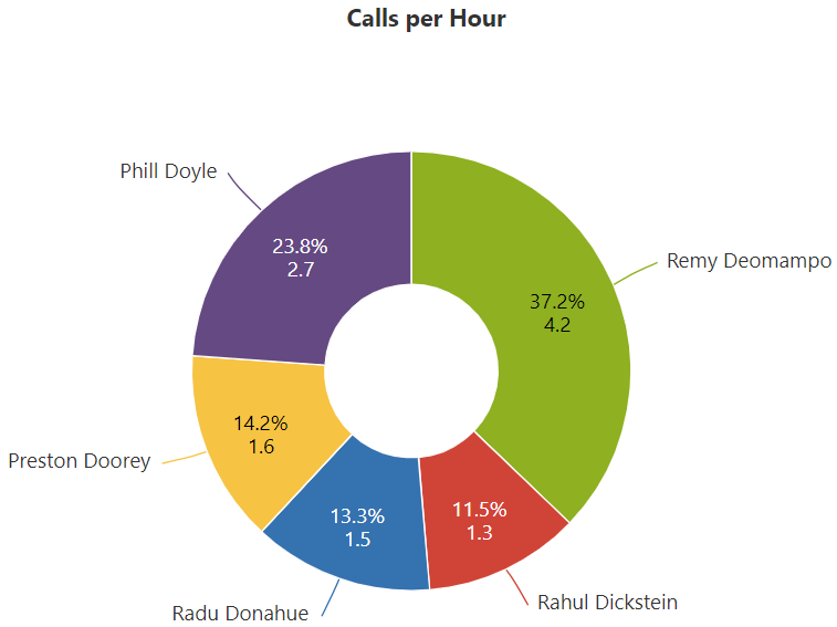
| Values column | Tickets per Hour / Calls per hour |
Data Table in Macro Placeholder
| Agent | Tickets per Hour | Average Time per Ticket (min) | Calls per Hour |
|---|---|---|---|
| Remy Deomampo | 4.6 | 5.1 | 4.2 |
| Rahul Dickstein | 4.8 | 1.6 | 1.3 |
| Radu Donahue | 6.4 | 5.6 | 1.5 |
| Preston Doorey | 4.7 | 1.3 | 1.6 |
| Phill Doyle | 2.0 | 3.4 | 2.7 |
Settings Tab
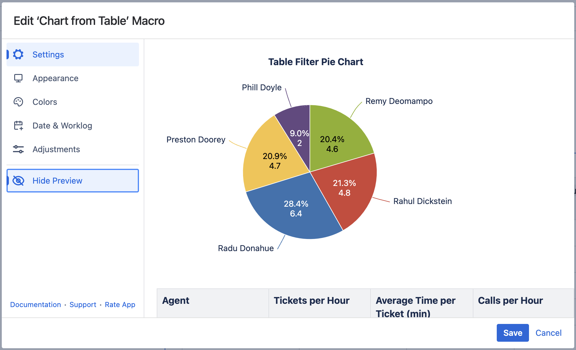
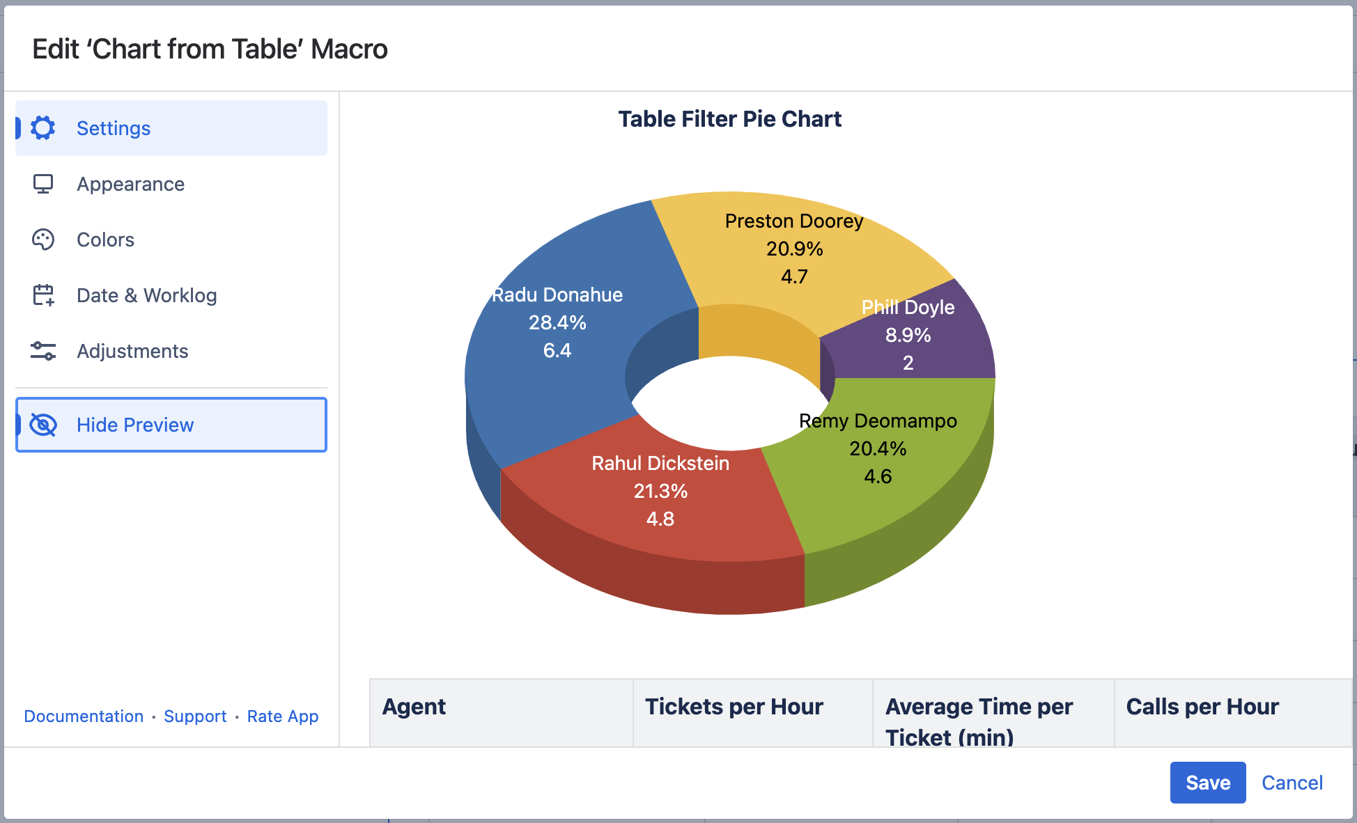
Select the chart type
To select the chart type in the page view mode:
- Insert the Chart from Table macro.
- Hover over the chart controls on the right of the table.
- Locate the Type option and select the chart type. The chart will be automatically regenerated.
- To save the modifications in the macro body, click the cogwheel icon and select Save changes.
To select the chart type in the macro browser:
- Switch the page to the edit mode.
- Insert the Chart from Table macro and paste the table within the macro body.
- Select the macro and click Edit.
- Locate the Type option in the Settings tab and select the chart type.
- Save the macro and the page.

Select data series
Labels column - the column containing labels for data values.
Values column - the column or columns containing numerical values for chart generation.
To select data series in the page view mode:
- Insert the Chart from Table macro.
- Hover over the chart controls on the right of the table.
- Locate the Labels column and Values column options and select the table columns containing data for chart generation. The chart will be automatically regenerated.
- To save the modifications in the macro body, click the cogwheel icon and select Save changes.
To select data series in the macro browser:
- Switch the page to the edit mode.
- Insert the Chart from Table macro and paste the table within the macro body.
- Select the macro and click Edit.
- Locate the Labels column and Values column options in the Settings tab and select the table columns containing data for chart generation.
- Save the macro and the page.

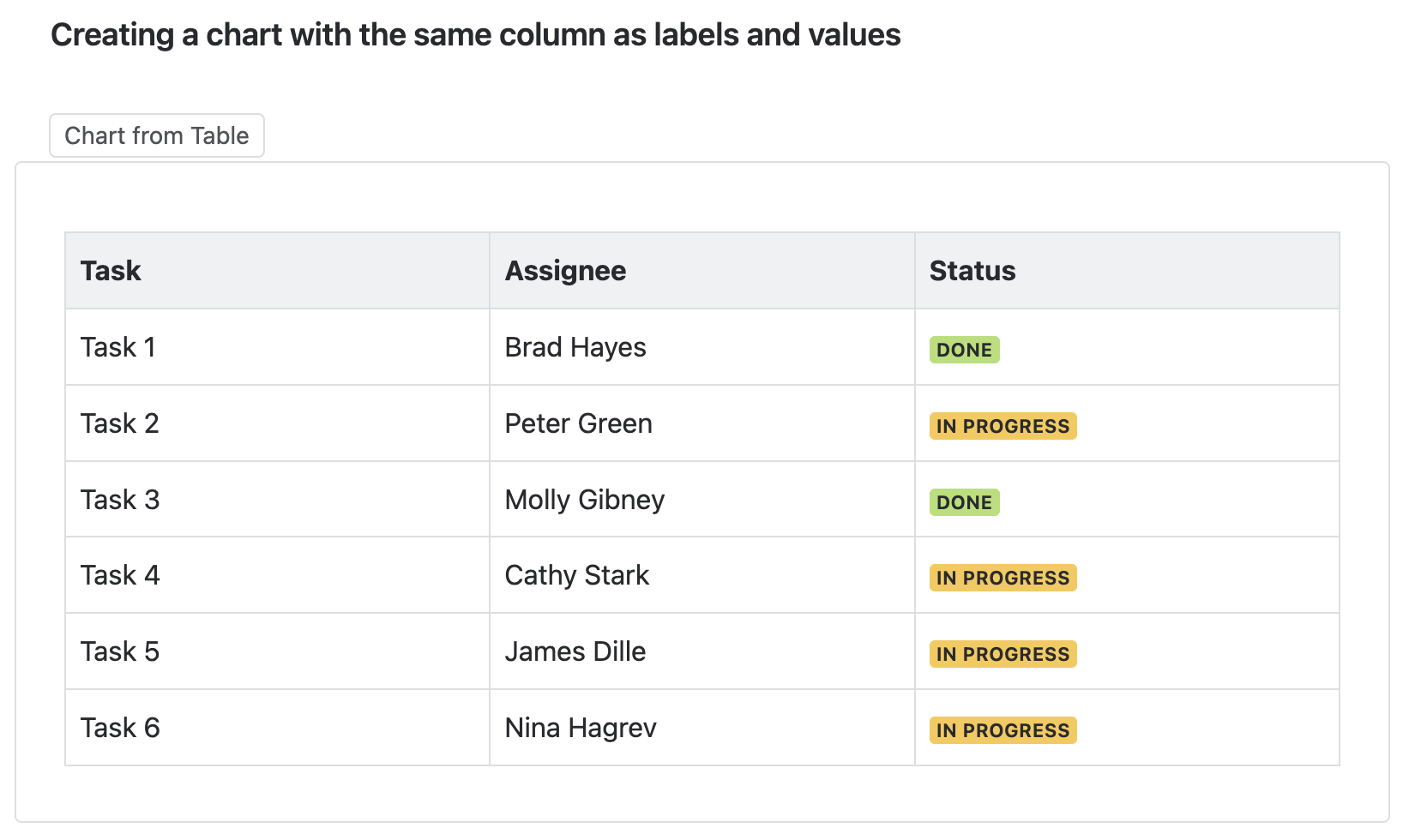
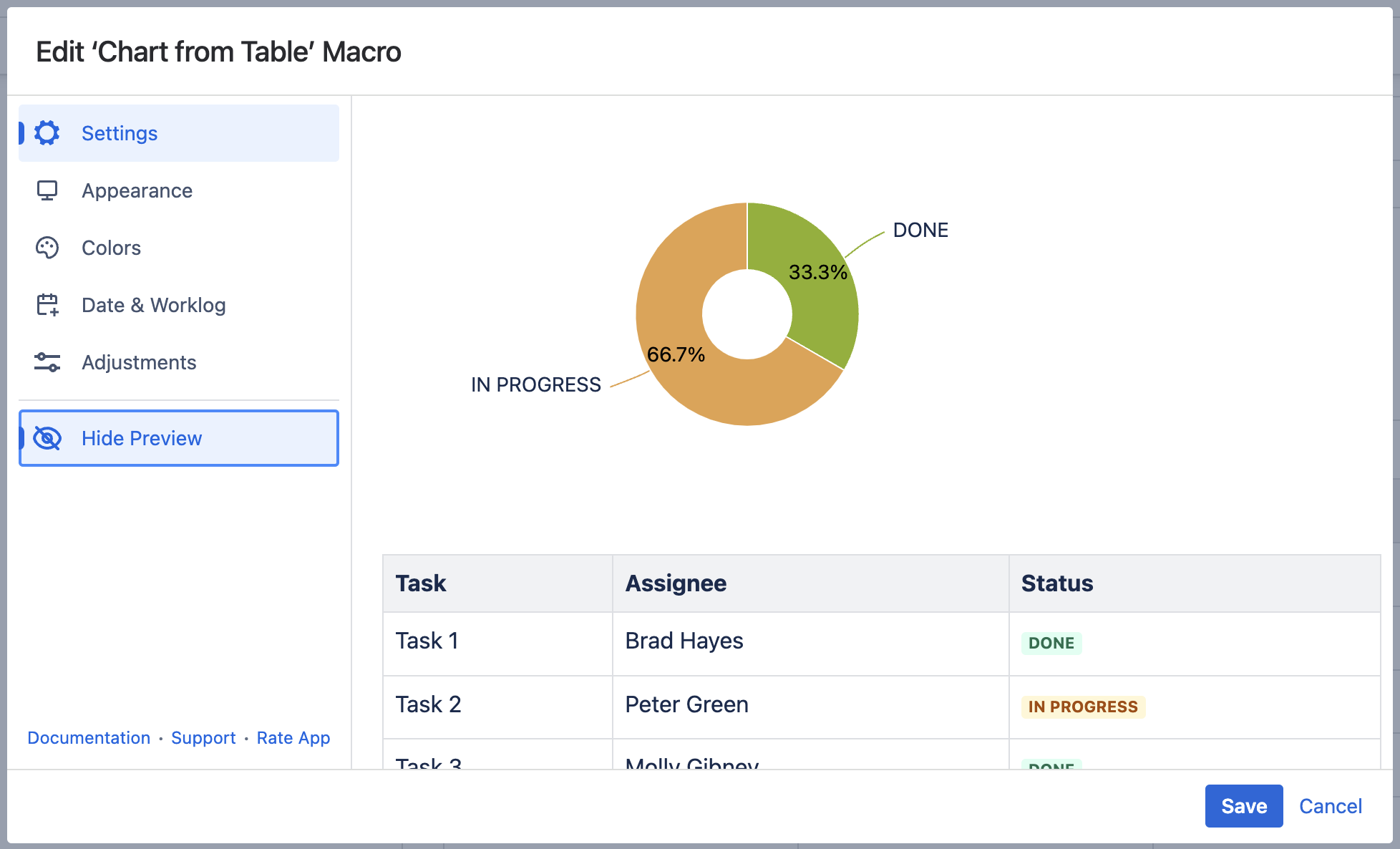
Create a chart with the same column as labels and values (an example of a use case)
Use case:
You need to visualize a distribution of categories or values within a whole list that is a table column.
Solution:
- Wrap the table in the Chart from Table macro.
- Choose the Pie/Donut chart type.
- Set the same column as the Values column and the Labels column.
- Save the macro and the page.

Adjustments Tab
Set the decimal separator
- Switch the page to the edit mode.
- Select the macro and click Edit.
- Switch to the Adjustments tab.
- Locate the Decimal separator option.
- Specify the correct decimal separator for numeric values in the source table (point or comma).
- Save the macro and the page.
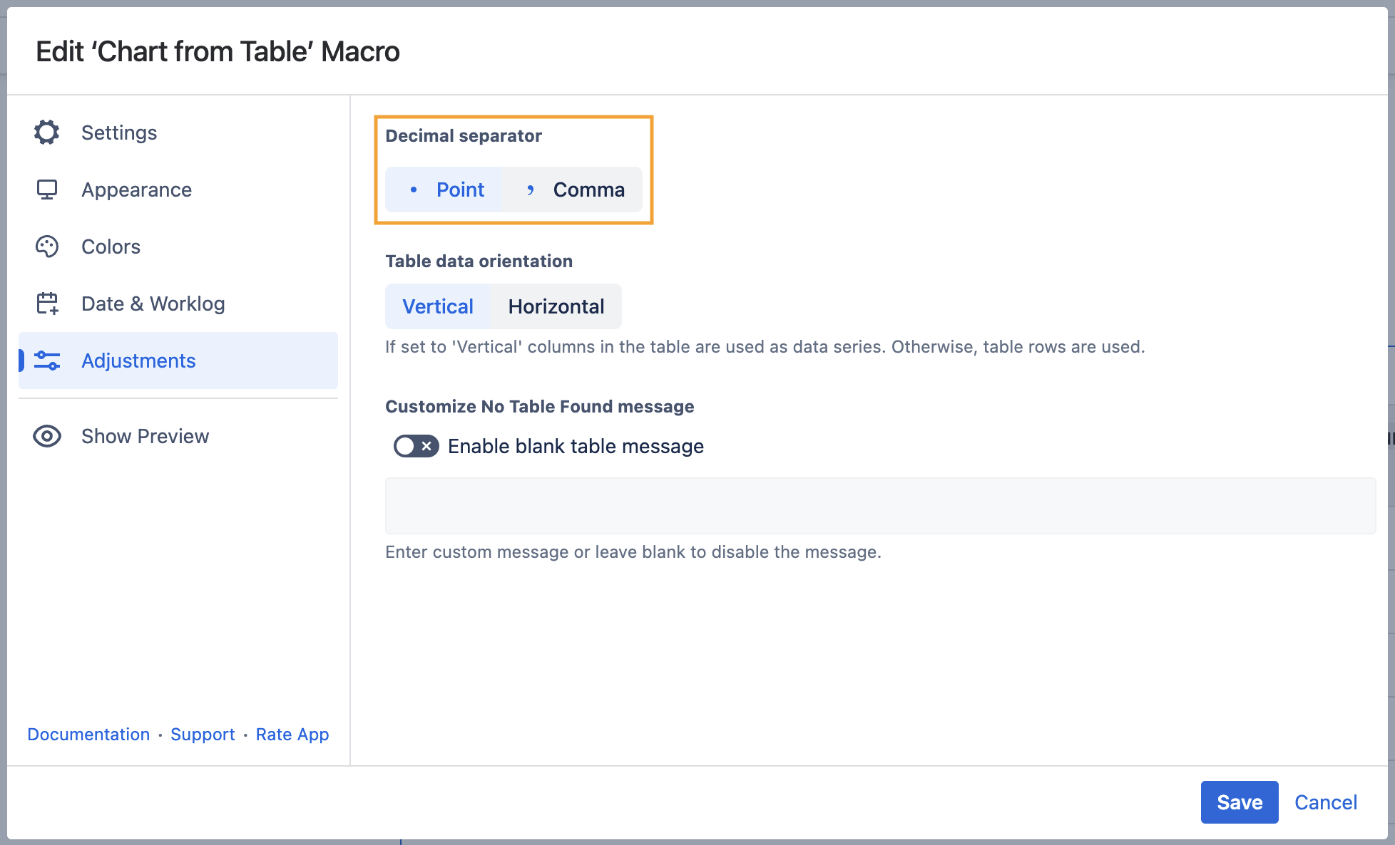
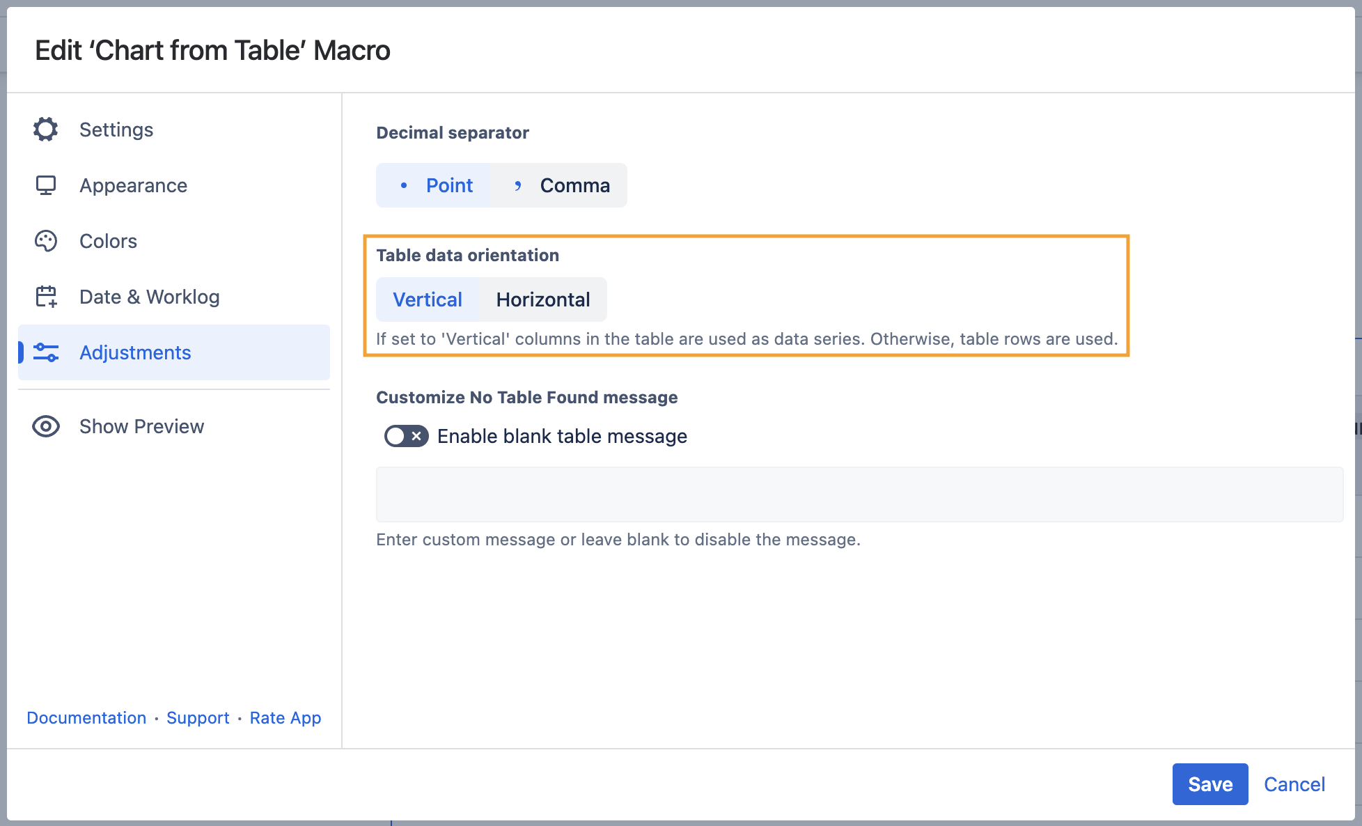
Set the table data orientation
- Switch the page to the edit mode.
- Select the macro and click Edit.
- Switch to the Adjustments tab.
- Locate the Table data orientation option.
- Select the Vertical or Horizontal option.
- Save the macro and the page.
Date & Worklog Tab
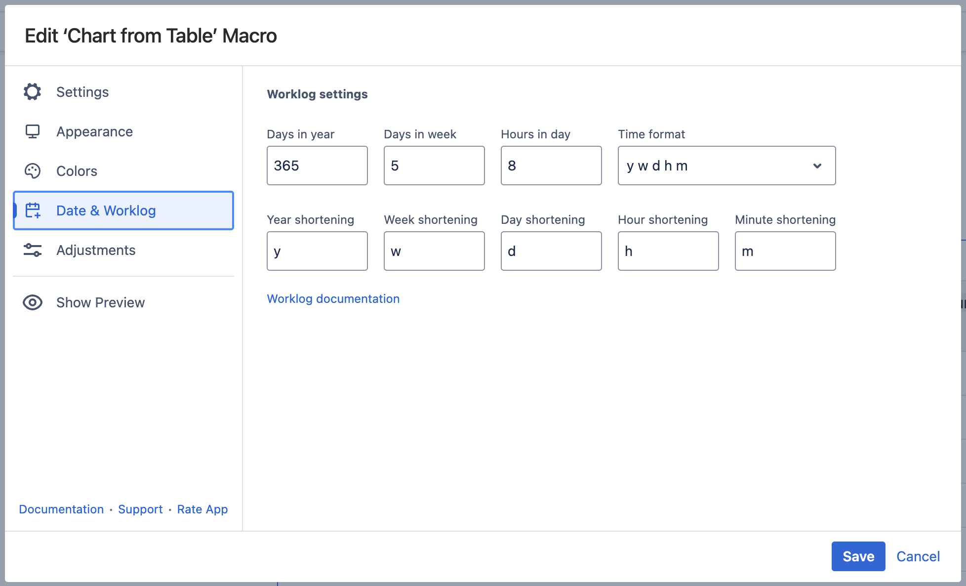
Set the worklog settings
- Switch the page to the edit mode.
- Select the macro and click Edit .
- Switch to the Date & Worklog tab.
- Locate the Worklog settings option.
- Define the worklog parameters, as follows:
- Days in year - enter the number of days in a year.
- Days in week - enter the number of business days in a week.
- Hours in day - enter the number of working hours in one business day.
- Time format - select the used time format in worklog values.
- Year shortening - enter the shortening for the year time unit if you use any language different from English.
- Week shortening - enter the shortening for the week time unit if you use any language different from English.
- Day shortening - enter the shortening for the day time unit if you use any language different from English.
- Hour shortening - enter the shortening for the hour time unit if you use any language different from English.
- Minute shortening - enter the shortening for the minute time unit if you use any language different from English.
- Save the macro and the page.
Appearance Tab
Set the height and width of the chart
- Switch the page to the edit mode.
- Select the macro and click Edit.
- Switch to the Appearance tab.
- Locate the Height and Width fields.
- Enter the appropriate dimensions of the chart.
Save the macro and the page.
To set the Height and Width of the chart in the page view mode:
- Hover over the chart controls on the right of the table.
- Locate the Height and Width fields.
- Enter the appropriate dimensions of the chart.
- To save the modifications in the macro body, click the cogwheel icon and select Save changes.
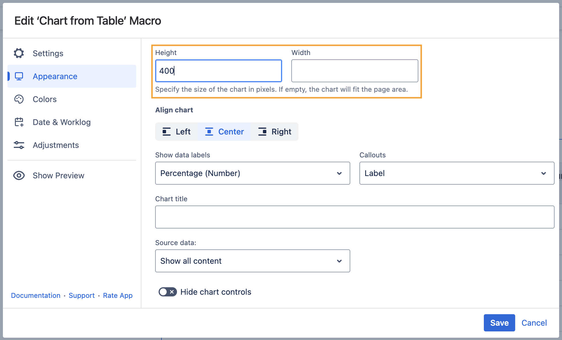
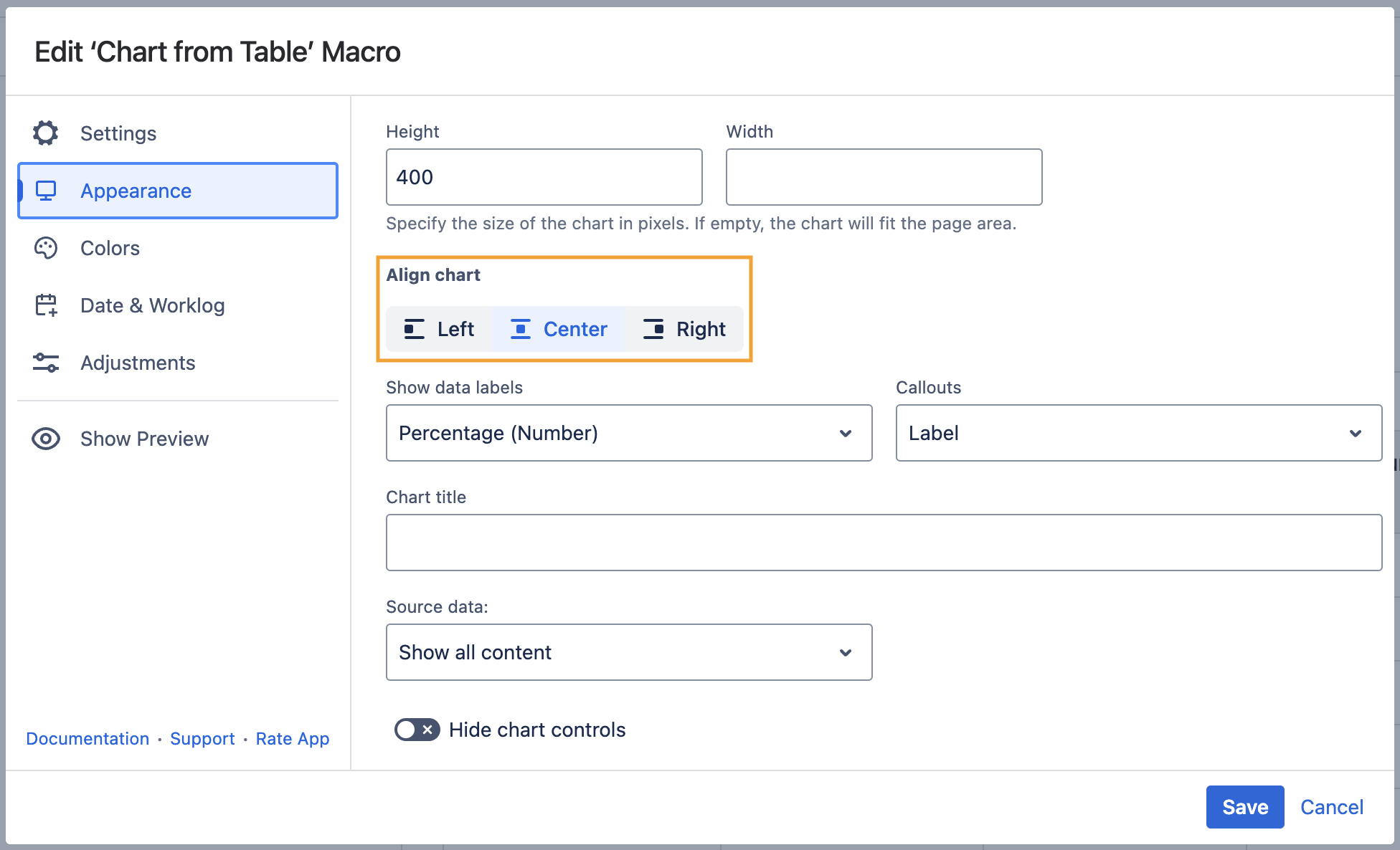
Align chart
- Switch the page to the edit mode.
- Select the macro and click Edit.
- Switch to the Appearance tab.
- Locate the Align chart option.
- Select the appropriate chart alignment, as follows:
- Left
- Center
- Right
- Save the macro and the page.
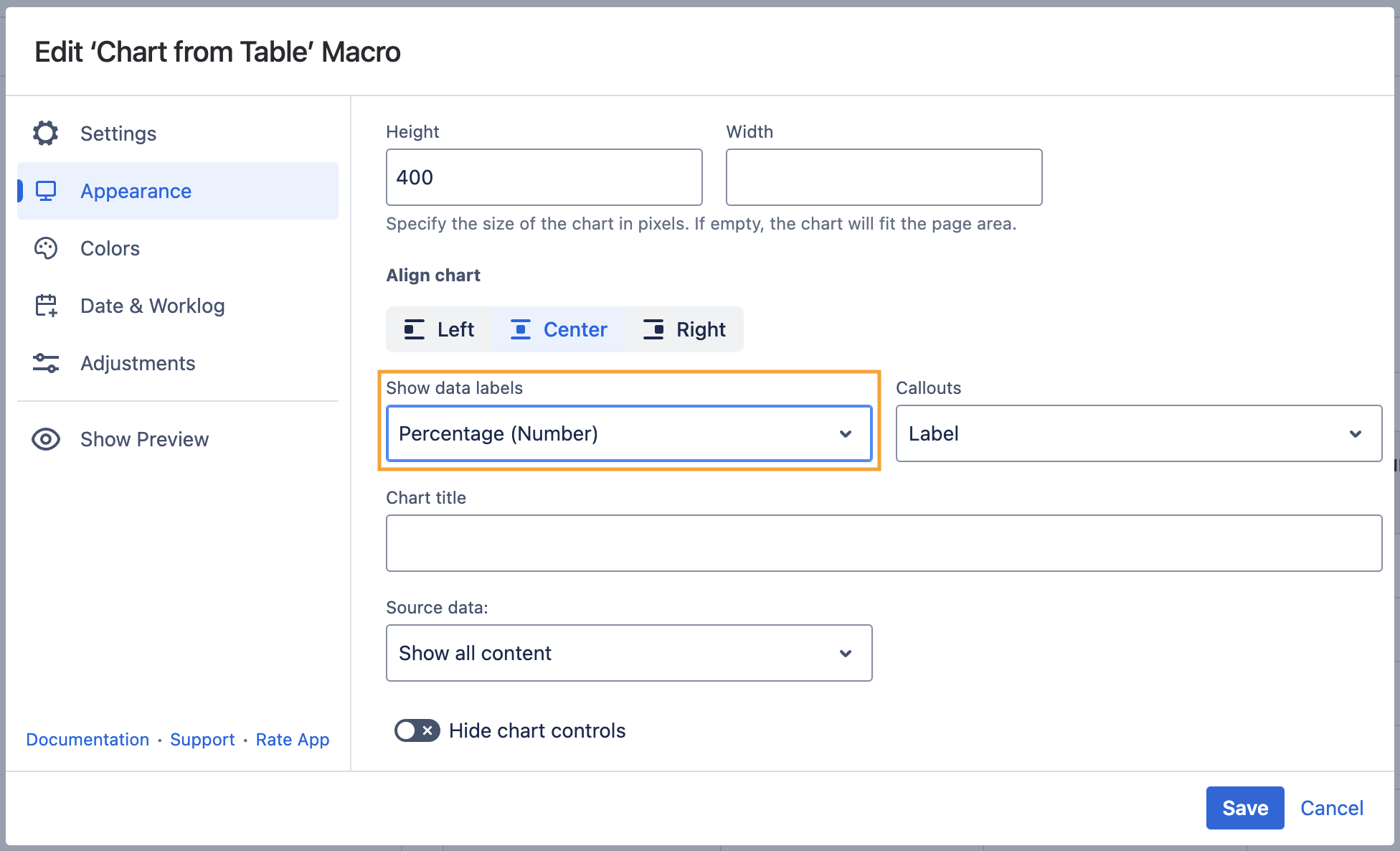
Show data labels
- Switch the page to the edit mode.
- Select the macro and click Edit.
- Switch to the Appearance tab.
- Locate the Show data labels option and select the appropriate option, as follows:
- None
- Value
- Percentage
- Value (Percentage)
- Percentage (Value)
- Save the macro and the page.
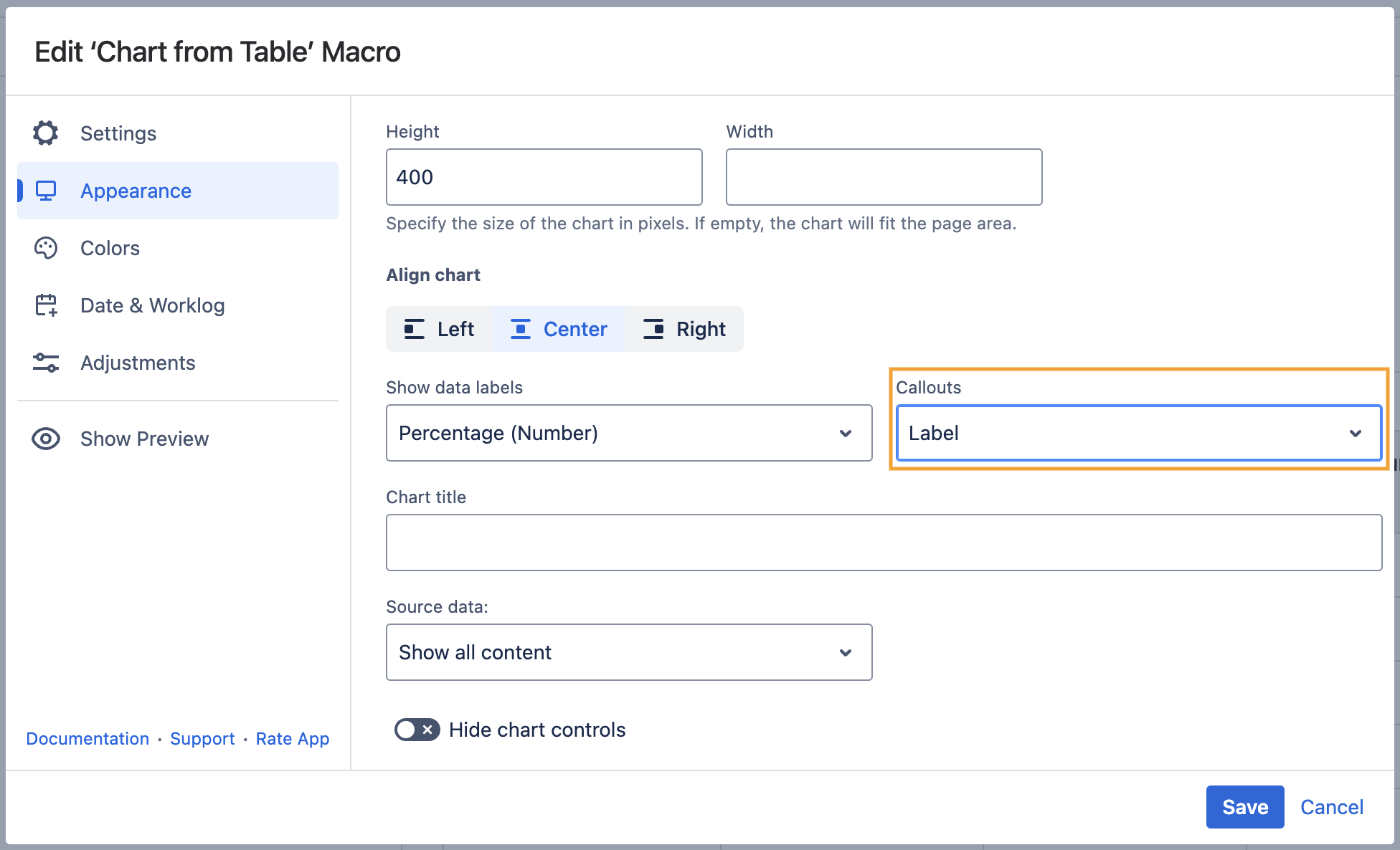
Callouts
- Switch the page to the edit mode.
- Select the macro and click Edit.
- Switch to the Appearance tab.
- Locate the Callouts option and select the appropriate option, as follows:
- None
- Label
- Save the macro and the page.
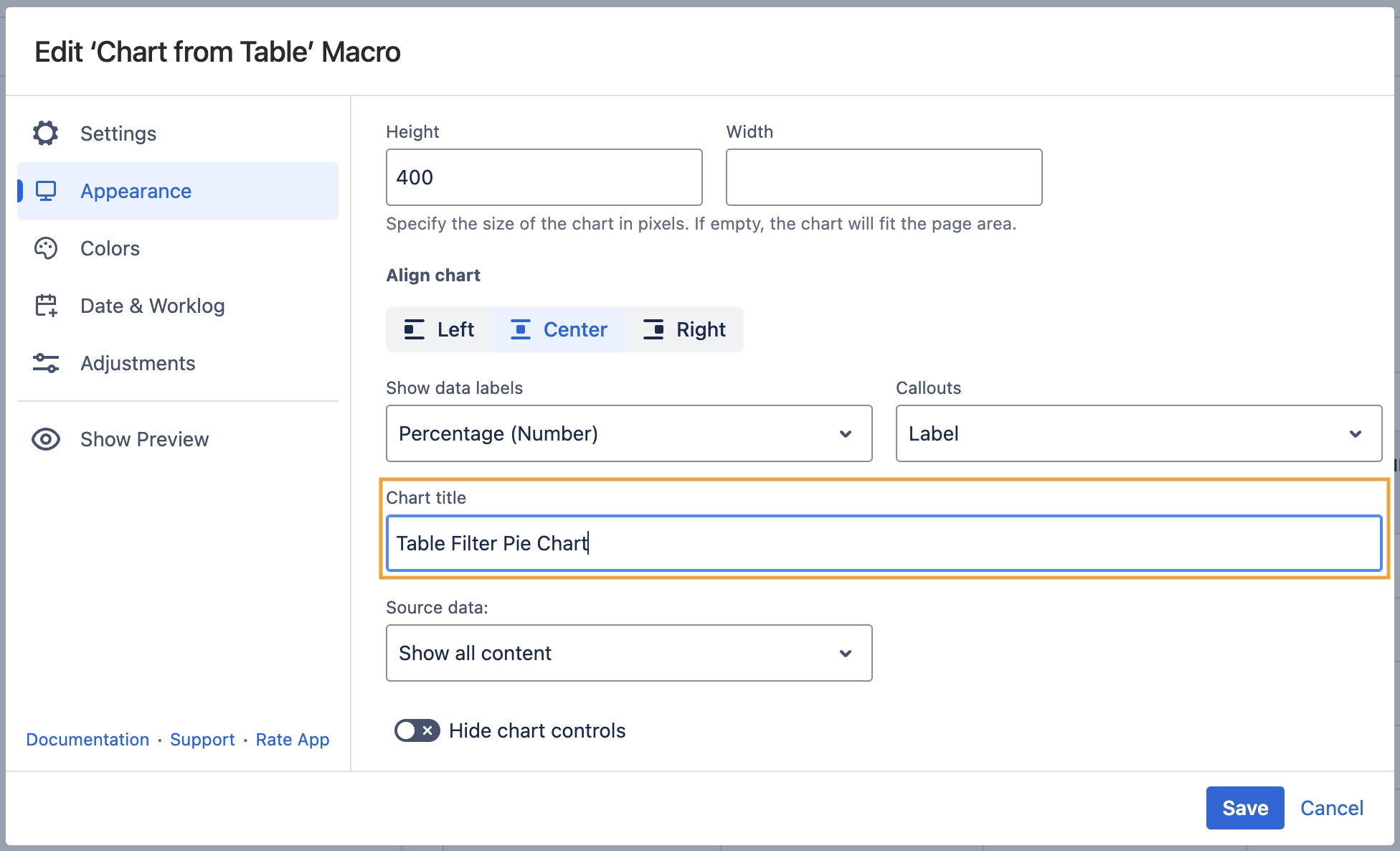
Set the chart title
- Switch the page to the edit mode.
- Select the macro and click Edit.
- Switch to the Appearance tab.
- Locate the Chart title option and enter the title.
- Save the macro and the page.
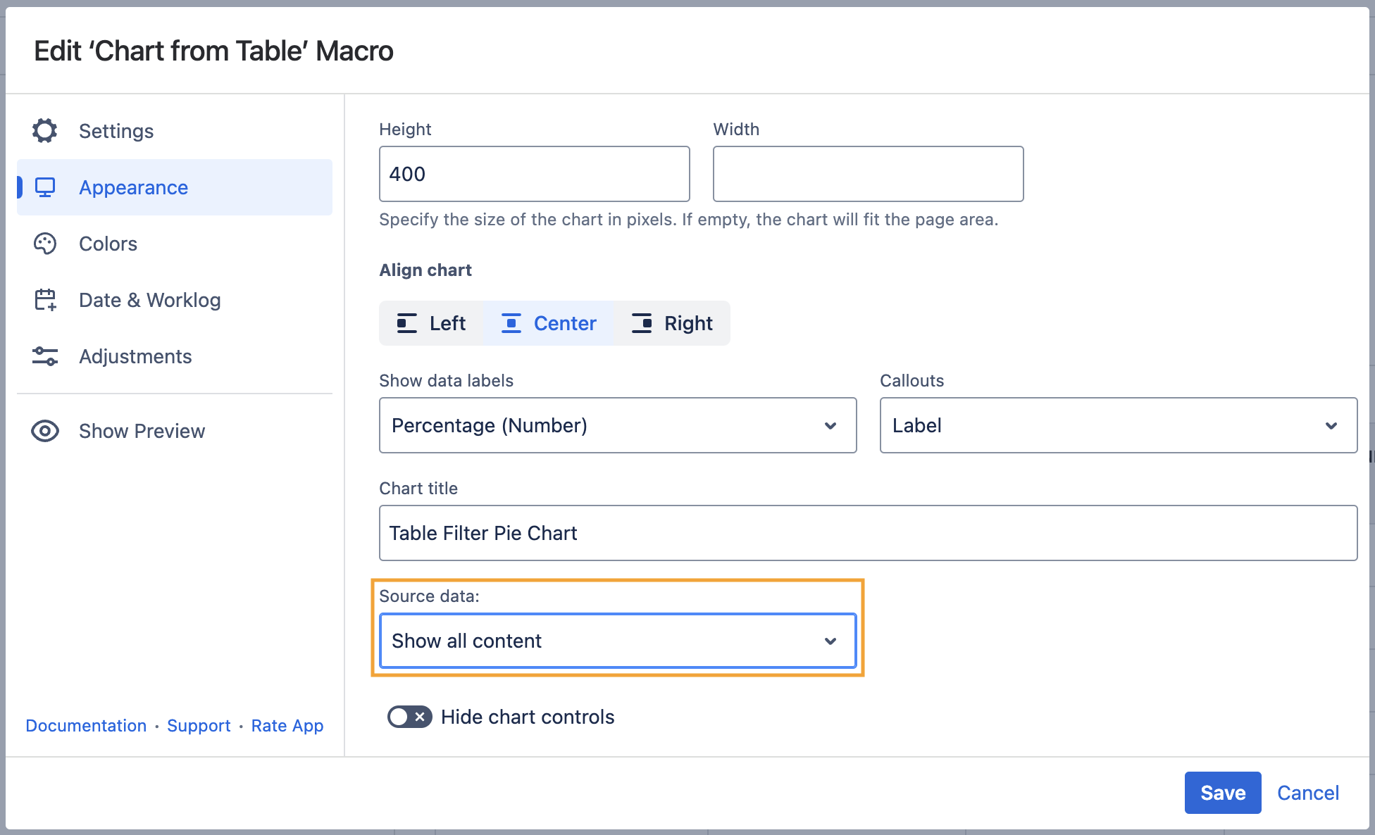
Show/Hide source data
- Switch the page to the edit mode.
- Select the macro and click Edit.
- Switch to the Appearance tab.
- Locate the Source data option and select the appropriate option, as follows:
- Show all content
- Hide tables
- Hide all content
- Save the macro and the page.
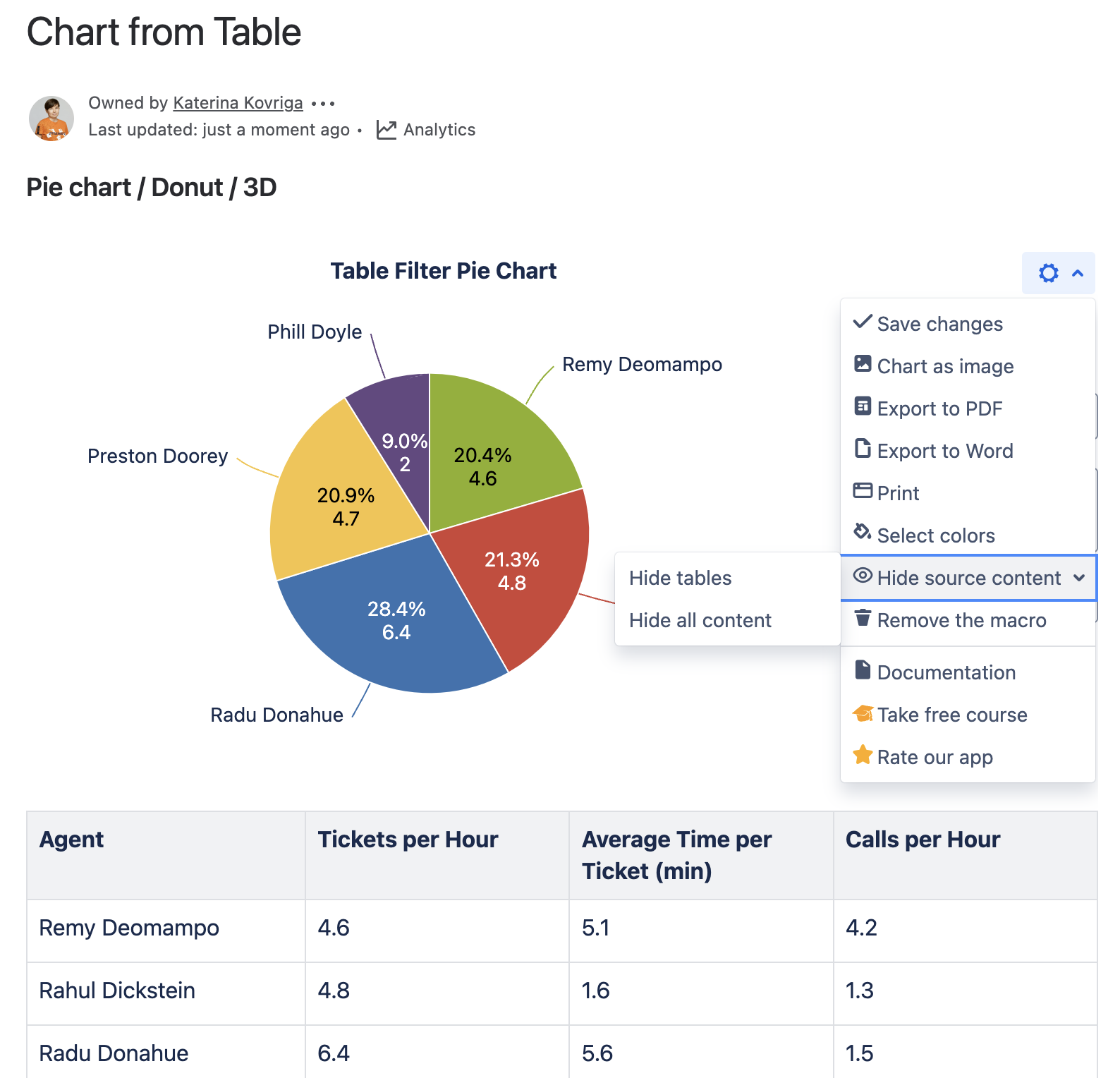
To show/hide source data in the page view mode:
- Hover over the chart controls on the right of the table.
- Click the cogwheel icon, select the Show source content, Hide source content (Hide tables, Hide all content) option.
- To save the modifications in the macro body, click the cogwheel icon and select Save changes.
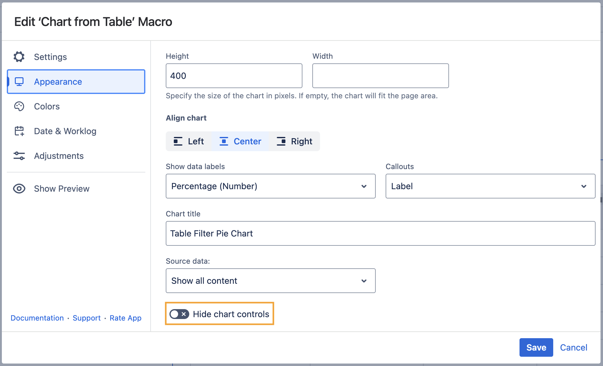
Hide chart controls
- Switch the page to the edit mode.
- Select the macro and click Edit.
- Switch to the Appearance tab.
- Locate and enable the Hide chart controls option.
- Save the macro and the page.
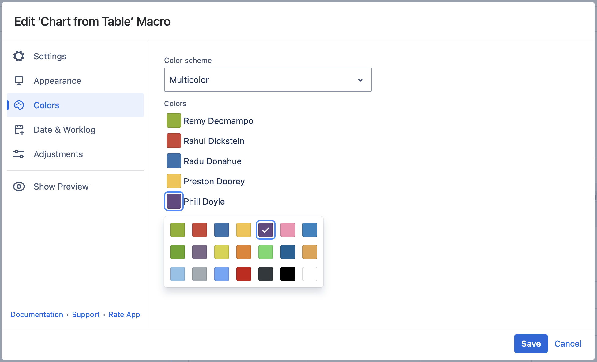
Colors Tab
Set colors
- Switch the page to the edit mode.
- Select the macro and click Edit.
- Switch to the Colors tab.
- Select the appropriate colors for each label.
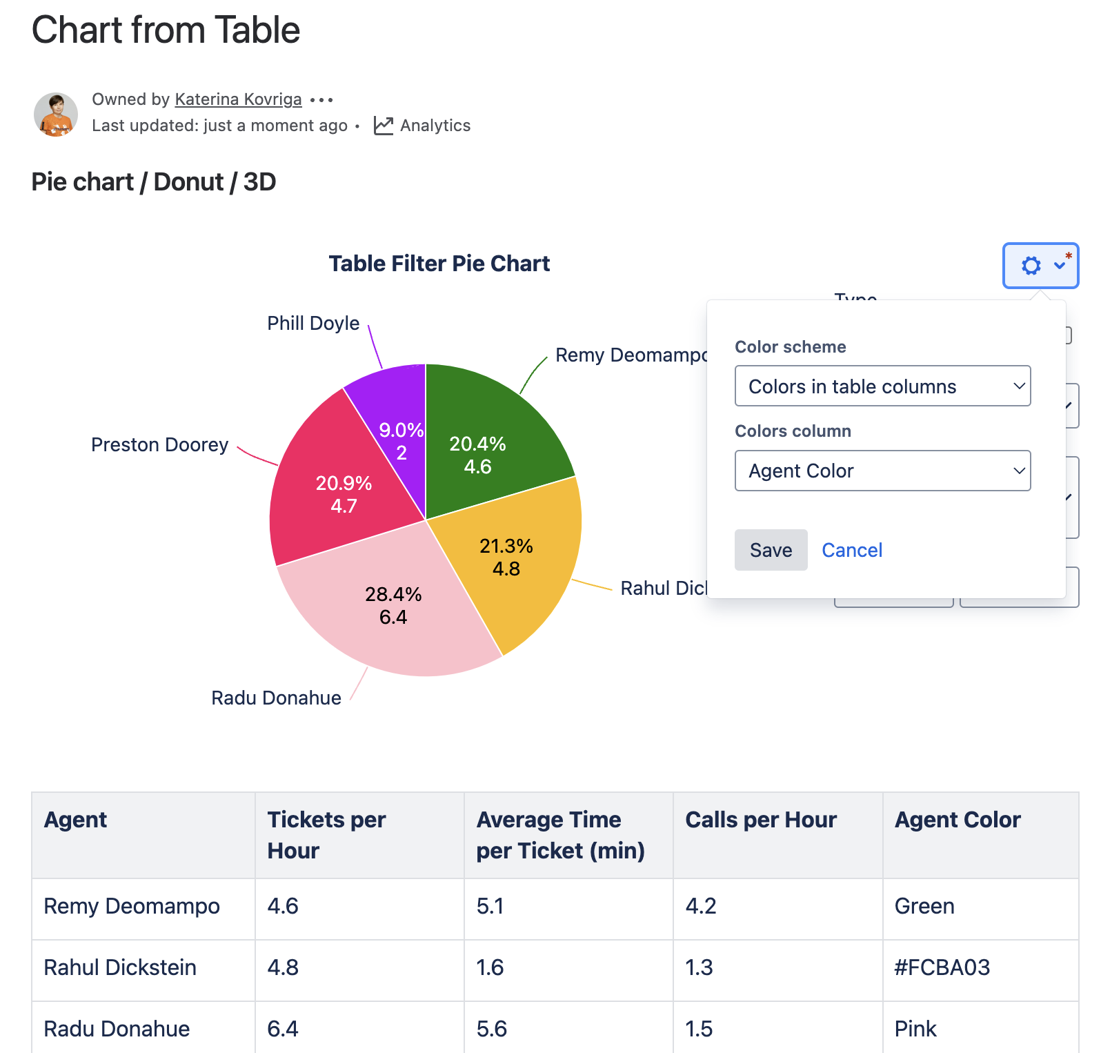
- To set individual column colors, locate the Color scheme option.
- Select the Multicolor or Colors in the table columns option.
- Save the macro and the page.
To set the colors in the page view mode:
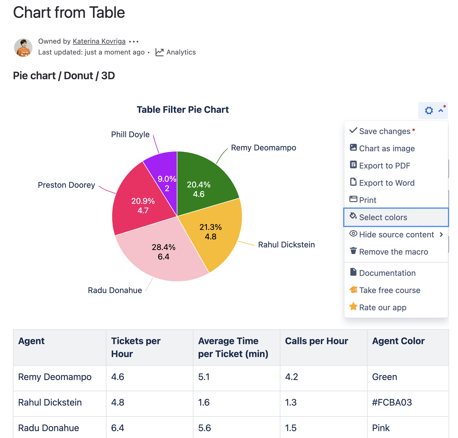
- Hover over the chart controls on the right of the table.
Click the cogwheel icon, locate the Select colors option. Select the Multicolor or Colors in the table columns option. Pick the colors or columns with colors and click Save. The chart will be automatically regenerated.
- To save the modifications in the macro body, click the cogwheel icon and select Save changes.
Preview Option
While working in the edit mode, use the Show/hide preview option to adjust the required settings before saving the macro and publishing the page.


Filter the Source Table
- Select one or more chart columns/sectors/bars.
- Only the related rows of the source table are displayed.
- Deselect all the columns/sectors/bars to display the whole source table.