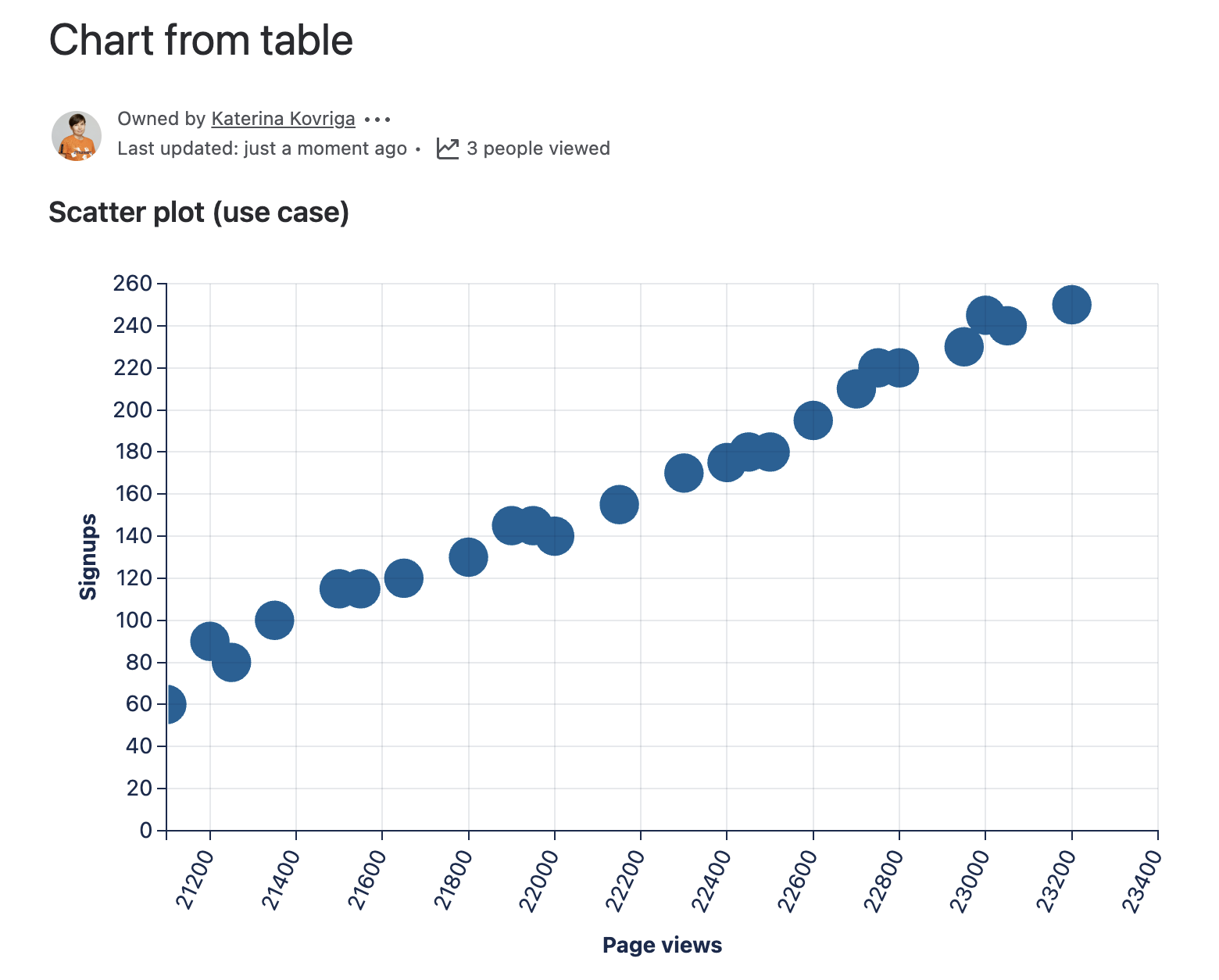
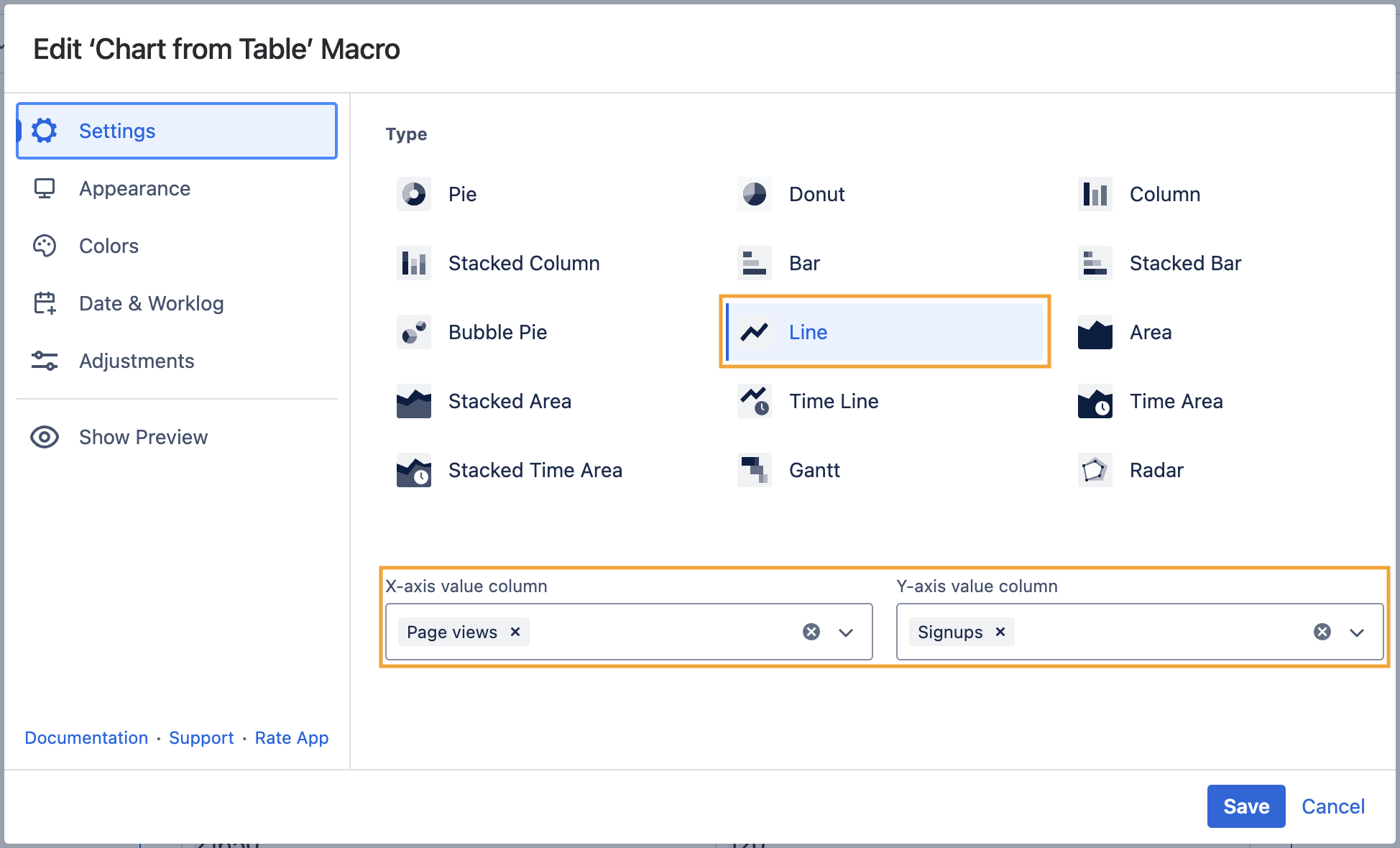
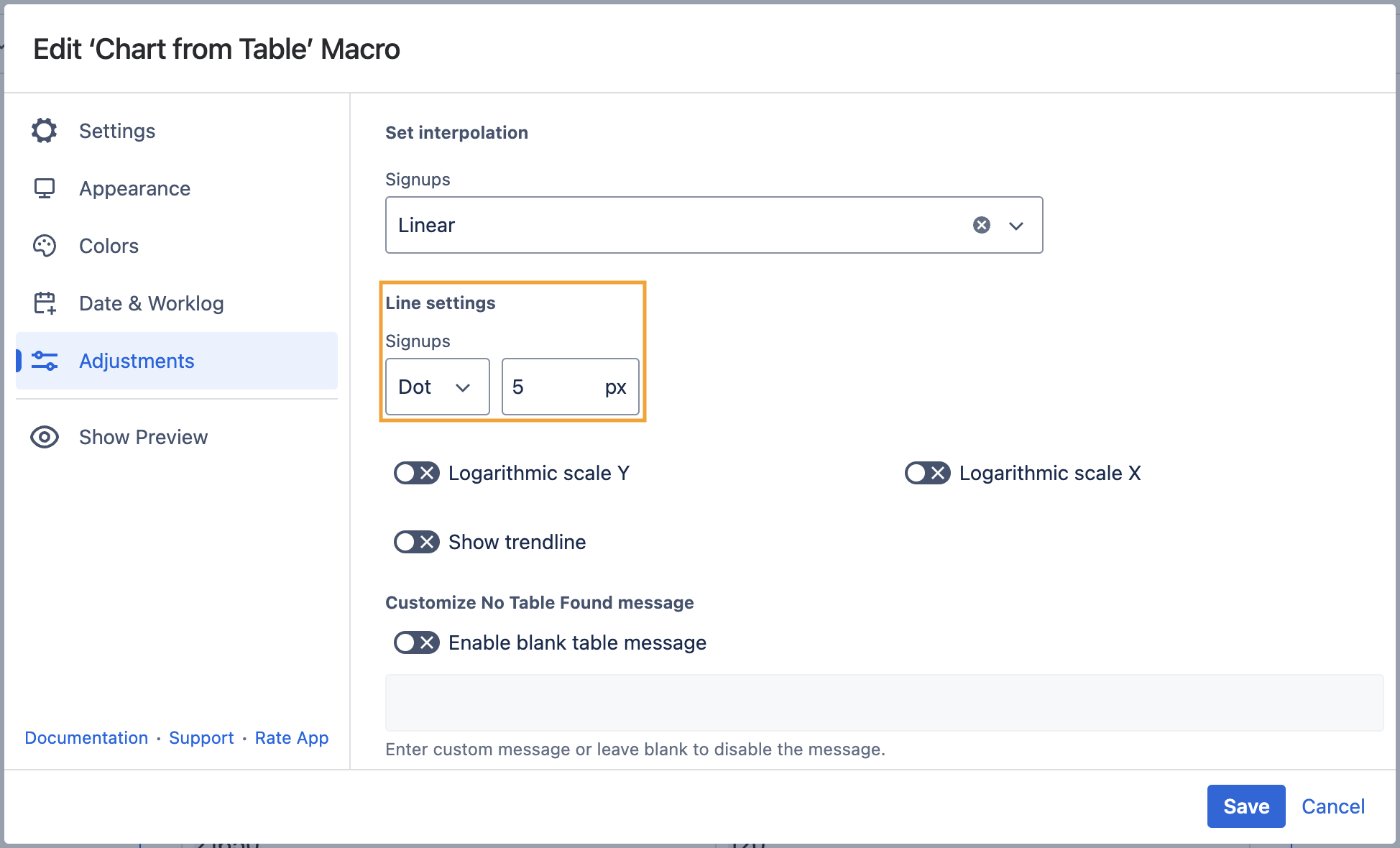
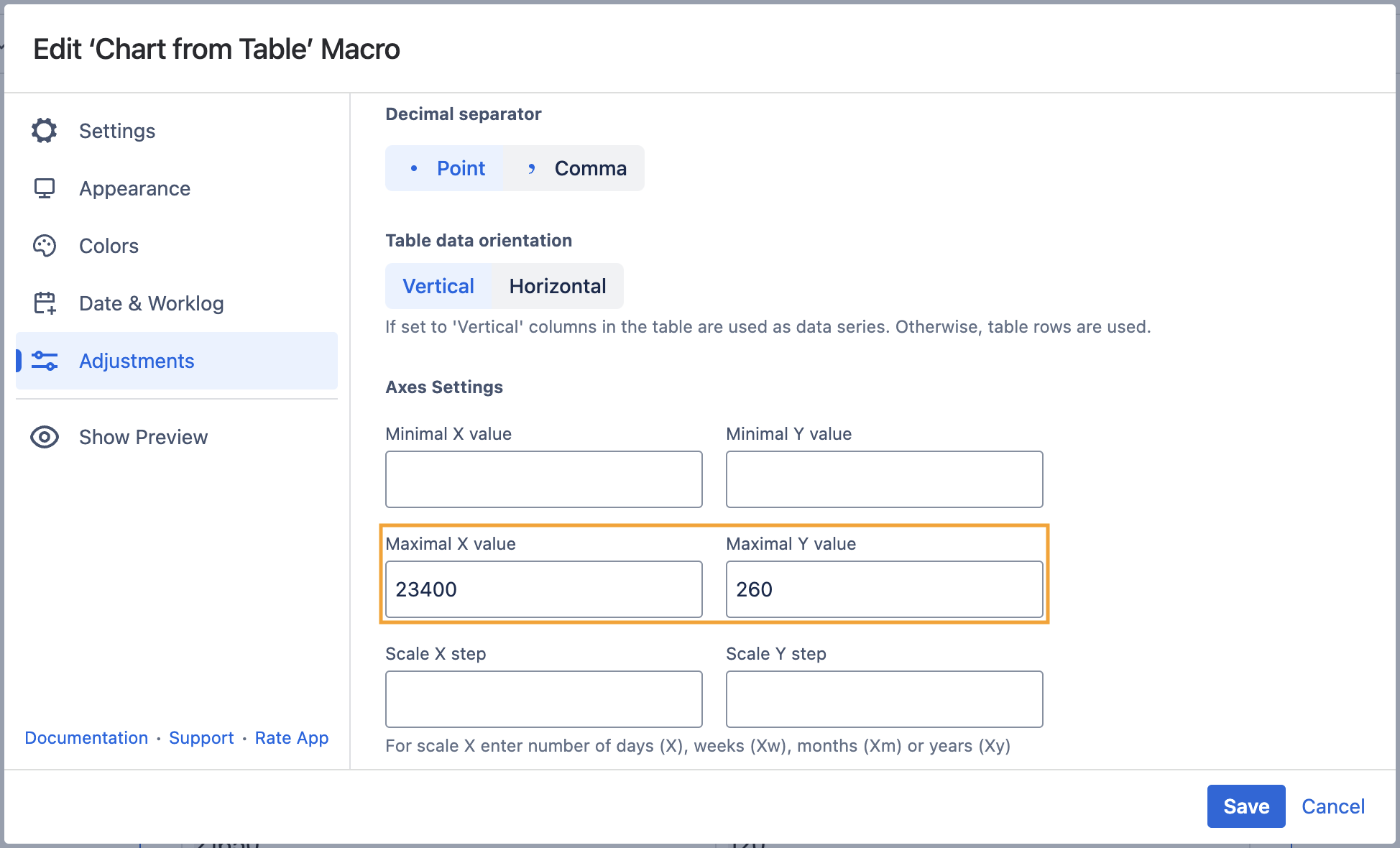
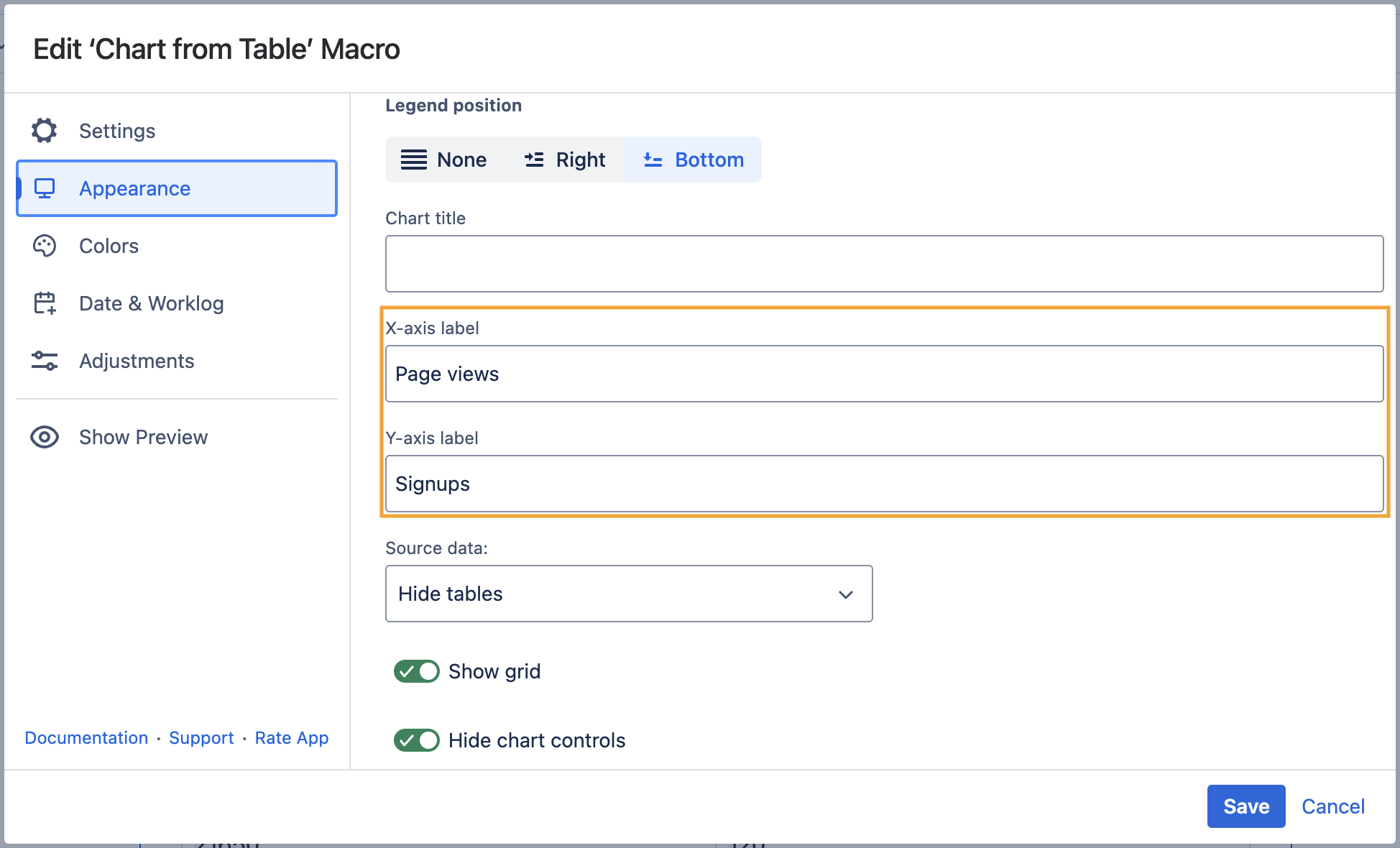
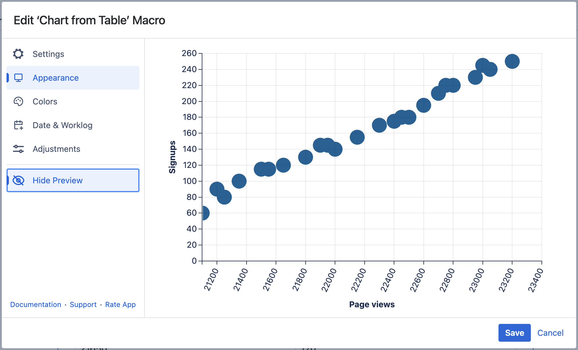
Table Filter, Charts & Spreadsheets for Confluence User guide Chart from Table Current: Scatter plot (use case) PDF Download PDF Download page Scatter plot (use case). Current page All pages Scatter plot (use case) You can build a Scatter plot with the help of the Line chart type and its settings. Use caseThere is a data table with two columns: "Page views" and "Signups". You need to show the relationship between page views and the number of signups of a website on the chart. Source tableYour source table looks like the table below. Page viewsSignups211006021250802135010021200902150011521650120215501152180013021900145220001402195014522150155223001702240017522500180224501802260019522750220227002102280022022950230230502402300024523200250 SolutionWrap the table with the Chart from Table macro.Choose the Line chart type. Set the required X-axis and Y-axis value columns.Switch to the Adjustments tab, locate the Line settings option, choose Dot as a type of the line and specify its size. Set other options if needed. ×