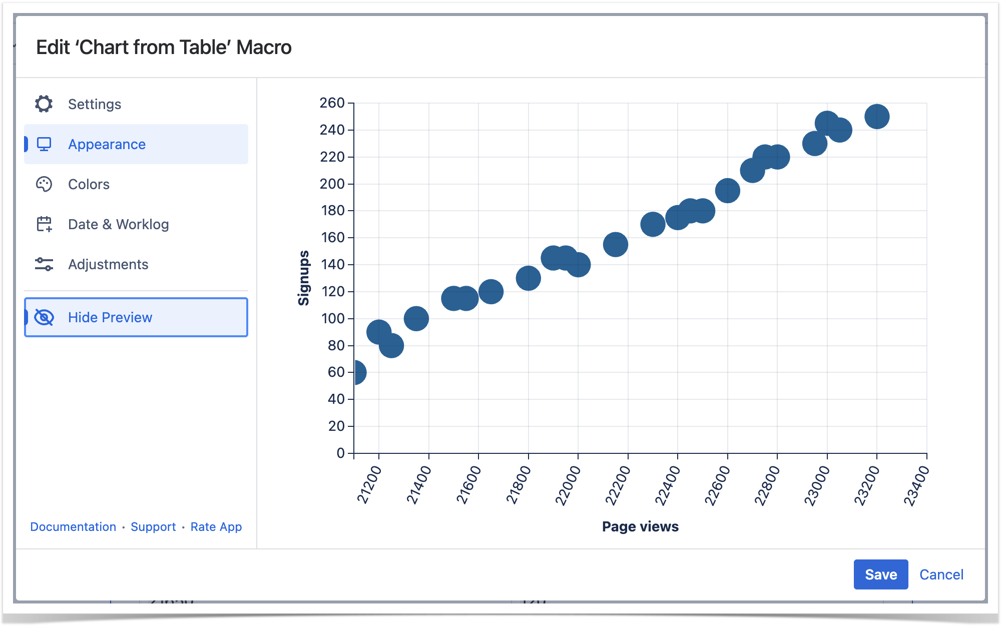
You can build a Scatter plot with the help of the Line chart type and its settings.
Use case
There is a data table with two columns: "Page views" and "Signups".
You need to show the relationship between page views and the number of signups of a website on the chart.
Source table
Your source table looks like the table below.
Page views | Signups |
|---|---|
21100 | 60 |
21250 | 80 |
21350 | 100 |
21200 | 90 |
21500 | 115 |
21650 | 120 |
21550 | 115 |
21800 | 130 |
21900 | 145 |
22000 | 140 |
21950 | 145 |
22150 | 155 |
22300 | 170 |
22400 | 175 |
22500 | 180 |
22450 | 180 |
22600 | 195 |
22750 | 220 |
22700 | 210 |
22800 | 220 |
22950 | 230 |
23050 | 240 |
23000 | 245 |
23200 | 250 |
Solution
- Wrap the table with the Chart from Table macro.
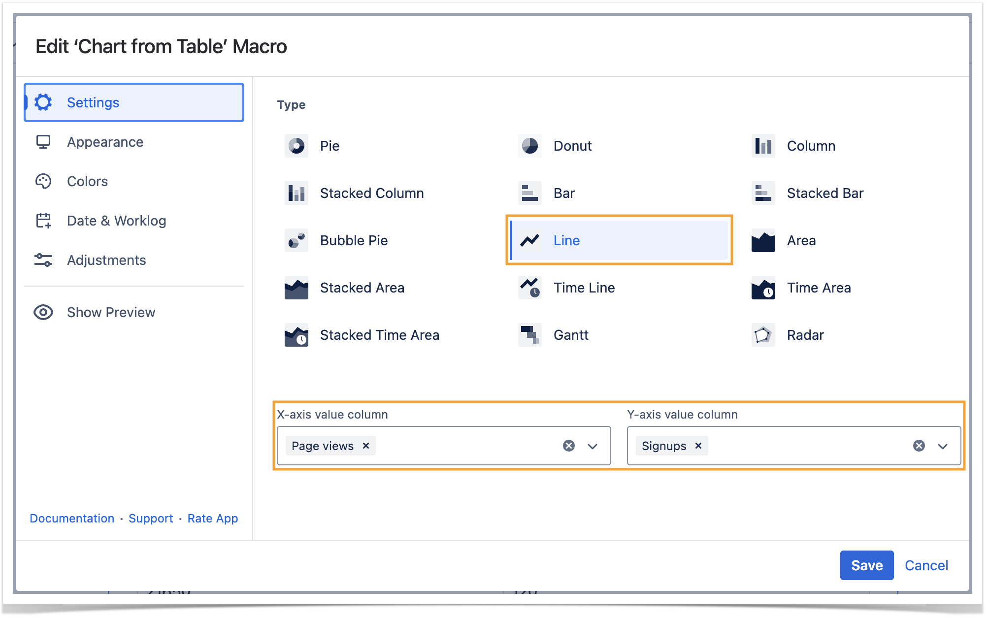
- Choose the Line chart type.
- Set the required X-axis and Y-axis value columns.
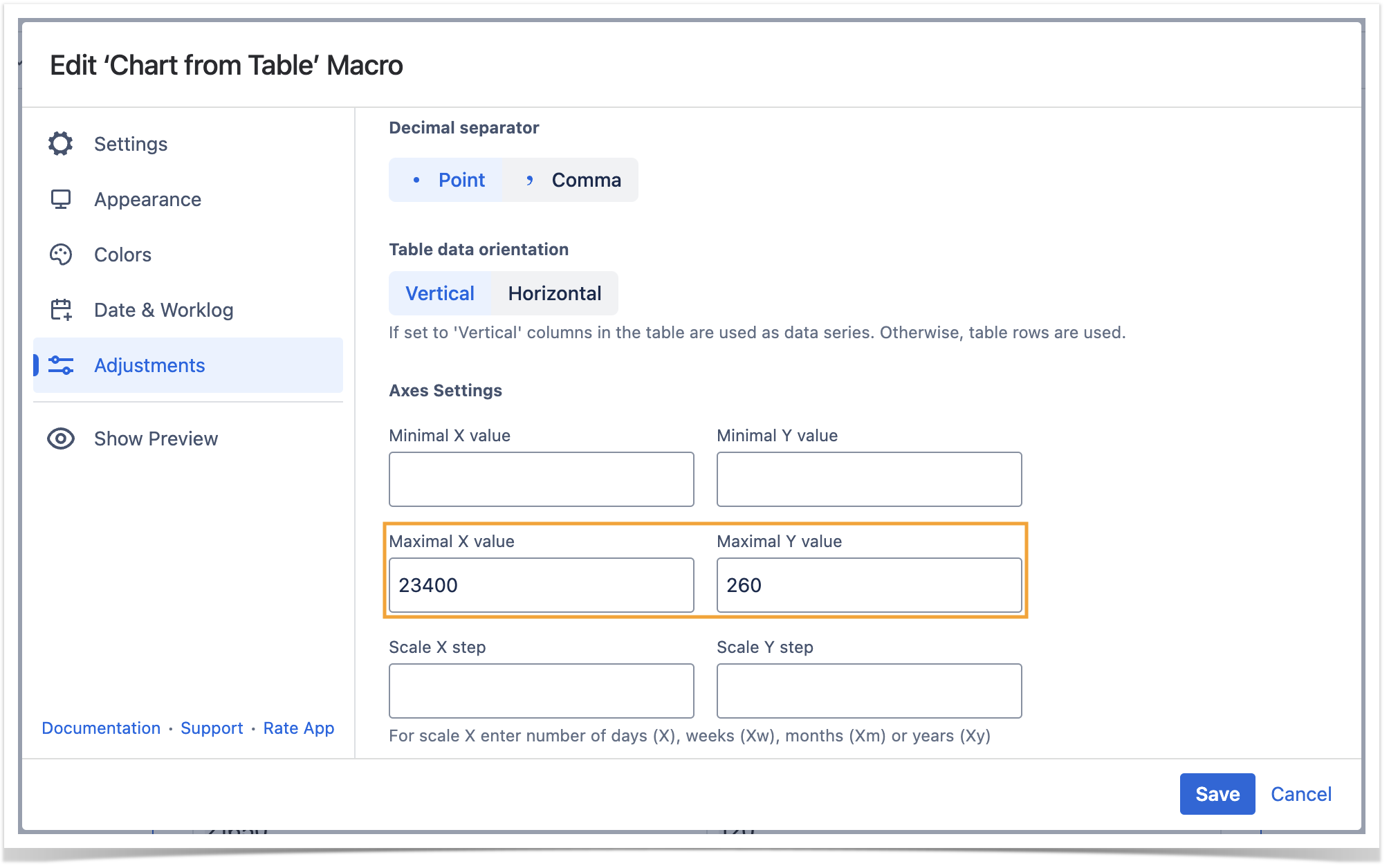
- Switch to the Adjustments tab, locate the Line settings option, choose Dot as a type of the line and specify its size.
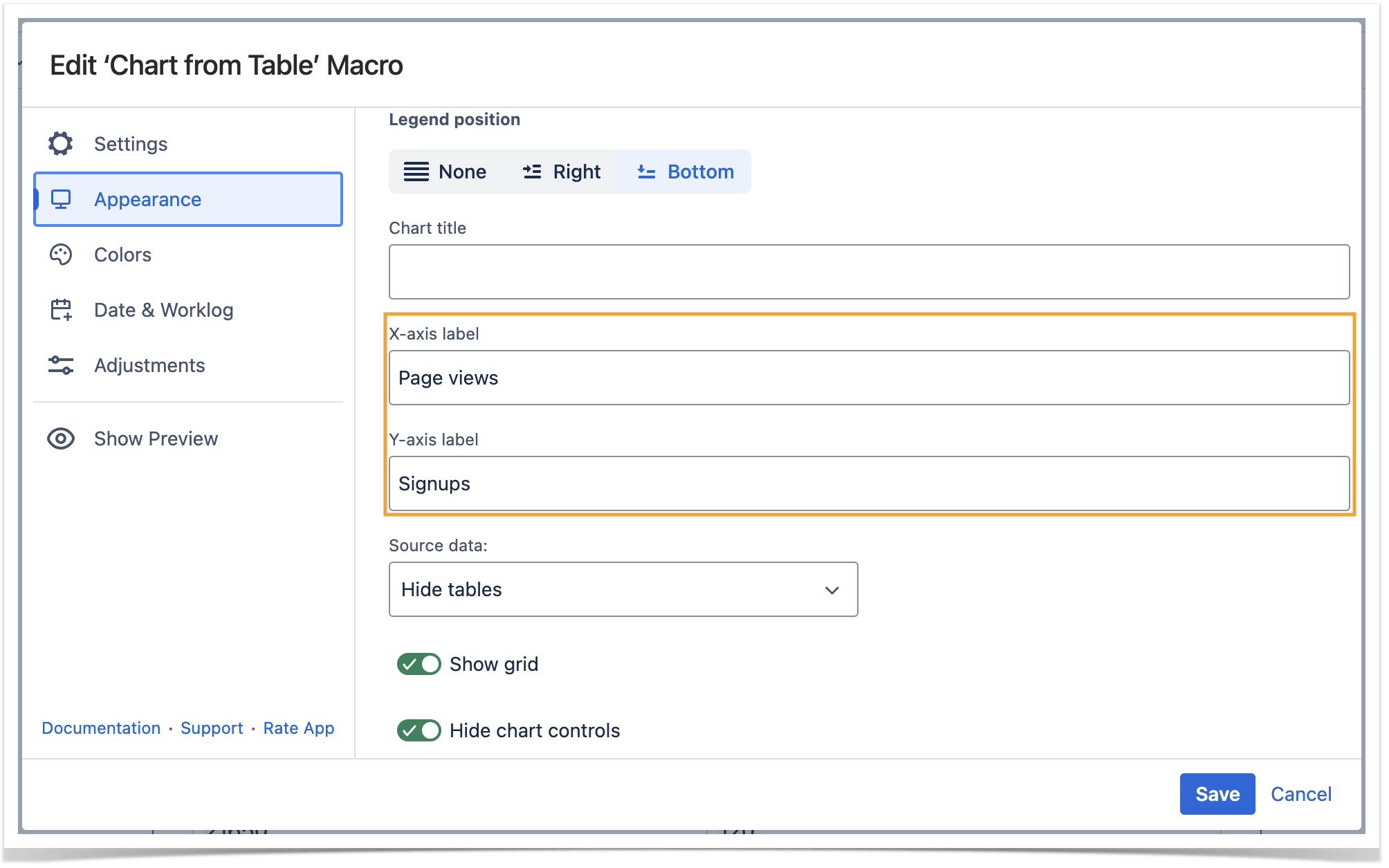
- Set other options if needed.


