| Section | |||||
|---|---|---|---|---|---|
|

Overview
| Section | |||||
|---|---|---|---|---|---|
|
| Column | ||||||||
|---|---|---|---|---|---|---|---|---|
| ||||||||
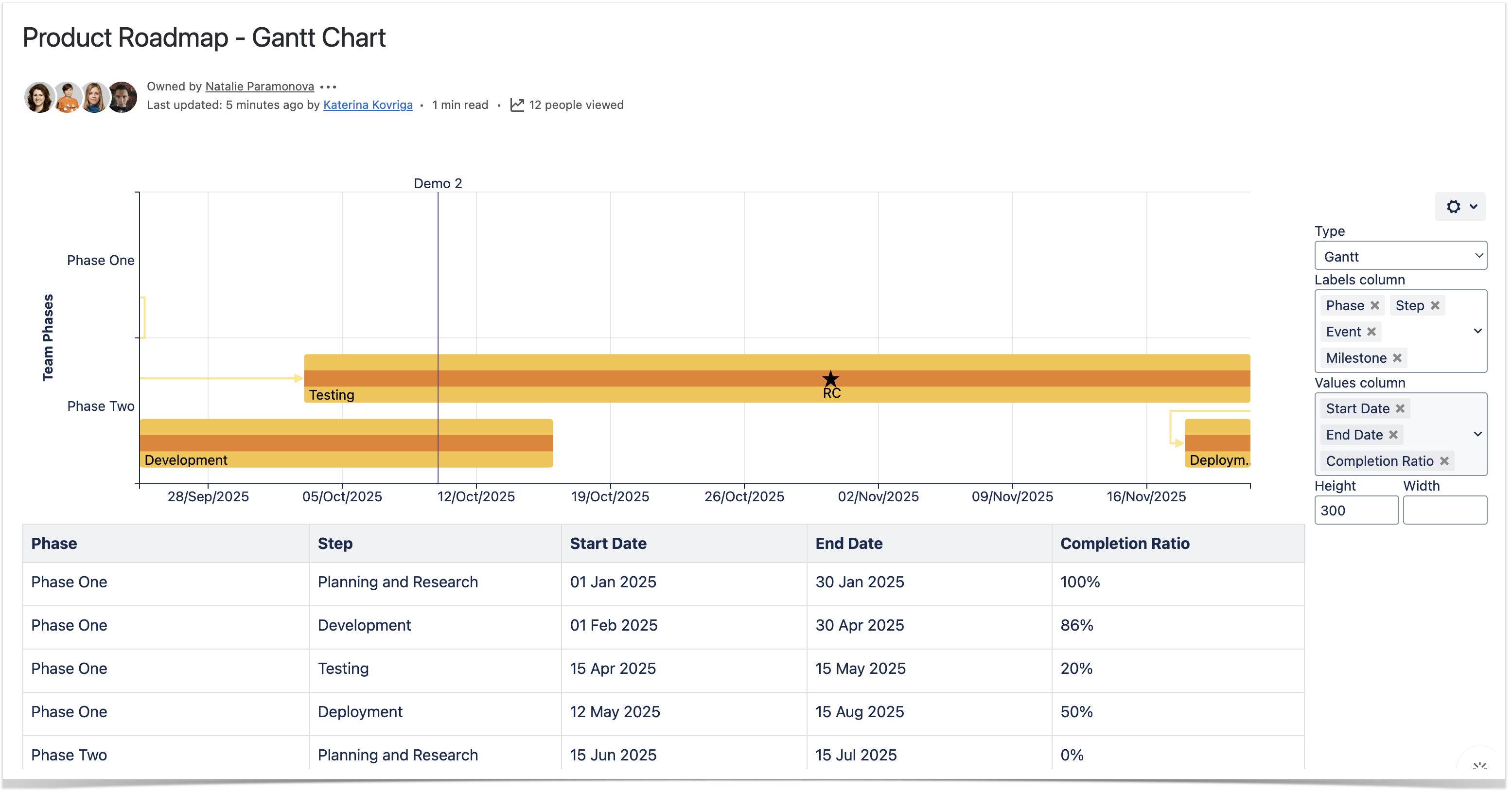
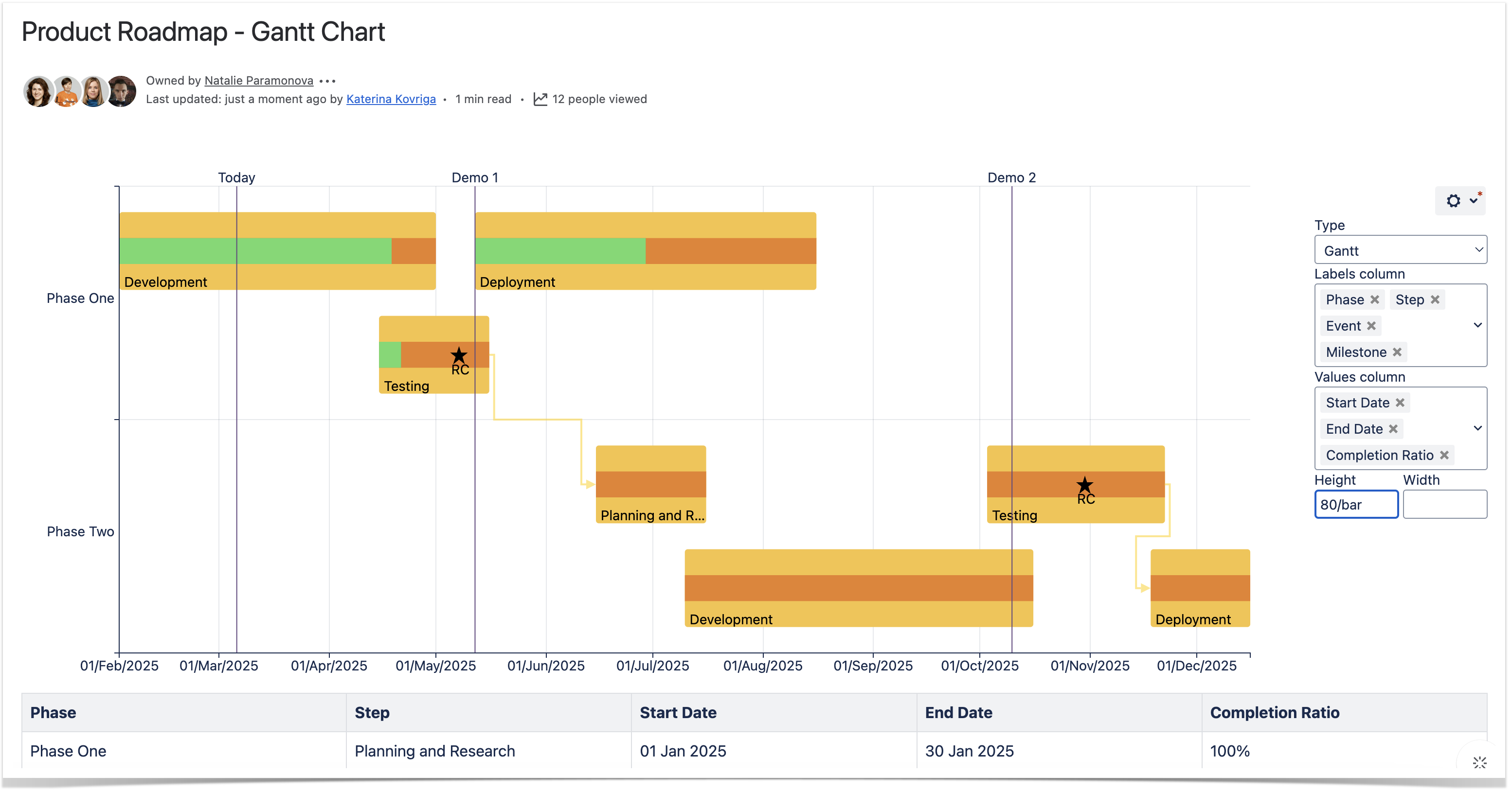
Parameters in Macro Browser
* - Minimum required columns to build the Gantt chart
|
| Column | |||||||||||||||||||||||||||||||||||||||||||||||||||||||||||||||||||||
|---|---|---|---|---|---|---|---|---|---|---|---|---|---|---|---|---|---|---|---|---|---|---|---|---|---|---|---|---|---|---|---|---|---|---|---|---|---|---|---|---|---|---|---|---|---|---|---|---|---|---|---|---|---|---|---|---|---|---|---|---|---|---|---|---|---|---|---|---|---|
| |||||||||||||||||||||||||||||||||||||||||||||||||||||||||||||||||||||
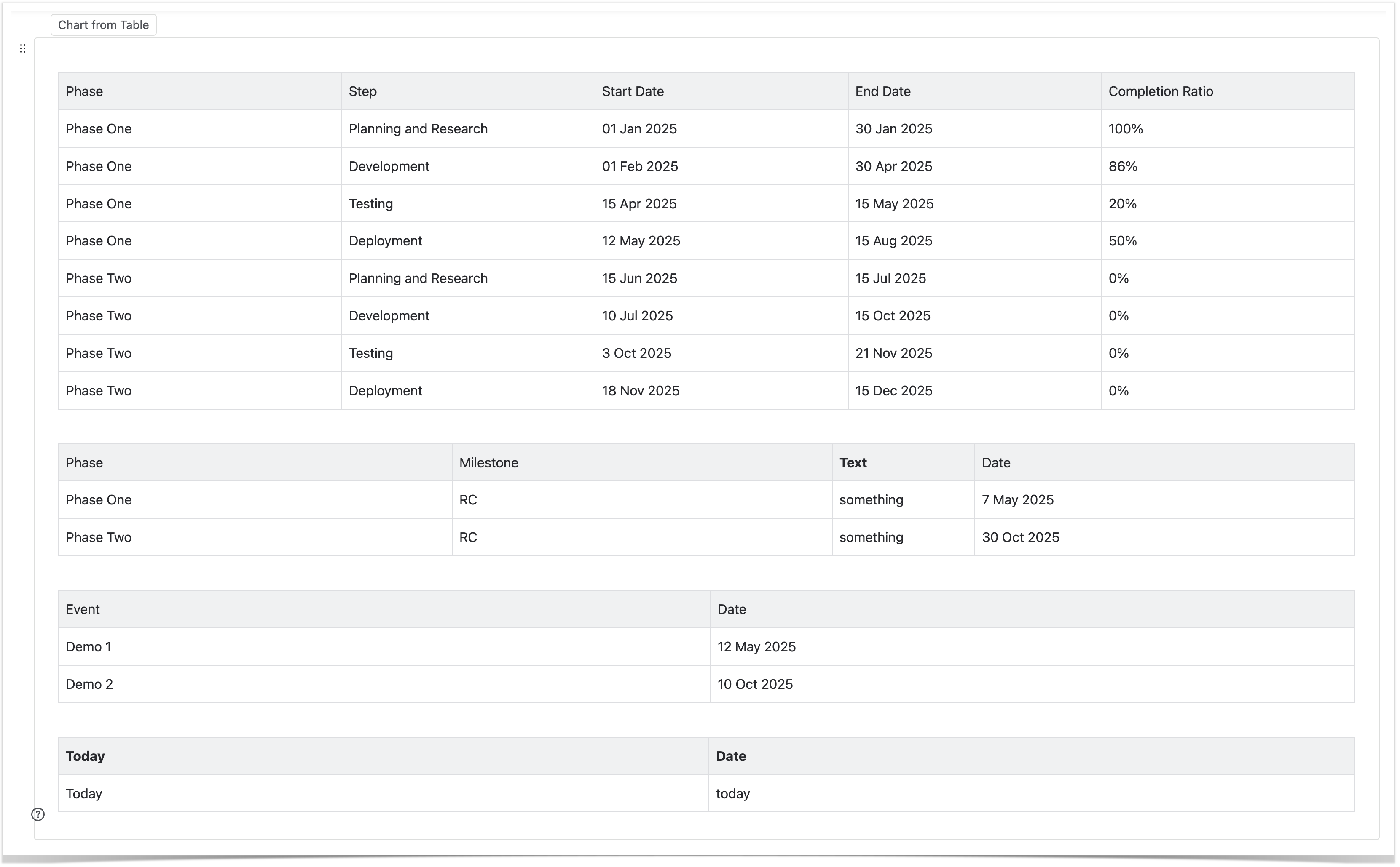
Data Tables in Macro Placeholder
|
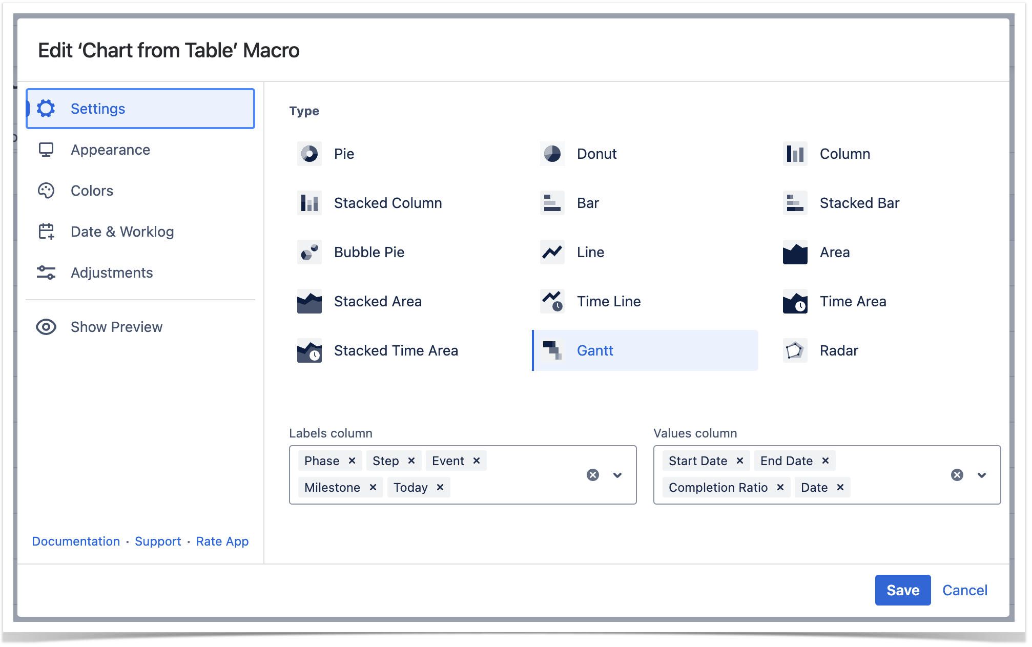
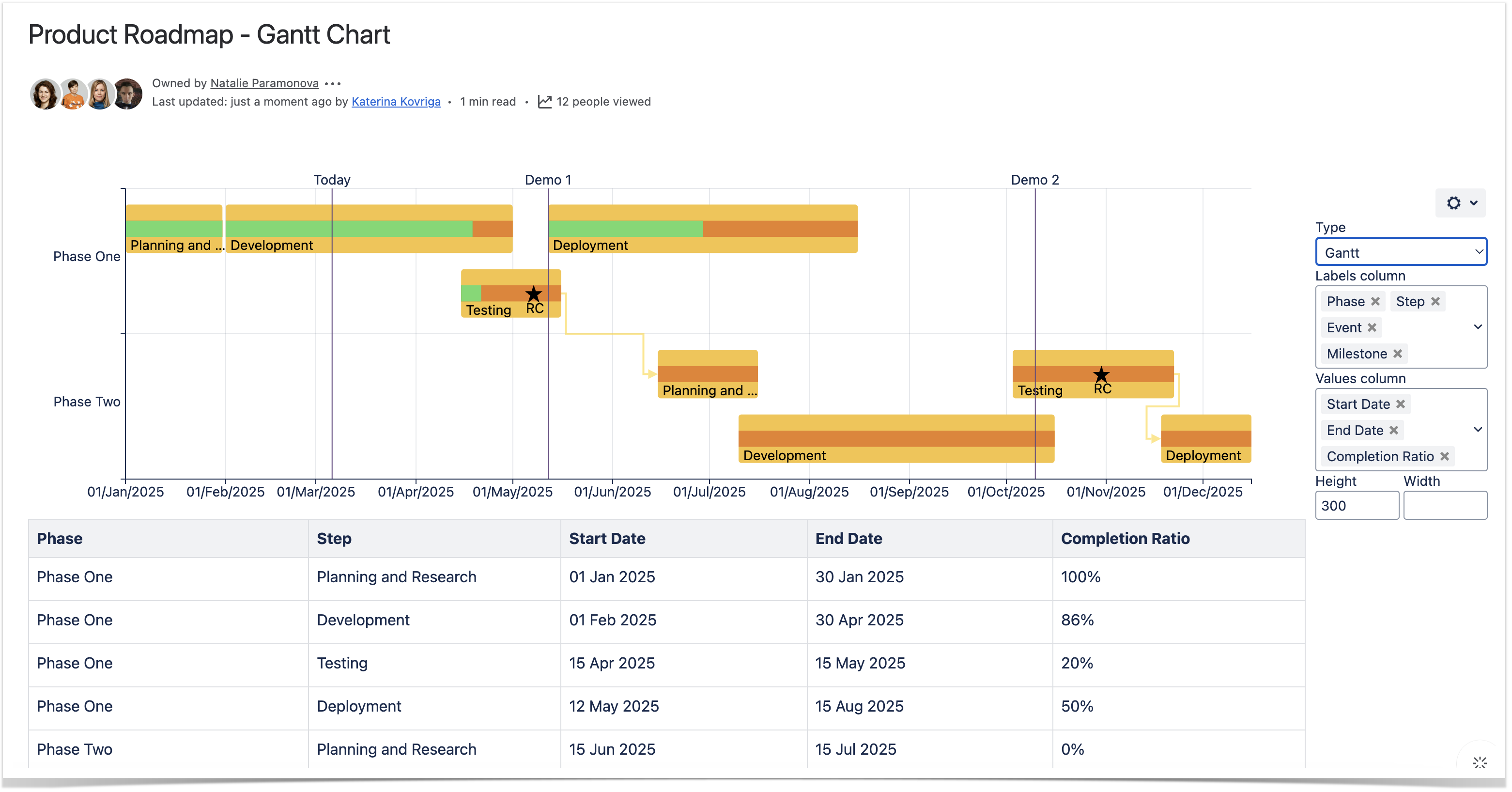
Settings Tab
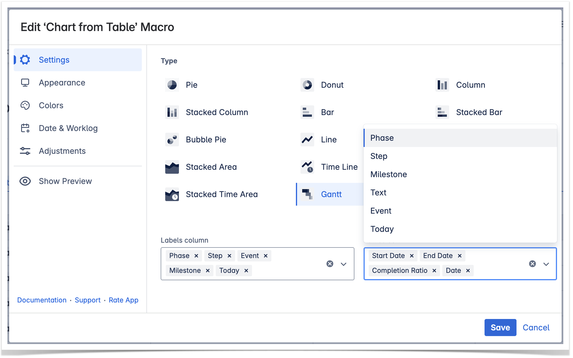
Select the chart type
To select the chart type in the page view mode:
- Insert the Chart from Table macro.
- Hover over the chart controls on the right of the table.
- Locate the Type option and select the chart type. The chart will be automatically regenerated.
- To save the modifications in the macro body, click the cogwheel icon and select Save changes.
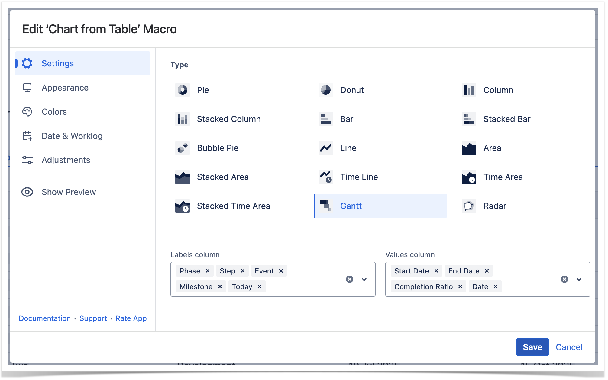
To select the chart type in the macro browser:
- Switch the page to the edit mode.
- Insert the Chart from Table macro and paste the table within the macro body.
- Select the macro and click Edit.
- Locate the Type option in the Settings tab and select the chart type.
- Save the macro and the page.
| Handy Carousel | ||
|---|---|---|
| ||
|
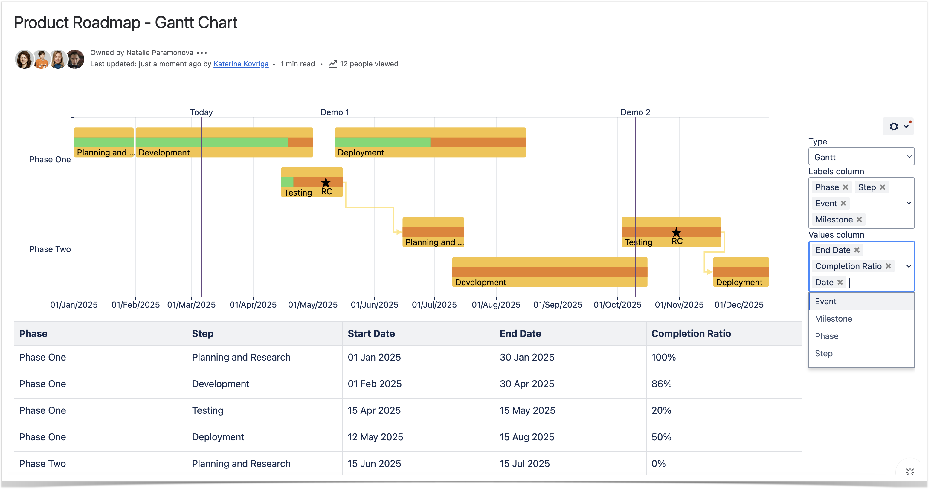
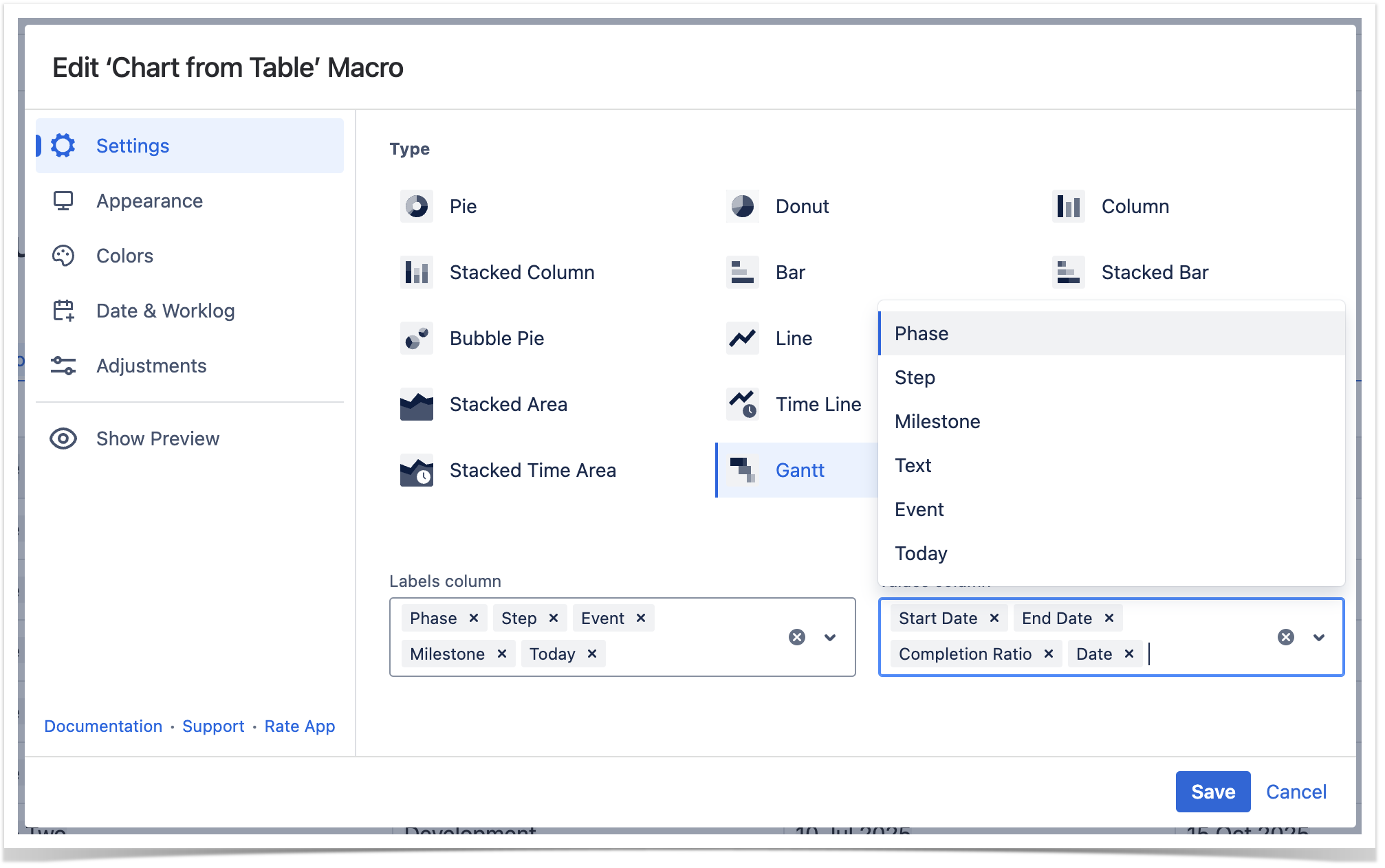
Select data series
Labels column - the column containing labels for data values.
Values column - the column or columns containing numerical values for chart generation.
To select data series in the page view mode:
- Insert the Chart from Table macro.
- Hover over the chart controls on the right of the table.
- Locate the Labels column and Values column options and select the table columns containing data for chart generation. The chart will be automatically regenerated.
- To save the modifications in the macro body, click the cogwheel icon and select Save changes.
To select data series in the macro browser:
- Switch the page to the edit mode.
- Insert the Chart from Table macro and paste the table within the macro body.
- Select the macro and click Edit.
- Locate the the Labels column and and Values column options options in the Settings tab and select the table columns containing data for chart generation.
- Save the macro and the page.
| Handy Carousel | ||
|---|---|---|
| ||
|
Adjustments Tab
Set the decimal separator
- Switch the page to the edit mode.
- Select the macro and click Edit.
- Switch to the Adjustments tab.
- Locate the Decimal separator option.
- Specify the correct decimal separator for numeric values in the source table (point or comma).
- Save the macro and the page.
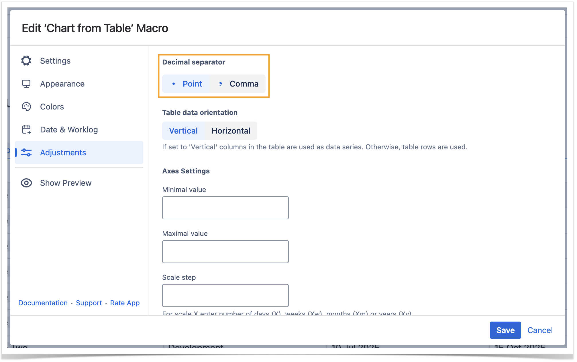
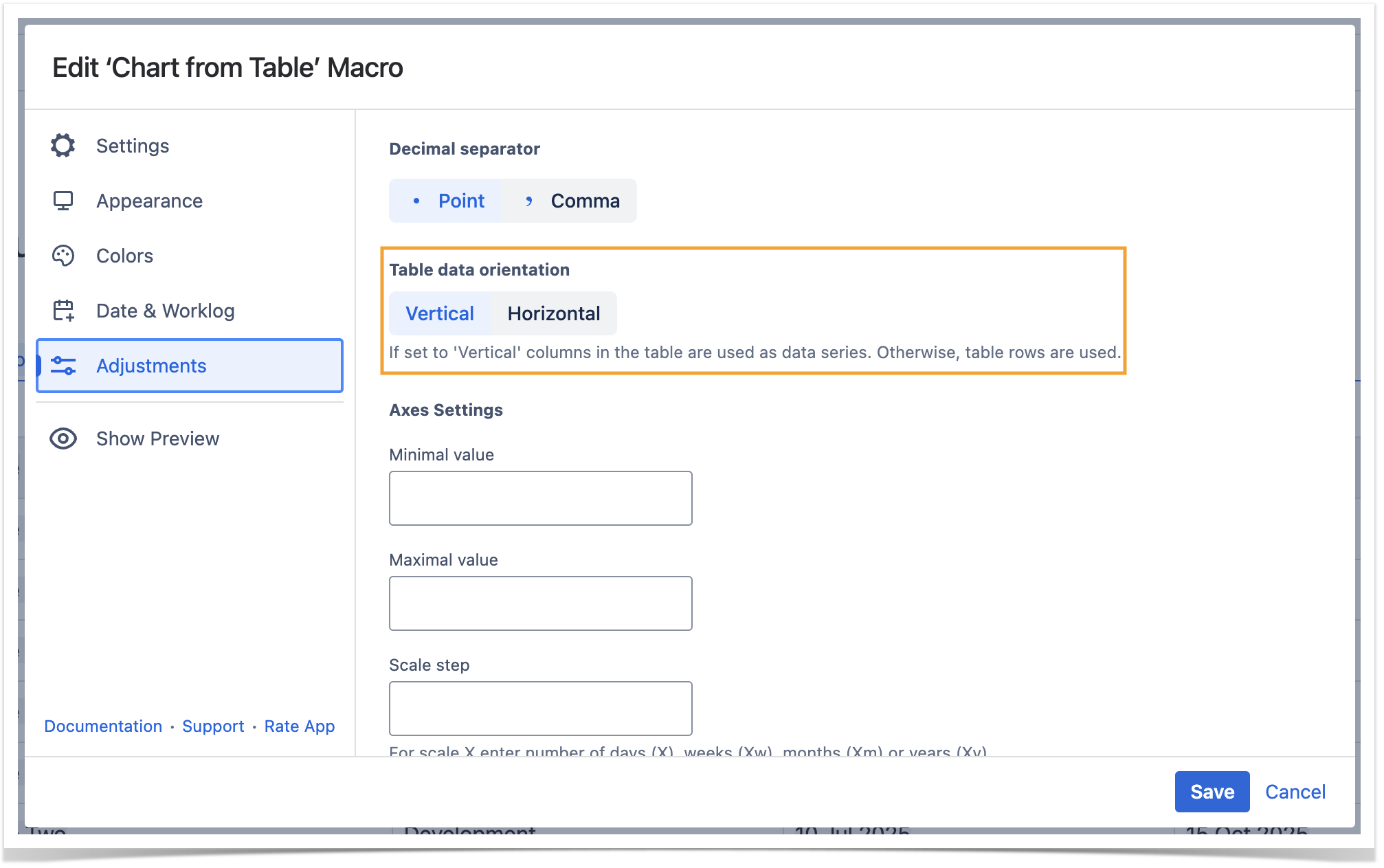
Set the table data orientation
- Switch the page to the edit mode.
- Select the macro and click Edit.
- Switch to the Adjustments tab.
- Locate the Table data orientation option.
- Select the Vertical or Horizontal option.
- Save the macro and the page.
Set the minimal and maximal values
Minimal value - the minimal value for showing only data values greater than the specified minimal value.
Maximal value - you can specify the maximal value for showing only data values not greater than the specified maximal value.
- Switch the page to the edit mode.
- Select the macro and click Edit.
- Switch to the Adjustments tab.
- Locate the Minimal and Maximal value options and set the values.
- Save the macro and the page.

Set the scale step
Scale Step - the required scale step for showing the numeric values in the chart.
- Switch the page to the edit mode.
- Select the macro and click Edit.
- Switch to the Adjustments tab.
- Locate the appropriate option depending on the chart type and set the scale step.
- Save the macro and the page.

Date & Worklog Tab
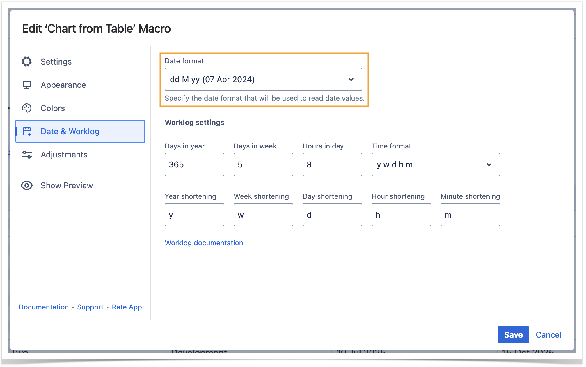
Set the date format
- Switch the page to the edit mode.
- Select the macro and click Edit.
- Switch to the Date & Worklog tab.
- Locate the Date format option.
- Specify the correct date format for date values in the source table.
- Save the macro and the page.
| Info |
|---|
| If the app detects the incorrect date format in the page view mode it presents you with the note panel where you canenter the correct date format. It is saved automatically if it is treated as the correct date format. |
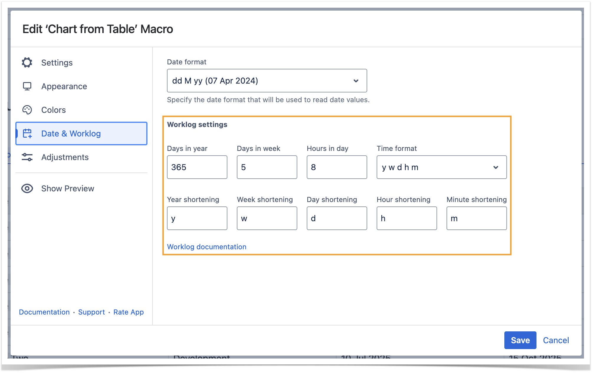
Set the worklog settings
| Info |
|---|
| Please ensure that the worklog parameters set in the macro are identical to parameters configured in Atlassian JIRA. |
- Switch the page to the edit mode.
- Select the macro and click Edit .
- Switch to the Date & Worklog tab.
- Locate the Worklog settings option.
- Define the worklog parameters, as follows:
- Days in year - enter the number of days in a year.
- Days in week - enter the number of business days in a week.
- Hours in day - enter the number of working hours in one business day.
- Time format - select the used time format in worklog values.
- Year shortening - enter the shortening for the year time unit if you use any language different from English.
- Week shortening - enter the shortening for the week time unit if you use any language different from English.
- Day shortening - enter the shortening for the day time unit if you use any language different from English.
- Hour shortening - enter the shortening for the hour time unit if you use any language different from English.
- Minute shortening - enter the shortening for the minute time unit if you use any language different from English.
- Save the macro and the page.
| Info |
|---|
| Worklog time units in different languages are denoted with different shortenings. Please adjust them according to your JIRA localization settings. |
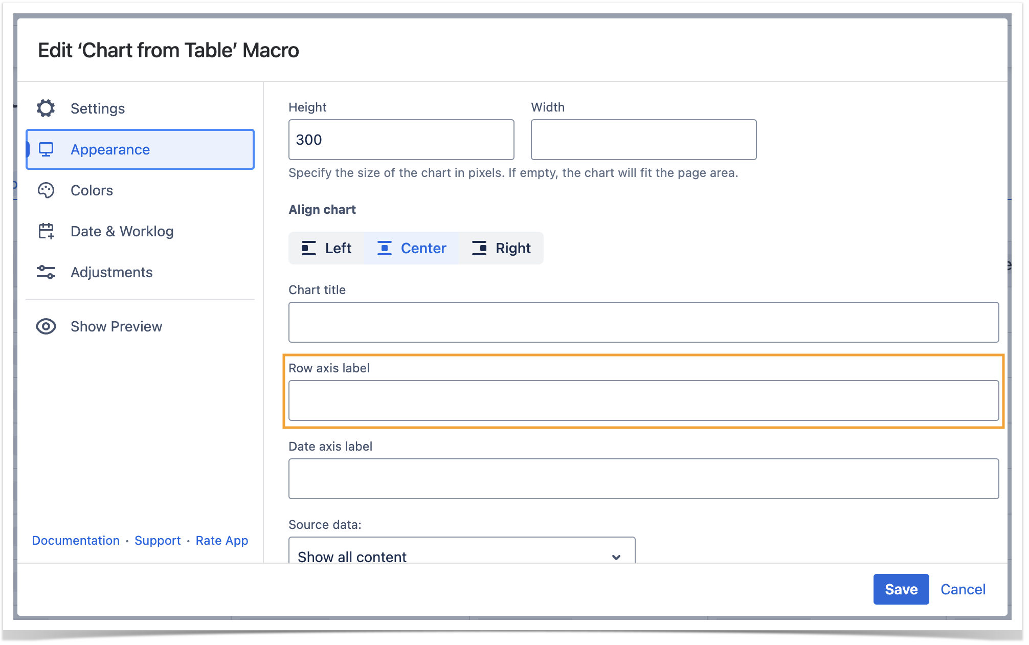
Appearance Tab
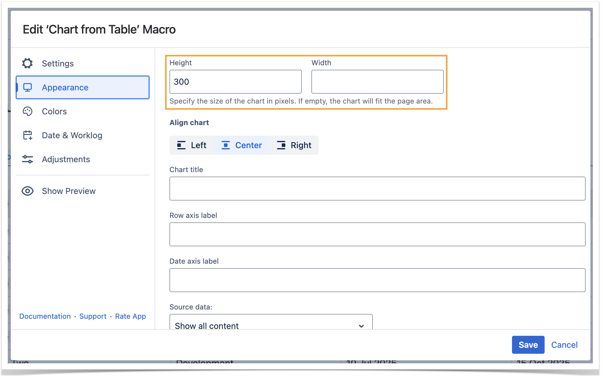
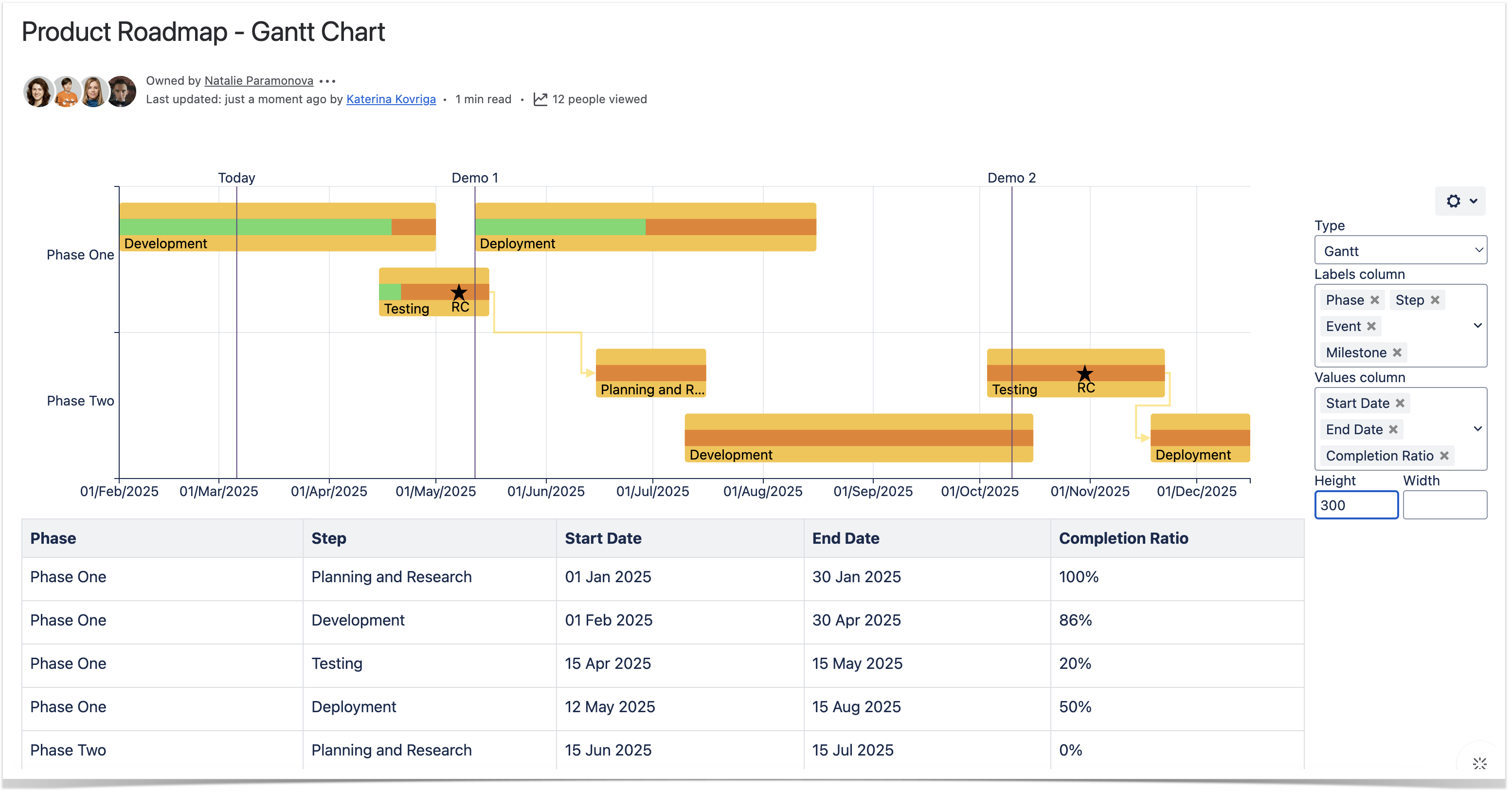
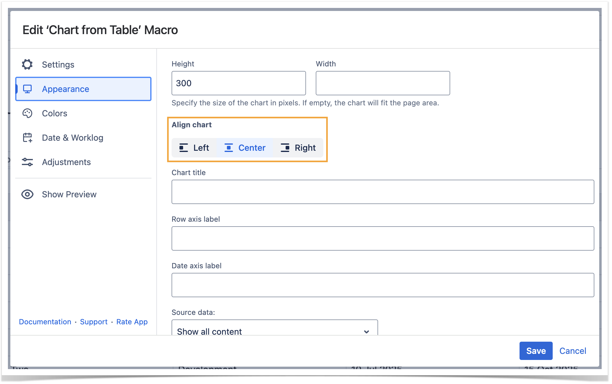
Set the height and width of the chart
- Switch the page to the edit mode.
- Select the macro and click Edit.
- Switch to the Appearance tab.
- Locate the Height and Width fields.
- Enter the appropriate dimensions of the chart.
Save the macro and the page.
| Info |
|---|
To set the Height and Width of the chart in the page view mode:
|
| Info |
|---|
Add /bar after the height value to set the height of bars. |
| Handy Carousel | ||
|---|---|---|
| ||
|
Align chart
- Switch the page to the edit mode.
- Select the macro and click Edit.
- Switch to the Appearance tab.
- Locate the Align chart option.
- Select the appropriate chart alignment, as follows:
- Left
- Center
- Right
- Save the macro and the page.
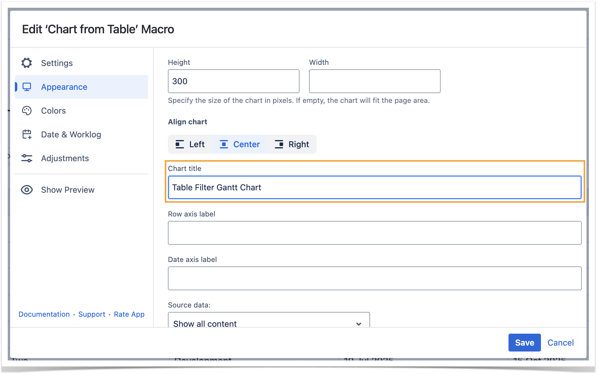
Set the chart title
- Switch the page to the edit mode.
- Select the macro and click Edit.
- Switch to the Appearance tab.
- Locate the Chart title option and enter the title.
- Save the macro and the page.
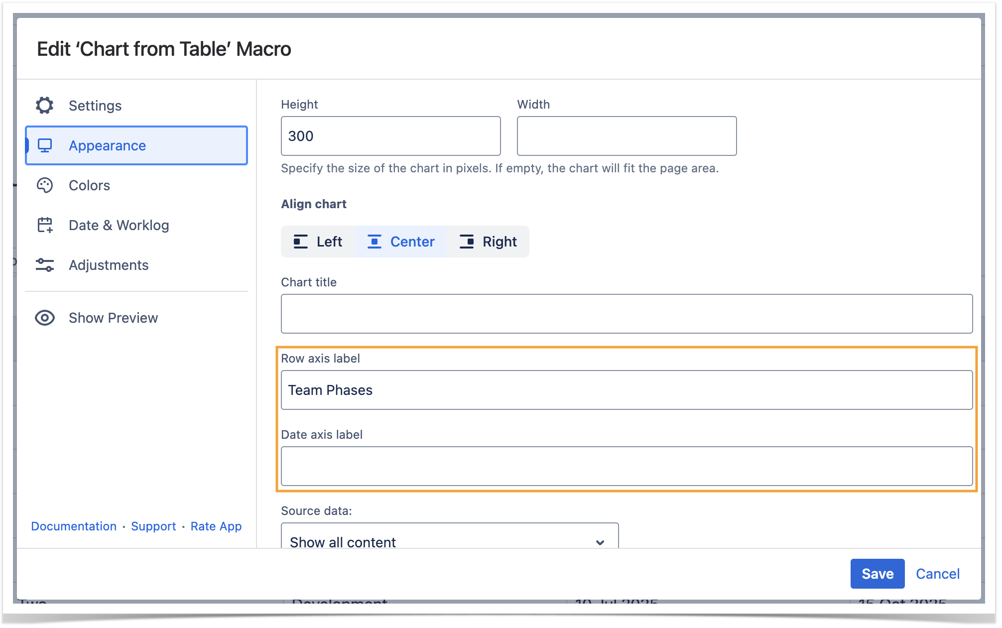
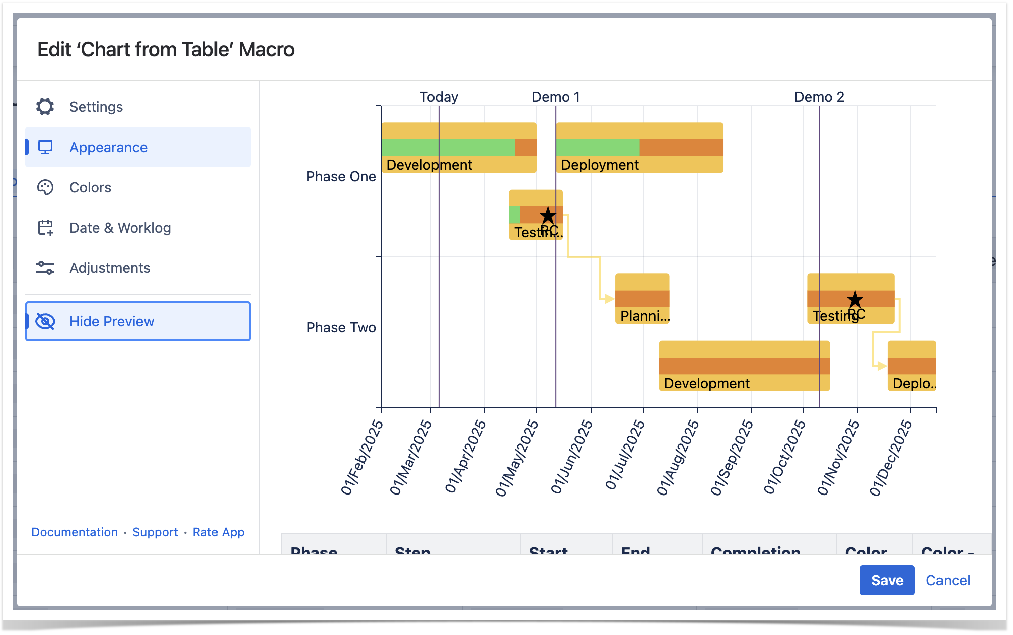
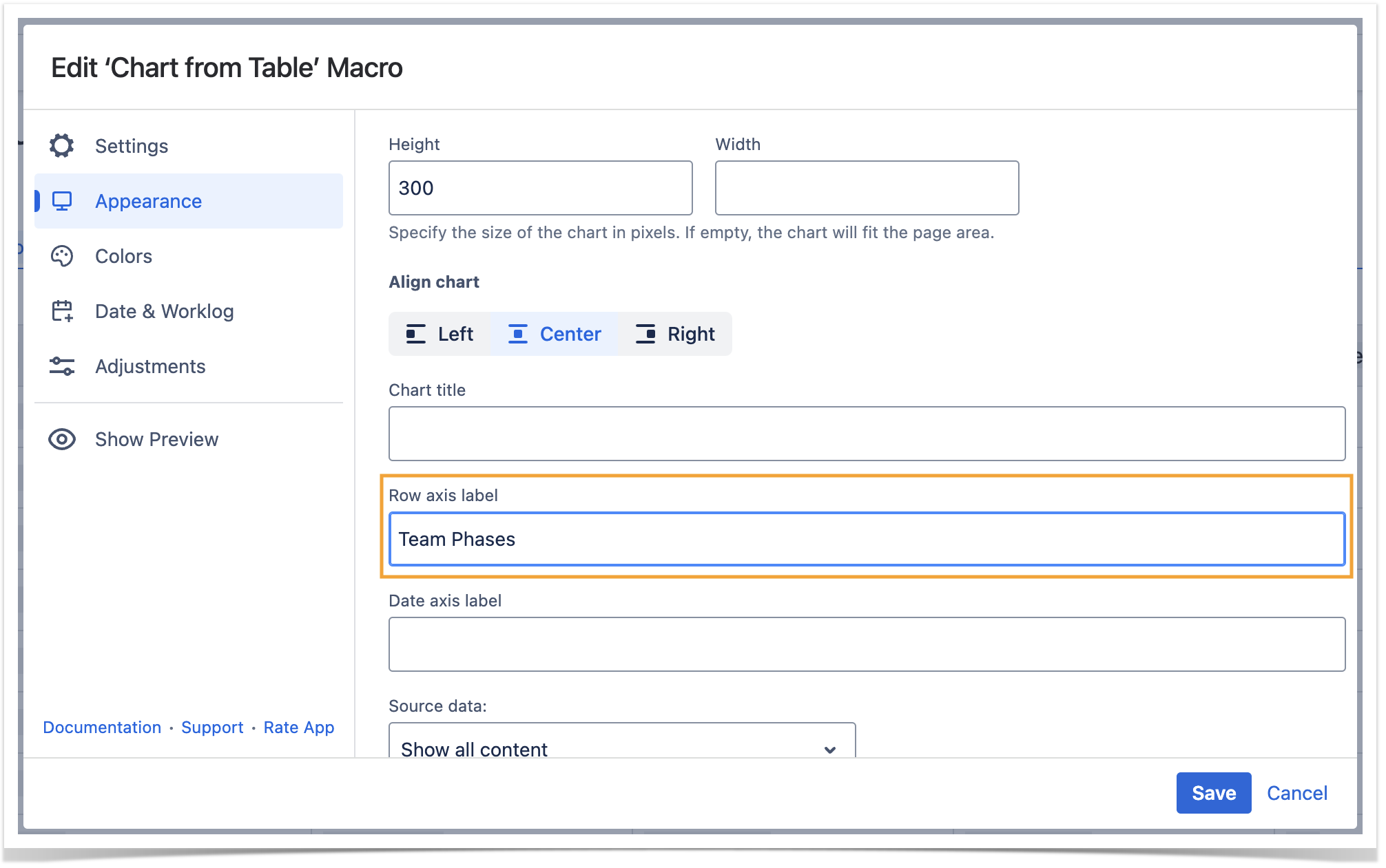
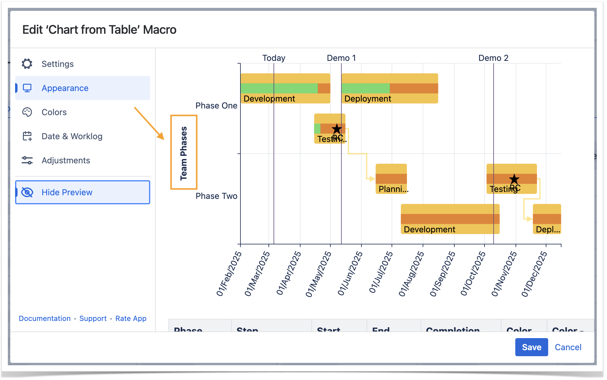
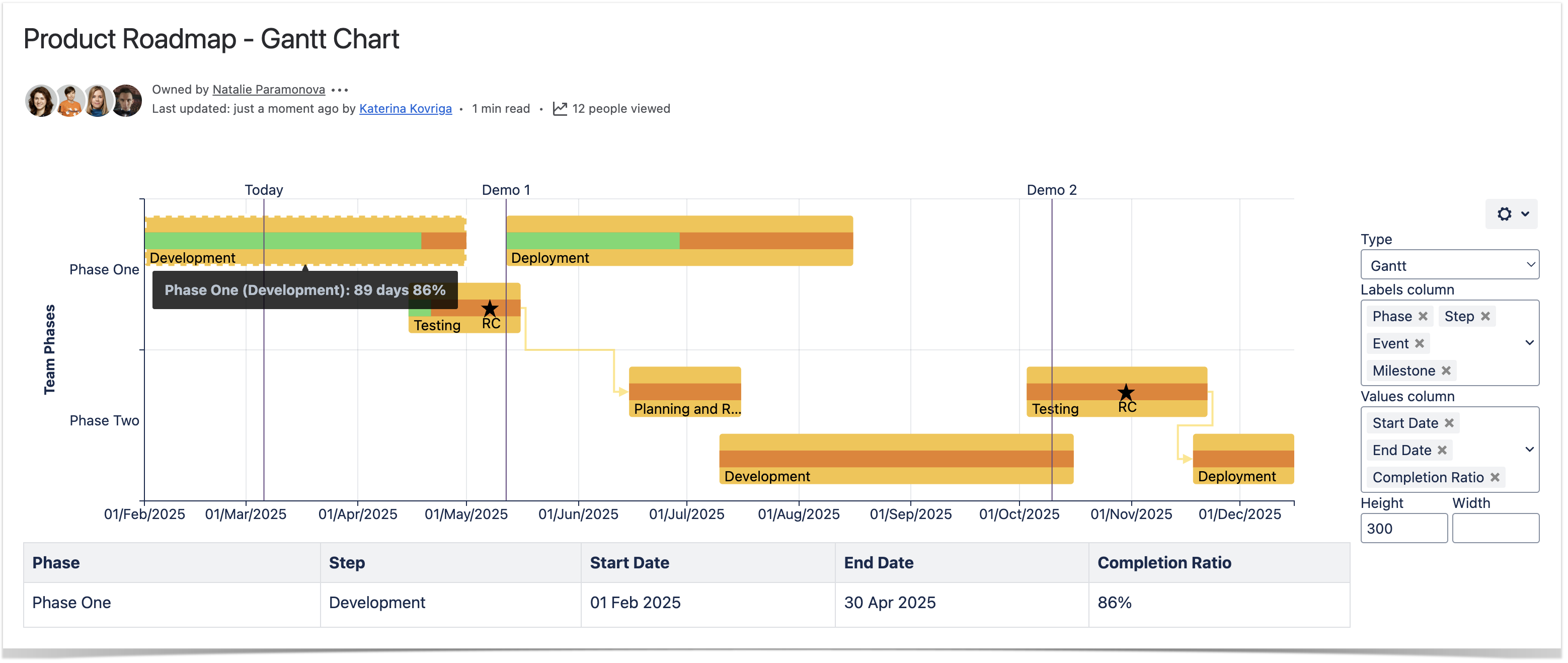
Set axis labels
- Switch the page to the edit mode.
- Select the macro and click Edit.
- Switch to the Appearance tab.
- Locate the Row axis label and Date axis label options and enter the labels.
- Save the macro and the page.
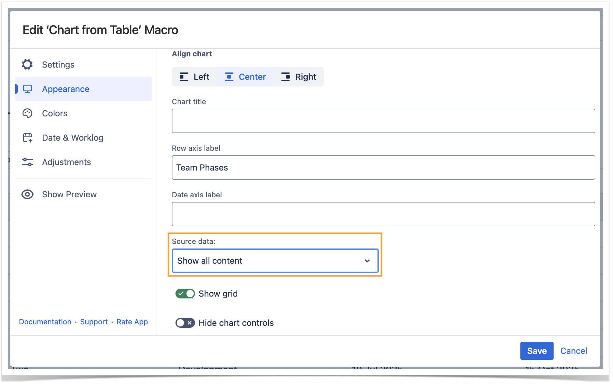
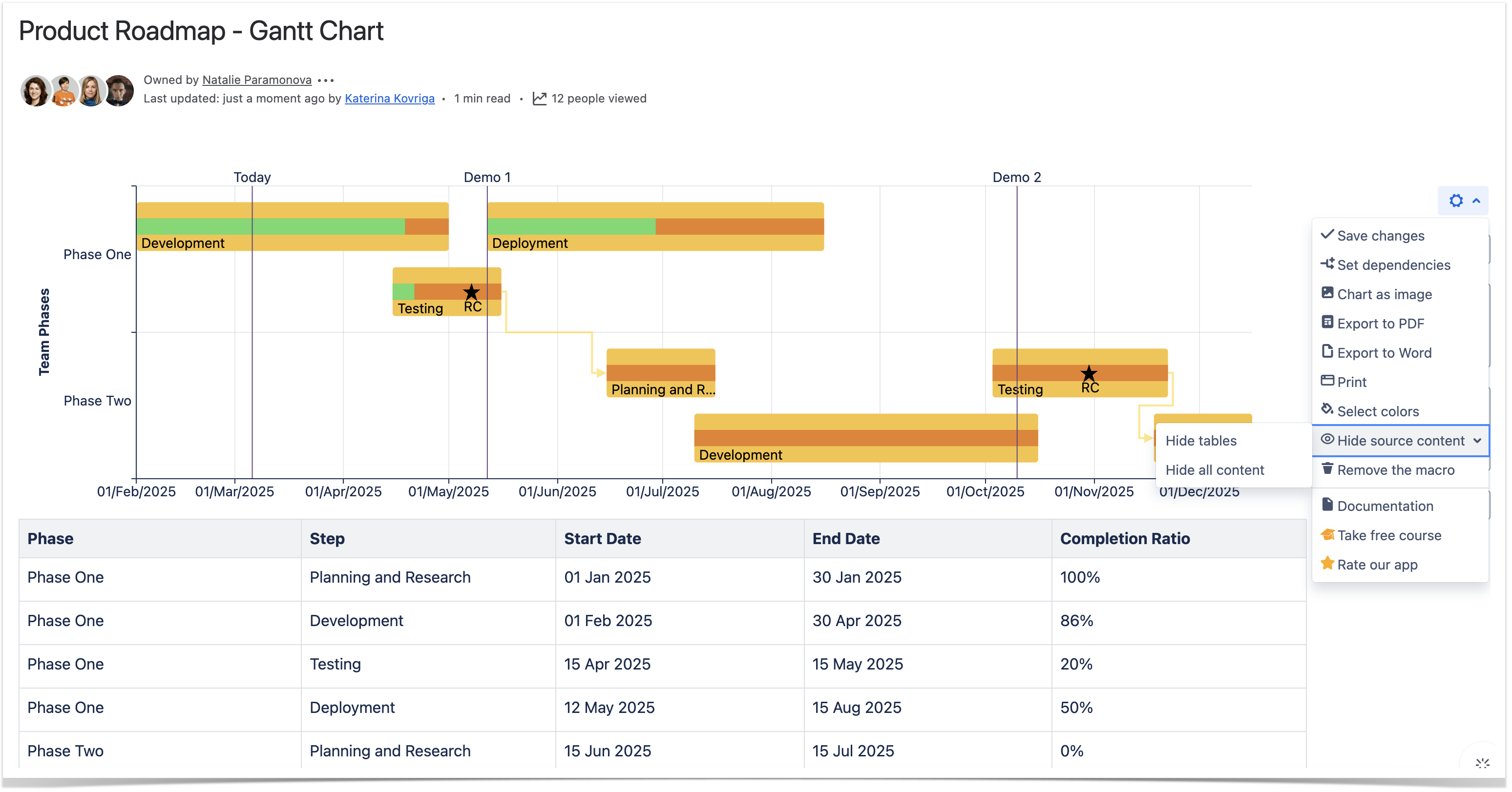
Show/Hide source data
- Switch the page to the edit mode.
- Select the macro and click Edit.
- Switch to the Appearance tab.
- Locate the Source data option and select the appropriate option, as follows:
- Show all content
- Hide tables
- Hide all content
- Save the macro and the page.
| Info |
|---|
To show/hide source data in the page view mode:
|
| Handy Carousel | ||
|---|---|---|
| ||
|
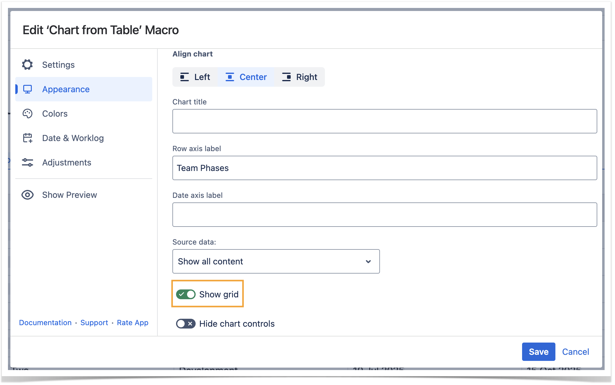
Show grid
- Switch the page to the edit mode.
- Select the macro and click Edit.
- Switch to the Appearance tab.
- Locate and enable the Show grid option.
- Save the macro and the page.
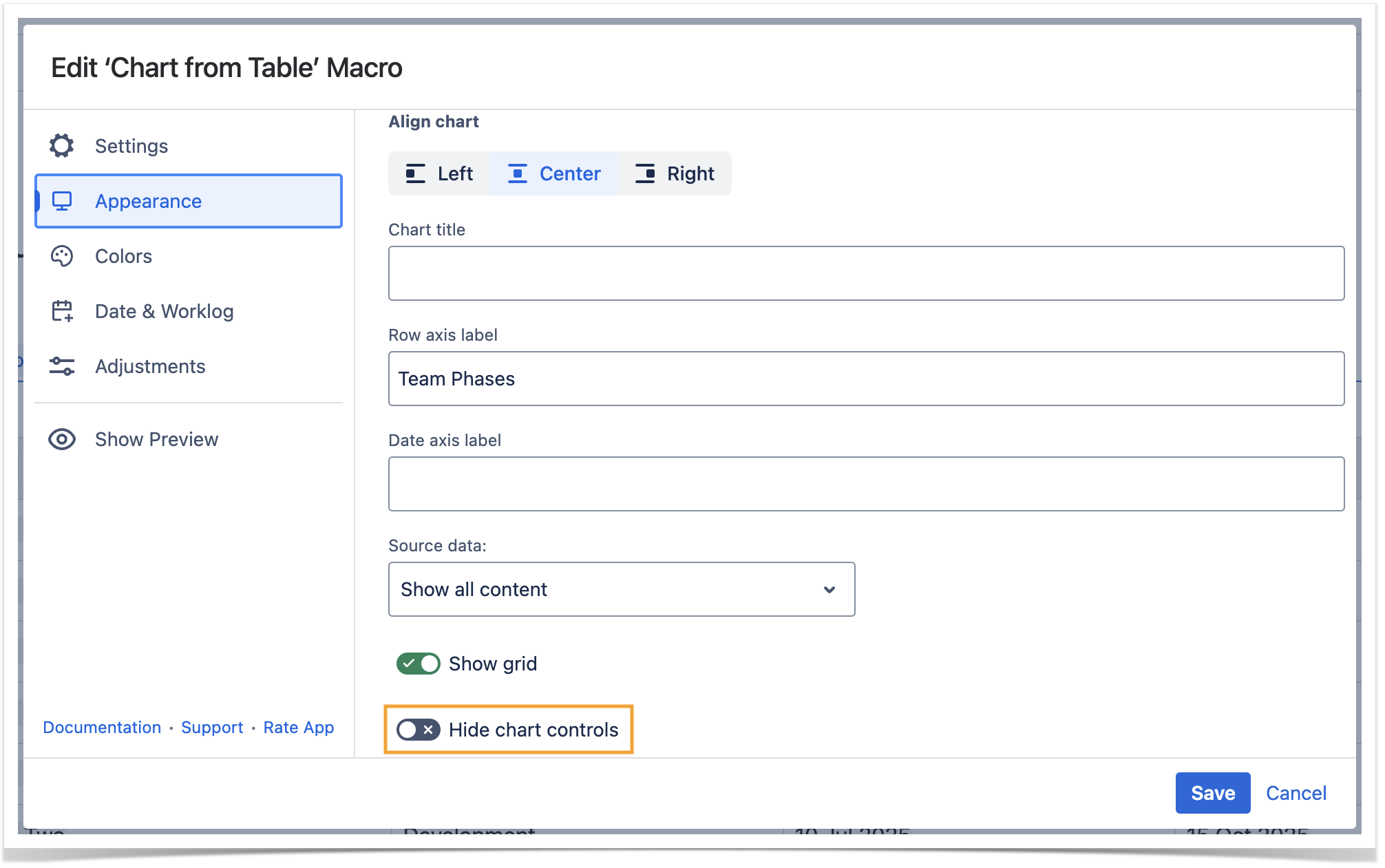
Hide chart controls
- Switch the page to the edit mode.
- Select the macro and click Edit.
- Switch to the Appearance tab.
- Locate and enable the Hide chart controls option.
- Save the macro and the page.
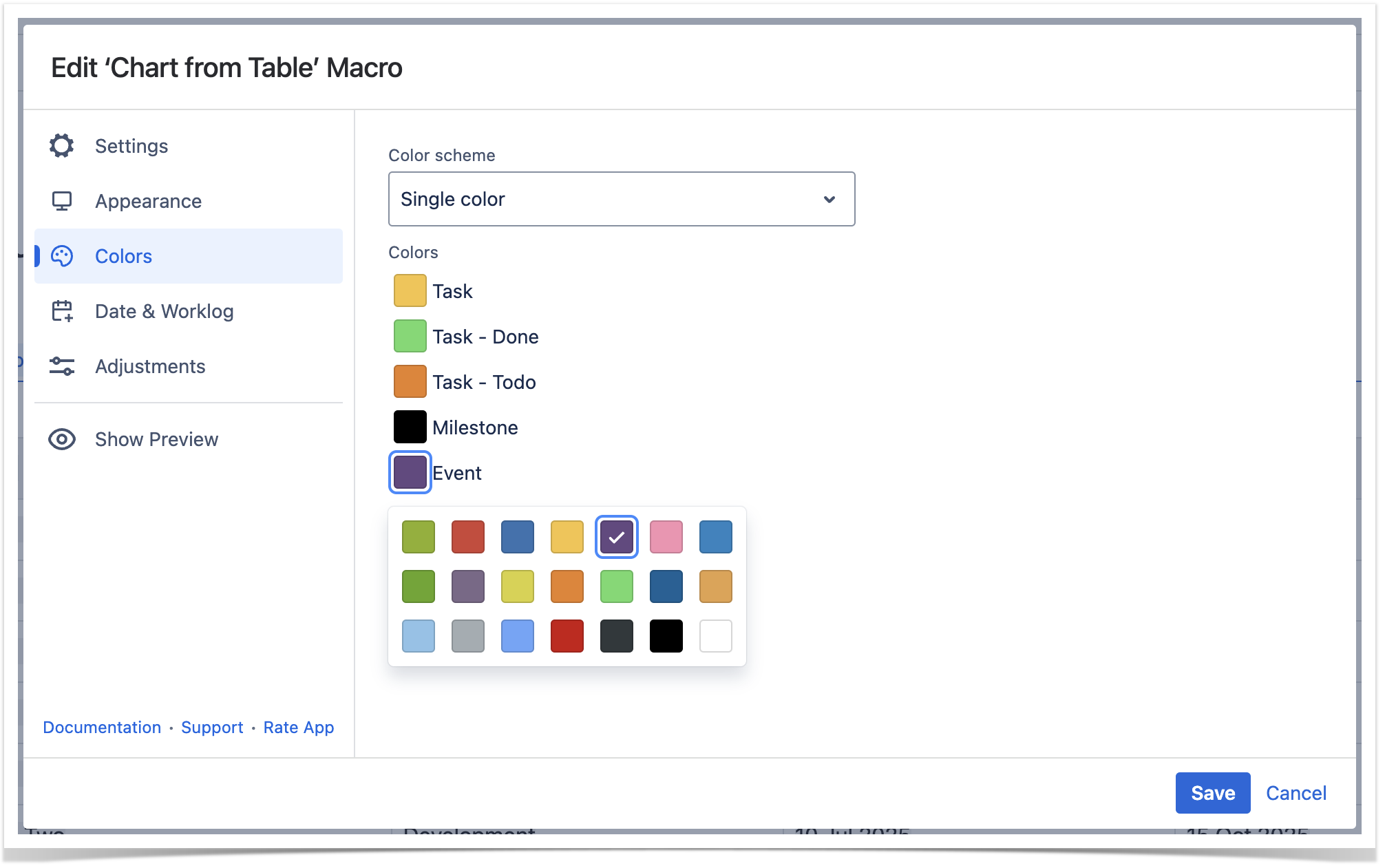
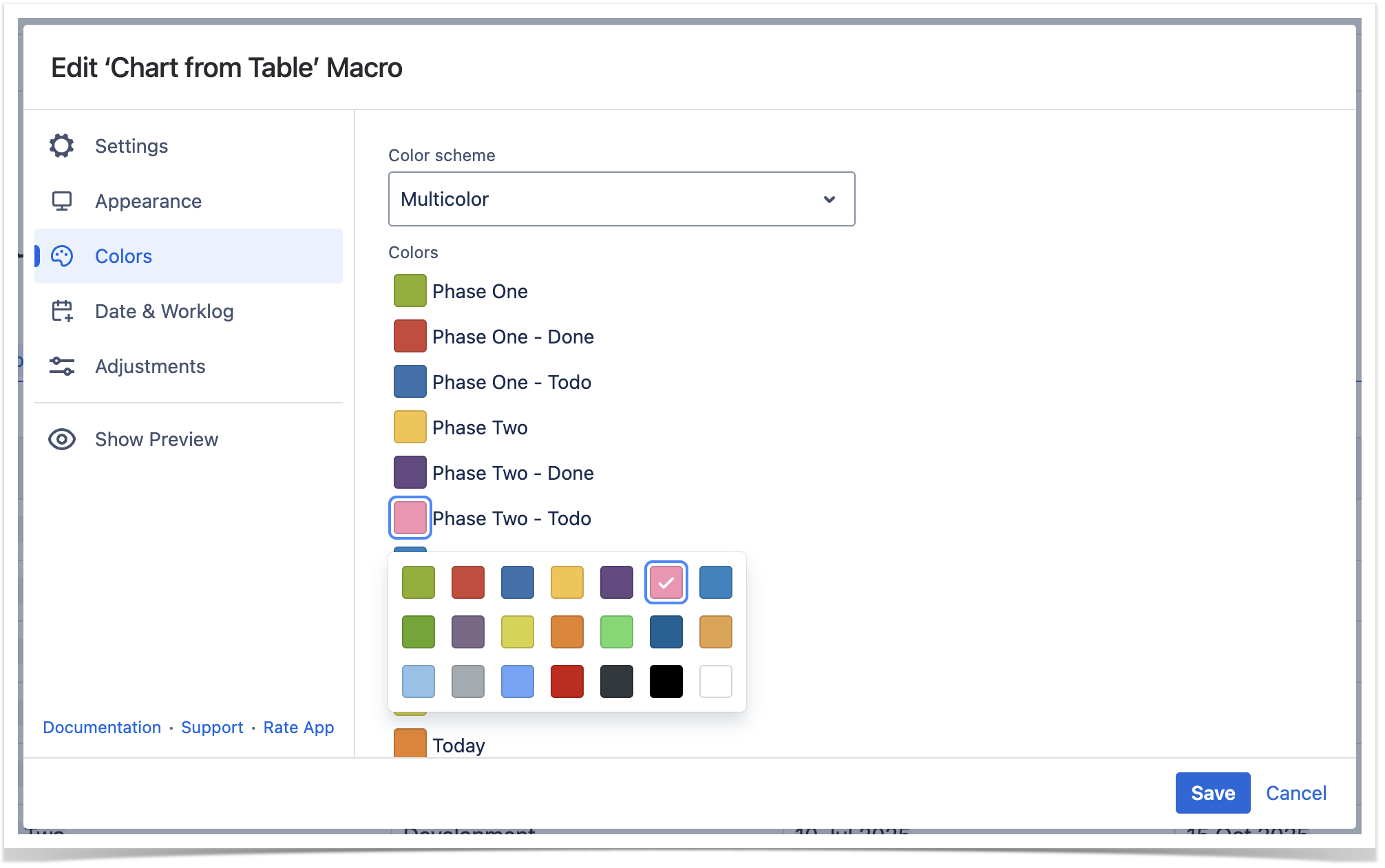
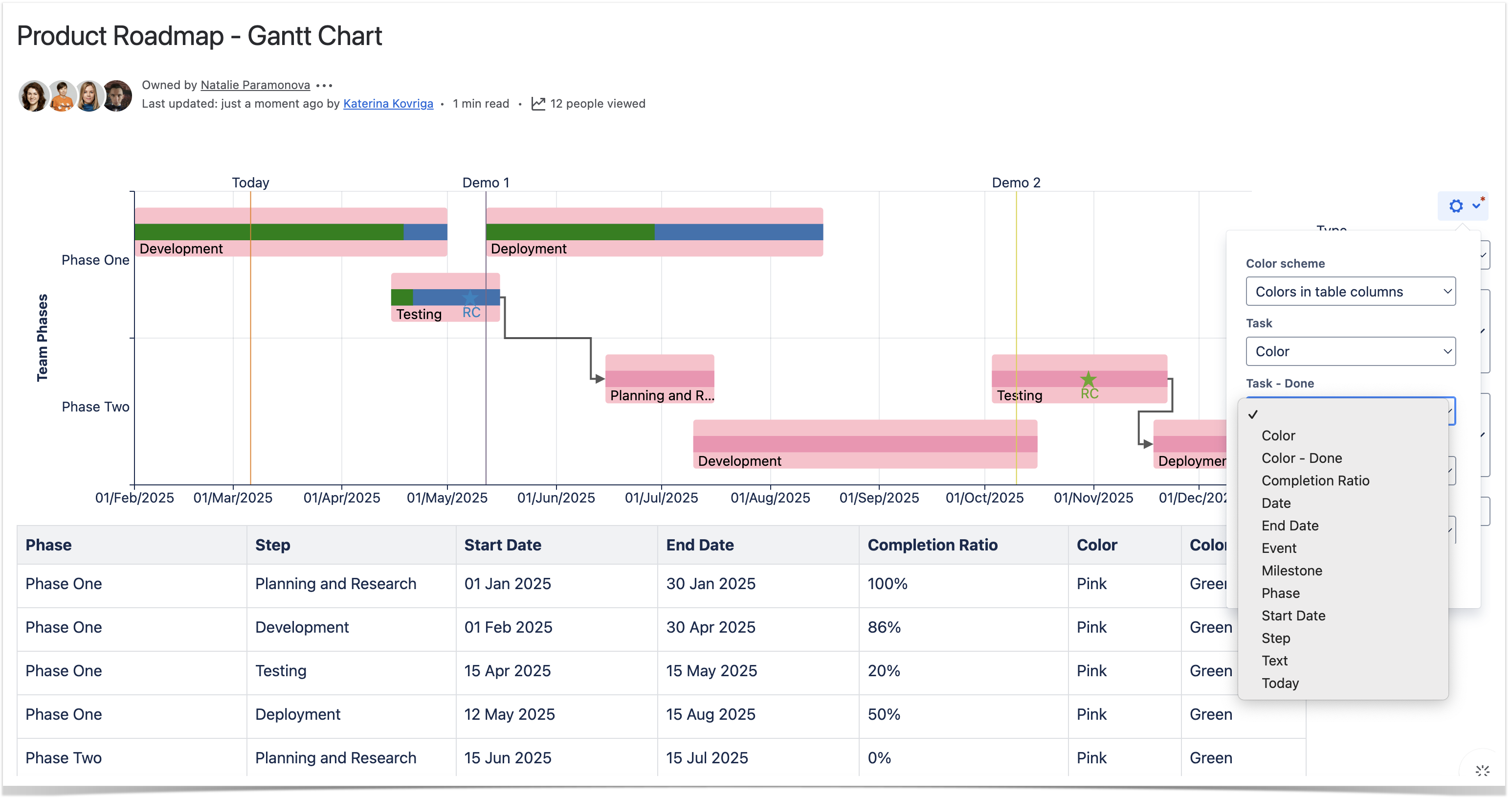
Colors Tab
Set colors
- Switch the page to the edit mode.
- Select the macro and click Edit.
- Switch to the Colors tab.
- Locate the Color scheme field and choose the required option: Single color, Multicolor or Colors in the table columns option.
- Save the macro and the page.
| Info |
|---|
To set the colors in the page view mode:
|
| Handy Tip | ||
|---|---|---|
| ||
The Multicolor setting enables you to select the appropriate colors for each value of the Label column specified in the data series field of the chart. |
| Handy Tip | ||
|---|---|---|
| ||
The Colors in the table columns setting enables you to add colors as either its simple name (e.g. green, yellow) or a HEX code (e.g. #808080-> gray) in a new custom-added column to paint values of the Labels column(-s) specified in the data series field of the chart.
|

| Handy Carousel | ||
|---|---|---|
| ||
|
Preview Option
While working in the edit mode, use the Show/hide preview option to adjust the required settings before saving the macro and publishing the page.
| Handy Carousel | ||
|---|---|---|
| ||
|
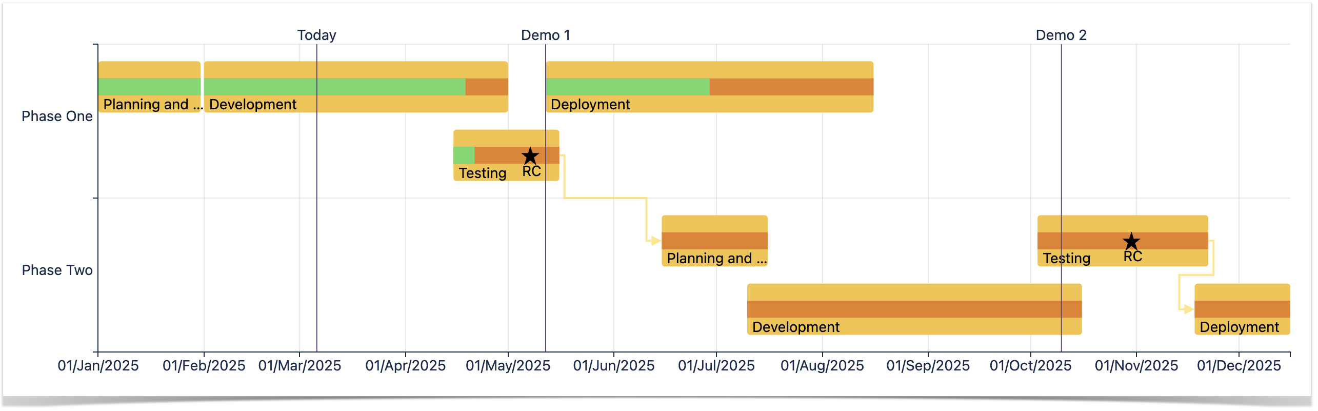
Filter the Source Table
- Select one or more chart columns/sectors/bars.
- Only the related rows of the source table are displayed.
- Deselect all the columns/sectors/bars to display the whole source table.
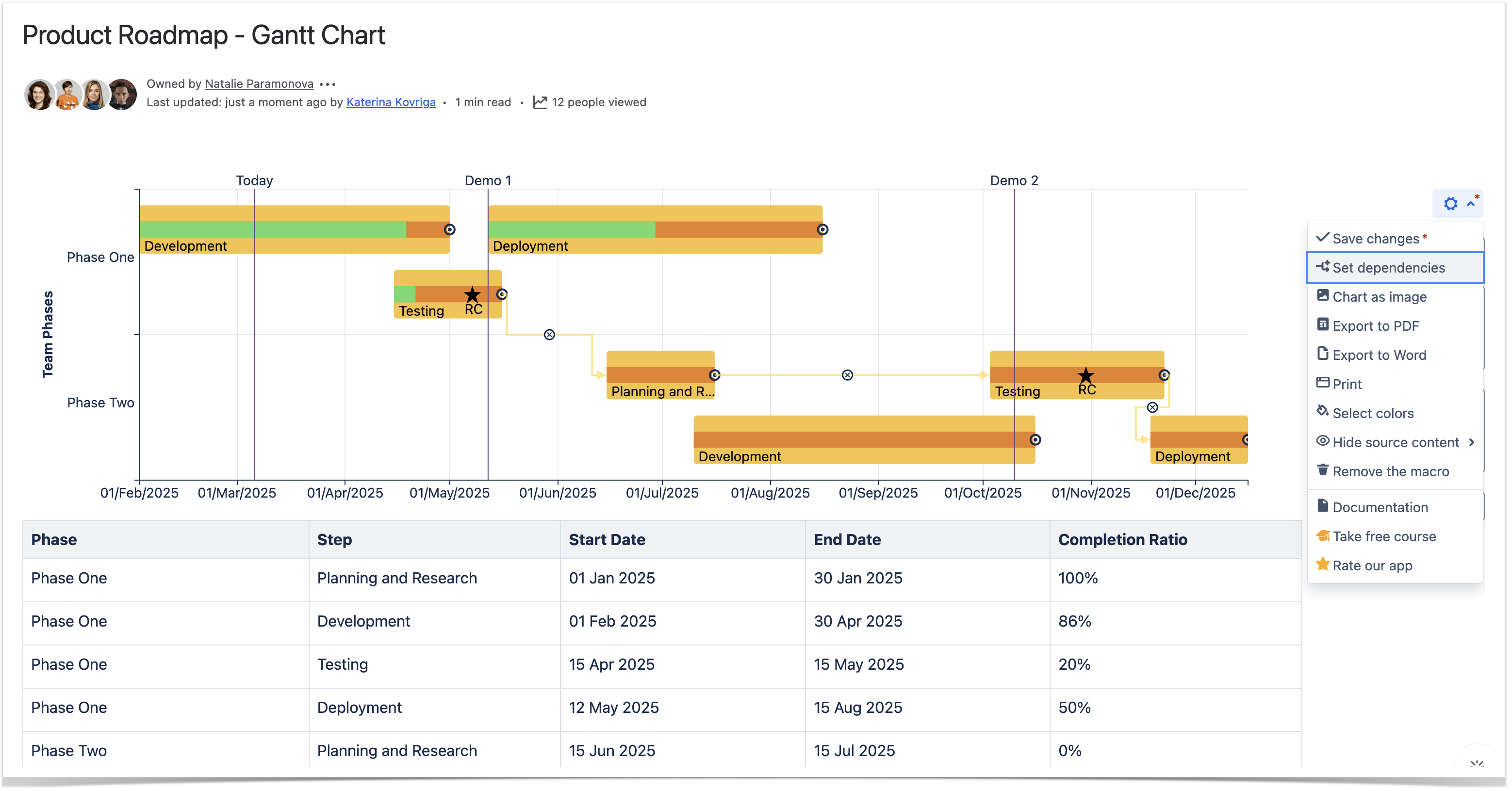
Set Dependencies
- Open the page with the chart.
- Click the cogwheel icon and select the Set dependencies option.
- Locate the arrows between tasks.
- To save the modifications, click the cogwheel icon and select Save changes.
Zoom in Chart
To zoom in the chart:
- Open the page with the chart you want to zoom in.
- Hover your mouse pointer over this chart.
- Hold down Ctrl and rotate the wheel button forward to zoom in the chart.
To navigate across the chart:
- Hold down Ctrl (for Windows) or Alt (for MacOS) and drag the mouse pointer across the chart.