| Mybanner |
|---|
This version of the app's documentation is outdated. Please find the information you're looking for here: |
| Panel | ||||||
|---|---|---|---|---|---|---|
| ||||||
The Table Filter and Charts for Confluence app allows you to visualize your table data and create dynamic charts on the fly while viewing Confluence pages. You can select the column containing labels and set one or multiple columns containing number values used for chart creation. Additionally, you can select the appropriate chart or graph type ( pie, donut, bubble pie, column, bar, Gantt, line, area, time line, time area and other). Optionally, you can configure your chart according to your use case. |
| Table of Contents | ||
|---|---|---|
|
| Widget Connector | ||||||
|---|---|---|---|---|---|---|
|
Starting from version 3.0.0 Table Filter add-on allows you to generate charts based on values from your data tables. The add-on supports the following types of charts:
- Pie
- Donut and 3D Donut
- Column
- Stacked Column
- Bar
- Stacked Bar
- Bubble Pie
- Line
- Area
- Stacked Area
- Time Line / Time Area
- Stacked Tme Area
- Gantt
- Radar (Spider)
Chart Parameters
These parameters determine the procedure of chart generation on Confluence page.
| Expand | ||||||||||||||||||||||||||||||||||||||||||||||||||||||||||
|---|---|---|---|---|---|---|---|---|---|---|---|---|---|---|---|---|---|---|---|---|---|---|---|---|---|---|---|---|---|---|---|---|---|---|---|---|---|---|---|---|---|---|---|---|---|---|---|---|---|---|---|---|---|---|---|---|---|---|
| ||||||||||||||||||||||||||||||||||||||||||||||||||||||||||
|
| Panel | ||||||
|---|---|---|---|---|---|---|
| ||||||
Table Filter for Confluence add-on allows you to visualize your table data and create dynamic charts that you can configure and update on the fly while viewing Confluence pages. You can select the column containing labels and set one or multiple columns containing number values used for chart creation. Additionally, you can select the appropriate chart or graph type (pie, donut and 3D donut, column, bar, line, area, time line and time area). Optionally, you can set the decimal separator, specify the dimensions of the chart, and enable the hiding of the source table. You can modify settings of your charts and save modifications in the macro body while viewing the page. |
| Table of Contents | ||
|---|---|---|
|
| Widget Connector | ||||||
|---|---|---|---|---|---|---|
|
Starting from version 3.0.0 Table Filter add-on allows you to generate charts based on values from your data tables. The add-on supports the following types of charts:
Chart Parameters
These parameters determine the procedure of chart generation on Confluence page.
| Expand | |||||||||||||||||||||||||||||||||||||||||||||||||||||||||||||||||||||||||||||||||||||||||||||||||||||||||||||||||||||||||||||||||||||
|---|---|---|---|---|---|---|---|---|---|---|---|---|---|---|---|---|---|---|---|---|---|---|---|---|---|---|---|---|---|---|---|---|---|---|---|---|---|---|---|---|---|---|---|---|---|---|---|---|---|---|---|---|---|---|---|---|---|---|---|---|---|---|---|---|---|---|---|---|---|---|---|---|---|---|---|---|---|---|---|---|---|---|---|---|---|---|---|---|---|---|---|---|---|---|---|---|---|---|---|---|---|---|---|---|---|---|---|---|---|---|---|---|---|---|---|---|---|---|---|---|---|---|---|---|---|---|---|---|---|---|---|---|---|
| |||||||||||||||||||||||||||||||||||||||||||||||||||||||||||||||||||||||||||||||||||||||||||||||||||||||||||||||||||||||||||||||||||||
| Parameter | Default | Compatible with | Description | Labels Column | None |
The column containing labels for data values. Values column | None |
The column containing numerical values for chart generation. X-axis value column | None |
The column containing numerical values for chart generation. | Y-axis value column | None |
The column or columns containing numerical values for chart generation. | Dates column | None |
You can select the column with dates for chart generation. | Date Format | yy-mm-dd |
You can specify the date format used in the column with dates. | Type | Pie | Global | You can select the appropriate chart type. | Decimal Separator | Point | Global | You can select the decimal separator (either point or comma). | Height | None (dependable on screen area) Global | You can define the height of the generated chart. | Width | None (dependable on screen area) Global | You can define the width of the generated chart. | Hide the source table | Disabled | Global | You can hide the table with data and enable display of the chart only. | Hide chart controls | Disabled | Global | You can hide the chart controls when you need just to display the chart without a necessity to update its view. | Show legend | Disabled | Global | You can hide the legend for the generated chart. | Show grid | Enabled |
You can enabled display of the grid on the generated chart. | Chart Title | Disabled | Global | You can specify the title of the chart. | Align chart | Enabled | Center | You can define the appropriate alignment for the chart. | X-axis label | Disabled | Global | You can specify the label for X axis of the chart. | Y-axis label | Disabled | Global | You can specify the label for Y axis of the chart. | Minimal Value | Disabled |
You can specify the minimal value for showing only data values greater than the specified minimal value. | Maximal Value | Disabled |
You can specify the maximal value for showing only data values not greater than the specified maximal value. | Scale Step | Disabled |
You can specify the required scale step for showing the chart. | Minimal X Value |
You can specify the minimal value for X axis for showing only data values greater than the specified minimal value. | Maximal X Value | |
You can specify the maximal value for X axis for showing only data values not greater than the specified maximal value. | Minimal Y Value |
You can specify the minimal value for Y axis for showing only data values greater than the specified minimal value. | Maximal Y Value | |
Scale X Step | |
You can specify the required scale step of X axis for showing the chart. For Time Line and Time Area charts you can specify the appropriate number of days (Xd), months (Xm) or years (Xy) where the 'X' is the digit, as follows:
Scale Y Step | |
You can specify the required scale step of Y axis for showing the chart. | Logarithmic scale Y | Disabled |
You can enable this option for very small or very large numeric values that cannot be properly aligned on the standard arithmetic scale. | Logarithmic scale X | Disabled |
You can enable this option for very small or very large numeric values that cannot be properly aligned on the standard arithmetic scale. | Colors | | Global | You can select the appropriate colors for charts and graphs instead of using the automatically assigned colors. | Logarithmic Scale | Disabled |
You can enable this option for very small or very large numeric values that cannot be properly aligned on the standard arithmetic scale. | |
Inserting Chart from Table macro
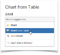
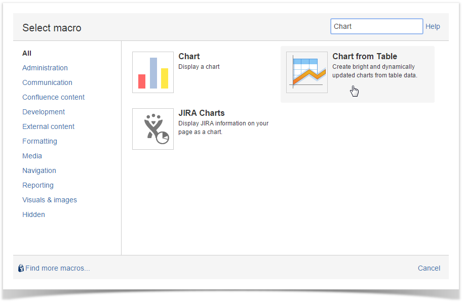
There exist three ways to insert the Chart from Table macro on the page.
| Macro Insertion | Instructions | Supported Data | ||
|---|---|---|---|---|
| Inserting the macro through the action icon on the editor pane |
|
| ||
| Manual entry of the {Chart from Table} query on the page |
|
| ||
| Selection of the Chart from Table macro in the Select Macro form |
|
|


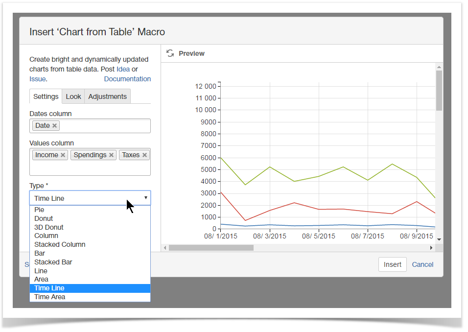
Selecting the chart type and data series
- On the Confluence page opened in the edit mode, click the Chart from Table macro.
- Click Edit.
- In the Insert/Edit Charts from Table Macro form, define parameters of the macro, as follows:
- Labels / Dates / X-axis value column - select the appropriate column containing the required data for chart generation. The name of the parameter, as well as data type may vary for different chart types.
- Values column - select the column containing numbering values for chart generation.
- Type - select the type of chart to generate.
- Click Save.
| Info |
|---|
|
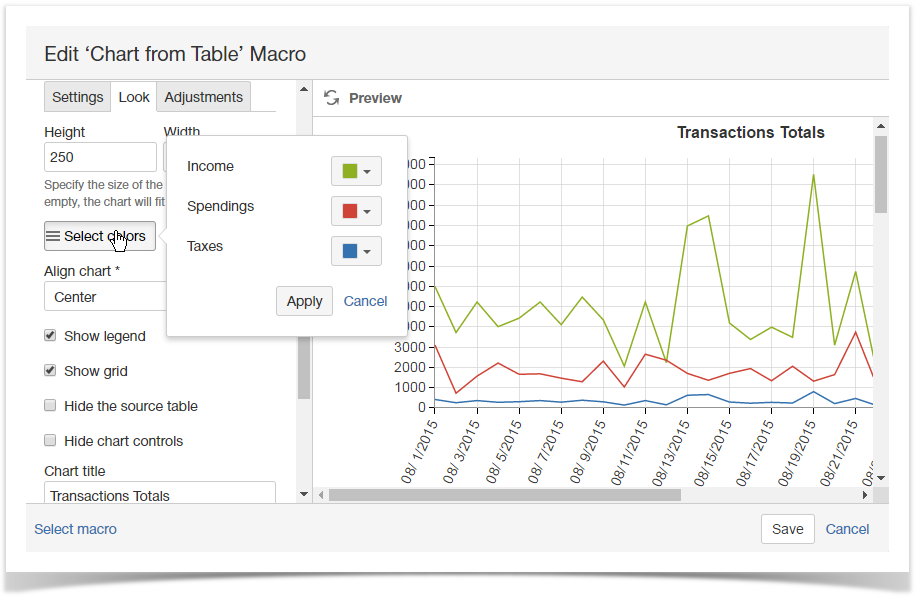
Configuring look of the chart
- On the Confluence page opened in the edit mode, click the Chart from Table macro.
- Click Edit.
- Switch to the Look tab.
- Configure the parameters affecting the look of chart.
- Click Save.
- Save the page.
| Info |
|---|
For the details on the list of all available parameters, see this. |
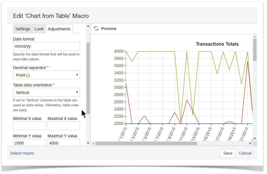
Adjusting chart configuration
- On the Confluence page opened in the edit mode, click the Chart from Table macro.
- Click Edit.
- Switch to the Adjustments tab.
- Adjust the parameters affecting presentation of data series.
- Click Save.
- Save the page.
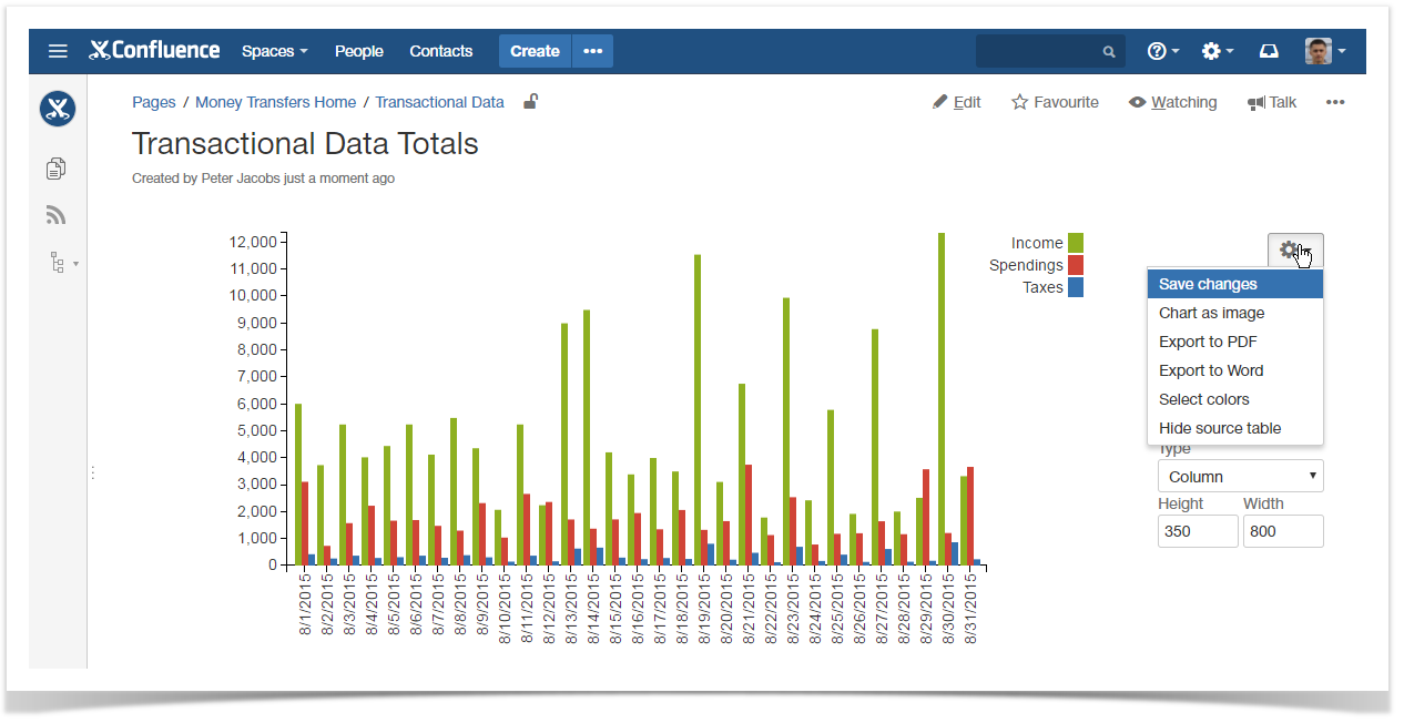
Managing Charts in the Page View Mode
Once you have defined settings of the Table chart macro and saved the page, you get a page with the generated chart.
To the right side of your chart, you can locate the chart management sidebar. It allows you to alternate the following parameters of Chart table macro:
- Labels column - change the column with labels for another one.
- Values column - change the column with data values. The chart will be automatically re-generated. Depending on the used chart type you may select column with numerical through Values column X and Values column Y fields.
- Dates column - change the column with dates. The chart will be automatically re-generated. This select box is shown for Time Line and Time Area charts only.
- Type - change the chart type for another one. You may need to re-select the table columns when changing the chart type.
- Height/Width - specify the required dimensions of the chart.
| Info |
|---|
|
To save new parameters in the macro body:
- Click the Cogwheel
 icon.
icon. - Select Save changes.
To export the chart:
- Click the Cogwheel icon.
- Select Export to PDF or Export to Word.
To save the chart as image:
- Click the Cogwheel icon.
- Select Chart as image.
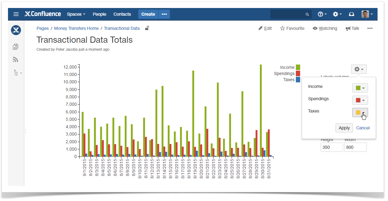
To update the colors used for charts and graphs:
- Click the Cogwheel icon.
- Click Select colors.
- Click the color picker and select the appropriate color on the palette.
- Click Apply to use the selected colors and redraw your chart or graph.
To show the source table:
- Click the Cogwheel icon.
- Select Show source table.
Removing Chart from Table macro for Table
- Switch Confluence page to the edit mode.
- Select the Chart from Table macro with the table or macro outputting the table.
- Click Unwrap.

|
Inserting Chart from Table macro
There exist three ways to insert the Chart from Table macro on the page.
| Macro Insertion | Instructions | Supported Data | ||||
|---|---|---|---|---|---|---|
Inserting the macro in the page view mode
|
|
| ||||
| Inserting the macro through the action icon on the editor pane |
|
| ||||
| Manual entry of the {Chart from Table} query on the page |
|
| ||||
| Selection of the Chart from Table macro in the Select Macro form |
|
|
Selecting the chart type and data series
- On the Confluence page opened in the edit mode, click the Chart from Table macro.
- Click Edit.
- In the Insert/Edit Charts from Table Macro form, define parameters of the macro, as follows:
- Labels / Dates / X-axis value column - select the appropriate column containing the required data for chart generation. The name of the parameter, as well as data type may vary for different chart types.
- Values column - select the column containing numbering values for chart generation.
- Type - select the type of chart to generate.
- Click Save.
| Info |
|---|
|
Configuring look of the chart
- On the Confluence page opened in the edit mode, click the Chart from Table macro.
- Click Edit.
- Switch to the Look tab.
- Configure the parameters affecting the look of chart.
- Click Save.
- Save the page.
| Info |
|---|
For the details on the list of all available parameters, see this. |
To set the chart dimensions:
- Locate the Height and Width fields.
- Enter the appropriate dimensions of the chart.
To set colors for chart elements (labels):
- Locate the Select colors button and click it.
- Select the appropriate colors for each label.
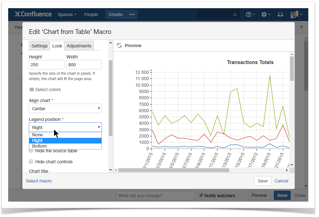
To set the chart alignment:
- Locate the Align chart option.
- Select the appropriate chart alignment, as follows:
- Left
- Center
- Right
To show the chart legend:
- Locate the Legend Position option.
- Select the appropriate legend position, as follows:
- None
- Right
- Bottom
Adjusting chart configuration
- On the Confluence page opened in the edit mode, click the Chart from Table macro.
- Click Edit.
- Switch to the Adjustments tab.
- Adjust the parameters affecting presentation of data series.
- Click Save.
- Save the page.
To set the date format:
- Locate the Date format option.
- Specify the correct date format for date values in the source table.
To show the trendline:
- Locate and enable the Show trendline option.
| Info |
|---|
The trendline can be displayed for the line/area and date line/area charts only. |
Managing Charts in the Page View Mode
Once you have defined settings of the Table chart macro and saved the page, you get a page with the generated chart.
To the right side of your chart, you can locate the chart management sidebar. It allows you to alternate the following parameters of Chart table macro:
- Labels column - change the column with labels for another one.
- Values column - change the column with data values. The chart will be automatically re-generated. Depending on the used chart type you may select column with numerical through Values column X and Values column Y fields.
- Dates column - change the column with dates. The chart will be automatically re-generated. This select box is shown for Time Line and Time Area charts only.
- Type - change the chart type for another one. You may need to re-select the table columns when changing the chart type.
- Height/Width - specify the required dimensions of the chart.
| Info |
|---|
|
To save new parameters in the macro body:
- Click the Cogwheel icon.
- Select Save changes.
To export the chart:
- Click the Cogwheel icon.
- Select Export to PDF or Export to Word.
To save the chart as image:
- Click the Cogwheel icon.
- Select Chart as image.
To update the colors used for charts and graphs:
- Click the Cogwheel icon.
- Click Select colors.
- Click the color picker and select the appropriate color on the palette.
- Click Apply to use the selected colors and redraw your chart or graph.
To show the source table:
- Click the Cogwheel icon.
- Select Show source table.
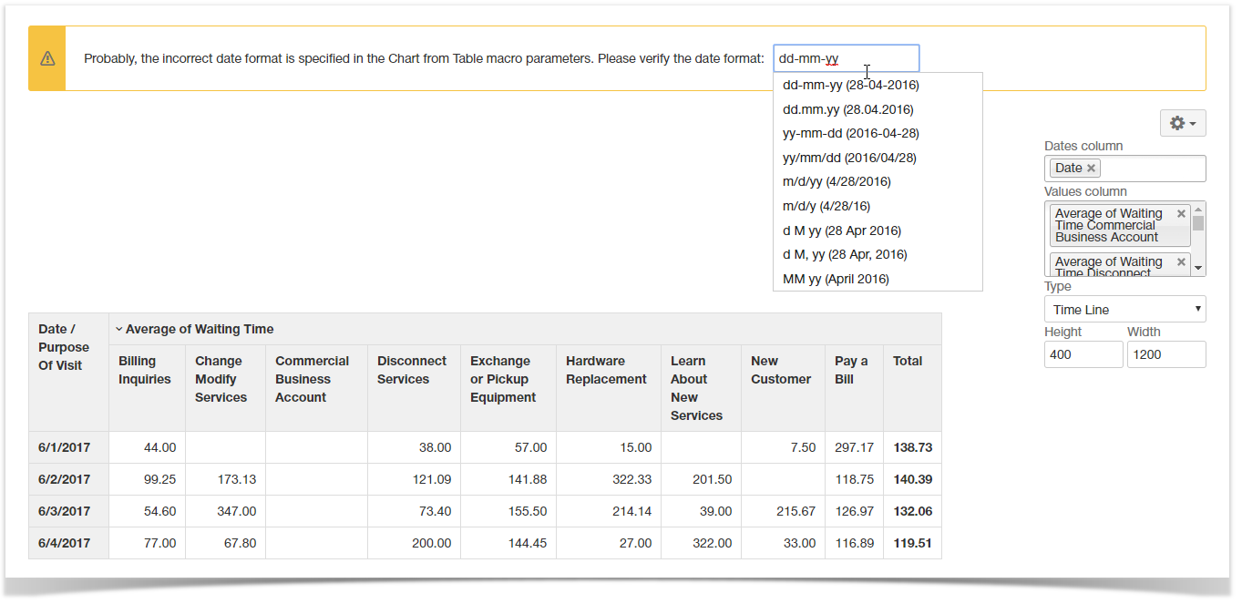
To set the date format:
From 3.12.0 version, the Table Filter and Charts app allows you to set the correct date format in the page view mode. If the app detects the incorrect date format it presents you with the note panel where you can enter the correct date format. It is saved automatically if it is treated as the correct date format.
Removing Chart from Table macro for Table
- Switch Confluence page to the edit mode.
- Select the Chart from Table macro with the table or macro outputting the table.
- Click Unwrap.
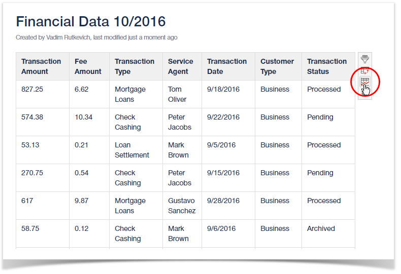
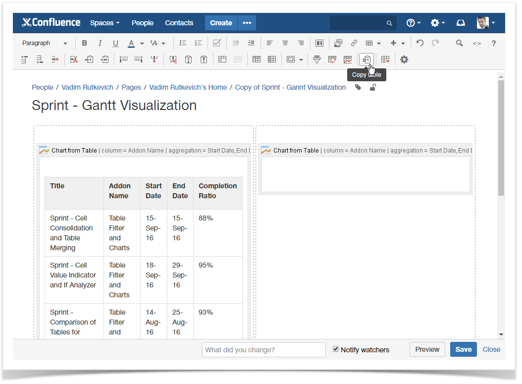
Copying a table into Chart from Table macro
- Switch Confluence page to the edit mode.
- Position the mouse pointer into any cell of the table you want to copy.
- Click the Copy Table
 icon on the editor pane.
 - Paste the table into the Chart from Table macro on the same or on a new page.
| Info |
|---|
You can also use the Table Excerpt and Table Excerpt Include macros for building multiple charts on the basis of a single source table. |
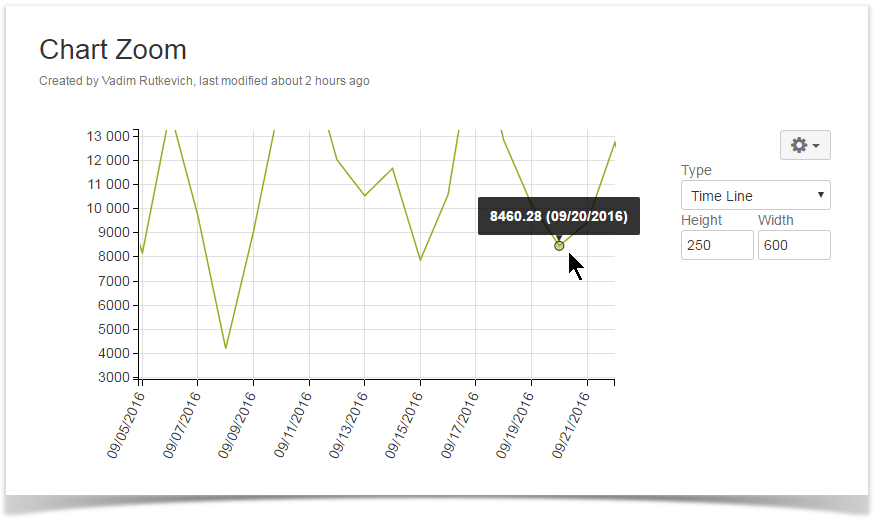
Zooming in Chart
- Open the page with the chart you want to zoom in.
- Hover your mouse pointer over this chart.
- Hold down Ctrl and rotate the wheel button forward to zoom in the chart.
You can also do the following:
To zoom in over the desired chart area:
- Click and hold the left mouse button.
- Drag the mouse pointer down and right over the chart.
To zoom out the chart:
- Click and hold down the left mouse button.
- Drag the mouse pointer left over the chart.
To scale up values along chart axes:
- Hold down Shift and drag the mouse pointer left or right. (for X axis)
- Hold down Shift and drag the mouse pointer upwards or downwards. (for Y axis)
To navigate across the chart:
- Hold down Ctrl (for Windows) or Alt (for MacOS) and drag the mouse pointer across the chart.
Filtering the source table
- Select one or more chart columns/sectors/bars.
- Only the related rows of the source table are displayed.
- Deselect all the columns/sectors/bars to display the whole source table.
Setting worklog settings
| Excerpt Include | ||||||
|---|---|---|---|---|---|---|
|
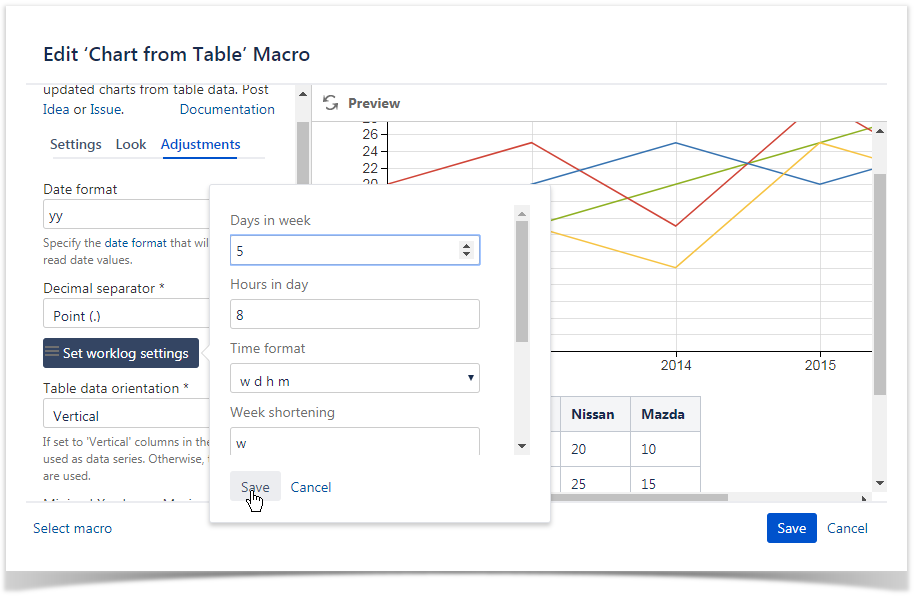
Chart Examples
Below you can find examples of chart configuration and data series used to generate a specific chart type.
Pie chart
| Parameters in Macro Browser | Data Table in Macro Placeholder | Rendered Chart | ||||||||||||||||||||||||||||||||||||||
|---|---|---|---|---|---|---|---|---|---|---|---|---|---|---|---|---|---|---|---|---|---|---|---|---|---|---|---|---|---|---|---|---|---|---|---|---|---|---|---|---|
|
|  |
Donut / 3D Donut chart
| Parameters in Macro Browser | Data Table in Macro Placeholder | Rendered Chart | ||||||||||||||||||||||||||||||||||||
|---|---|---|---|---|---|---|---|---|---|---|---|---|---|---|---|---|---|---|---|---|---|---|---|---|---|---|---|---|---|---|---|---|---|---|---|---|---|---|
|
|  |
Line chart
| Parameters in Macro Browser | Data Table in Macro Placeholder | Rendered Chart | ||||||||||||||||||||||||||||||||||||
|---|---|---|---|---|---|---|---|---|---|---|---|---|---|---|---|---|---|---|---|---|---|---|---|---|---|---|---|---|---|---|---|---|---|---|---|---|---|---|
|
|
|
Column chart
| Parameters in Macro Browser | Data Table in Macro Placeholder | Rendered Chart | |||||||||||||||||||||||||||||||||||||||||||||
|---|---|---|---|---|---|---|---|---|---|---|---|---|---|---|---|---|---|---|---|---|---|---|---|---|---|---|---|---|---|---|---|---|---|---|---|---|---|---|---|---|---|---|---|---|---|---|---|
|
|  |
Stacked Column chart
| Parameters in Macro Browser | Data Table in Macro Placeholder | Rendered Chart | |||||||||||||||||||||||||||||||||||||||||||||
|---|---|---|---|---|---|---|---|---|---|---|---|---|---|---|---|---|---|---|---|---|---|---|---|---|---|---|---|---|---|---|---|---|---|---|---|---|---|---|---|---|---|---|---|---|---|---|---|
|
|  |
Bar chart
| Parameters in Macro Browser | Data Table in Macro Placeholder | Rendered Chart | |||||||||||||||||||||||||||||||||||||||||||||
|---|---|---|---|---|---|---|---|---|---|---|---|---|---|---|---|---|---|---|---|---|---|---|---|---|---|---|---|---|---|---|---|---|---|---|---|---|---|---|---|---|---|---|---|---|---|---|---|
|
|  |
Stacked Bar chart
| Parameters in Macro Browser | Data Table in Macro Placeholder | Rendered Chart | |||||||||||||||||||||||||||||||||||||||||||||
|---|---|---|---|---|---|---|---|---|---|---|---|---|---|---|---|---|---|---|---|---|---|---|---|---|---|---|---|---|---|---|---|---|---|---|---|---|---|---|---|---|---|---|---|---|---|---|---|
|
|  |
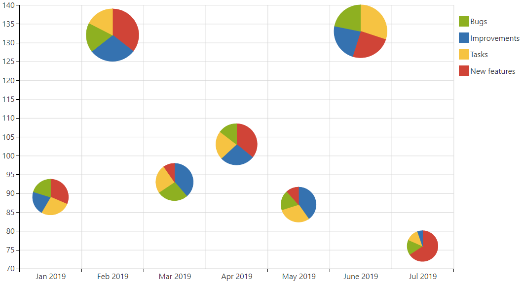
Bubble Pie chart
| Parameters in Macro Browser | Data Table in Macro Placeholder | Rendered Chart | ||||||||||||||||||||||||||||||||||||||||||||||||||||||||||
|---|---|---|---|---|---|---|---|---|---|---|---|---|---|---|---|---|---|---|---|---|---|---|---|---|---|---|---|---|---|---|---|---|---|---|---|---|---|---|---|---|---|---|---|---|---|---|---|---|---|---|---|---|---|---|---|---|---|---|---|---|
|
|
|
Area chart
| Parameters in Macro Browser | Data Table in Macro Placeholder | Rendered Chart | ||||||||||||||||||||||||||||||||||||
|---|---|---|---|---|---|---|---|---|---|---|---|---|---|---|---|---|---|---|---|---|---|---|---|---|---|---|---|---|---|---|---|---|---|---|---|---|---|---|
|
|  |
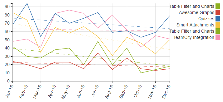
Time Line / Time Area
Chart Examples
Piechart
| Parameters in Macro Browser | Data Table in Macro Placeholder | Rendered Chart |
|---|
|
|
|
|
|
|
|
 |
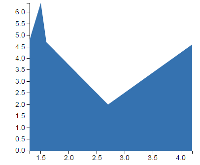
Line / Area chart (Logarithmic scale)
| Info |
|---|
Instead of using the default arithmetic scale, you can use the logarithmic scale that is convenient for too large or too small numbers. |
| Parameters in Macro Browser | Data Table in Macro Placeholder | Rendered Chart |
|---|
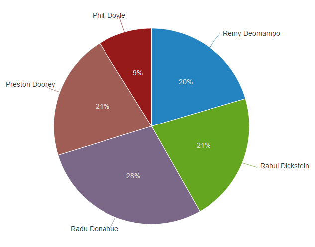
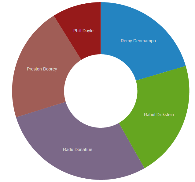
| Columns label | Agent |
|---|---|
| Values column | Tickets per Hour |
| Type | Donut / 3D Donut |
| Decimal separator | Point (.) |
| Height | Default |
| Width | Default |
| Agent | Tickets per Hour | Average Time per Ticket (min) | Calls per Hour |
|---|---|---|---|
| Remy Deomampo | 4.6 | 5.1 | 4.2 |
| Rahul Dickstein | 4.8 | 1.6 | 1.3 |
| Radu Donahue | 6.4 | 5.6 | 1.5 |
| Preston Doorey | 4.7 | 1.3 | 1.6 |
| Phill Doyle | 2.0 | 3.4 | 2.7 |
Line chart
| Parameters in Macro Browser | Data Table in Macro Placeholder | Rendered Chart | ||||||||||||||||||||||||||||||||||||
|---|---|---|---|---|---|---|---|---|---|---|---|---|---|---|---|---|---|---|---|---|---|---|---|---|---|---|---|---|---|---|---|---|---|---|---|---|---|---|
|
|
|
Column chart
| Parameters in Macro Browser | Data Table in Macro Placeholder | Rendered Chart | |||||||||||||||||||||||||||||||||||||||||||||
|---|---|---|---|---|---|---|---|---|---|---|---|---|---|---|---|---|---|---|---|---|---|---|---|---|---|---|---|---|---|---|---|---|---|---|---|---|---|---|---|---|---|---|---|---|---|---|---|
|
| |
Stacked Column chart
| Parameters in Macro Browser | Data Table in Macro Placeholder | Rendered Chart | |||||||||||||||||||||||||||||||||||||||||||||
|---|---|---|---|---|---|---|---|---|---|---|---|---|---|---|---|---|---|---|---|---|---|---|---|---|---|---|---|---|---|---|---|---|---|---|---|---|---|---|---|---|---|---|---|---|---|---|---|
|
| |
|
|  |
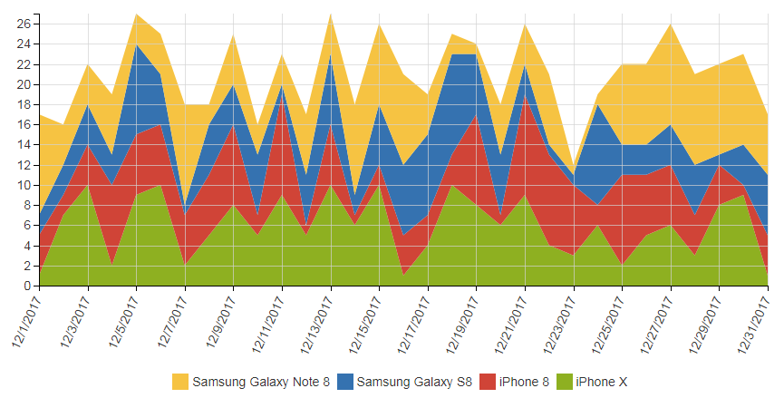
Stacked Time Area chart
| Parameters in Macro Browser | Data Table in Macro Placeholder | Rendered Chart | ||||||||||||||||||||||||||||||||||||||||||||||||||||||||||||||||||||||||||||||||||||||||||||||||||||||||||||||||||||||||||||||||||||||||||||||||||||||||||||||||||||||||||||||
|---|---|---|---|---|---|---|---|---|---|---|---|---|---|---|---|---|---|---|---|---|---|---|---|---|---|---|---|---|---|---|---|---|---|---|---|---|---|---|---|---|---|---|---|---|---|---|---|---|---|---|---|---|---|---|---|---|---|---|---|---|---|---|---|---|---|---|---|---|---|---|---|---|---|---|---|---|---|---|---|---|---|---|---|---|---|---|---|---|---|---|---|---|---|---|---|---|---|---|---|---|---|---|---|---|---|---|---|---|---|---|---|---|---|---|---|---|---|---|---|---|---|---|---|---|---|---|---|---|---|---|---|---|---|---|---|---|---|---|---|---|---|---|---|---|---|---|---|---|---|---|---|---|---|---|---|---|---|---|---|---|---|---|---|---|---|---|---|---|---|---|---|---|---|---|---|---|
|
|
|
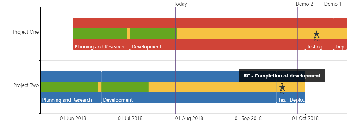
Gantt chart
| Parameters in Macro Browser | Data Table in Macro Placeholder | Rendered Chart |
|---|
|
|
|
|
|
|
|
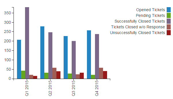
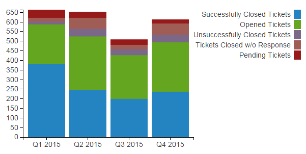
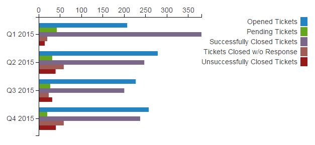
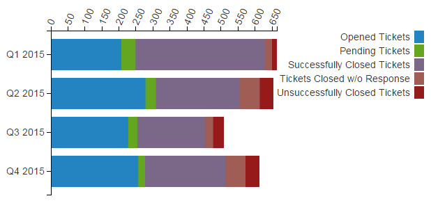
| Period | Opened Tickets | Pending Tickets | Successfully Closed Tickets | Tickets Closed w/o Response | Unsuccessfully Closed Tickets | Total Tickets |
|---|---|---|---|---|---|---|
| Q1 2015 | 207 | 42 | 381 | 20 | 14 | 664 |
| Q2 2015 | 278 | 31 | 247 | 58 | 39 | 653 |
| Q3 2015 | 227 | 27 | 200 | 23 | 31 | 508 |
| Q4 2015 | 257 | 20 | 237 | 58 | 40 | 612 |
Stacked Bar chart
| Parameters in Macro Browser | Data Table in Macro Placeholder | Rendered Chart | |||||||||||||||||||||||||||||||||||||||||||||
|---|---|---|---|---|---|---|---|---|---|---|---|---|---|---|---|---|---|---|---|---|---|---|---|---|---|---|---|---|---|---|---|---|---|---|---|---|---|---|---|---|---|---|---|---|---|---|---|
|
| |
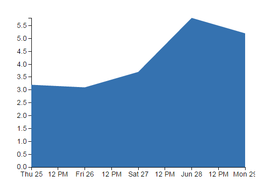
Area chart
| Parameters in Macro Browser | Data Table in Macro Placeholder | Rendered Chart | ||||||||||||||||||||||||||||||||||||
|---|---|---|---|---|---|---|---|---|---|---|---|---|---|---|---|---|---|---|---|---|---|---|---|---|---|---|---|---|---|---|---|---|---|---|---|---|---|---|
|
| |
Time Line / Time Area chart
| Parameters in Macro Browser | Data Table in Macro Placeholder | Rendered Chart | ||||||||||||||||||||||||||||||||||||||
|---|---|---|---|---|---|---|---|---|---|---|---|---|---|---|---|---|---|---|---|---|---|---|---|---|---|---|---|---|---|---|---|---|---|---|---|---|---|---|---|---|
|
| |
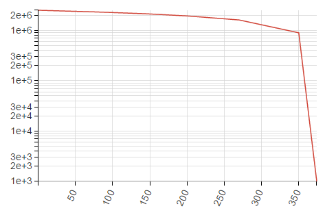
Line / Area chart (Logarithmic scale)
| Info |
|---|
Instead of using the default arithmetic scale, you can use the logarithmic scale that is convenient for too large or too small numbers. |
|
|
|
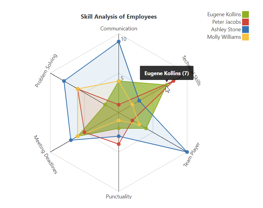
Radar (Spider) chart
| Parameters in Macro Browser | Data Table in Macro Placeholder | Rendered Chart | |||||||||||||||||||||||||||||||||||||||||||
|---|---|---|---|---|---|---|---|---|---|---|---|---|---|---|---|---|---|---|---|---|---|---|---|---|---|---|---|---|---|---|---|---|---|---|---|---|---|---|---|---|---|---|---|---|---|
|
|
|
Time Line chart with Trend
| Parameters in Macro Browser | Data Table in Macro Placeholder | Rendered Chart | ||||||||||||||||||||||||||||||||||||||||||||||||||||||||||||||||||||||||||||||||||||||||
|---|---|---|---|---|---|---|---|---|---|---|---|---|---|---|---|---|---|---|---|---|---|---|---|---|---|---|---|---|---|---|---|---|---|---|---|---|---|---|---|---|---|---|---|---|---|---|---|---|---|---|---|---|---|---|---|---|---|---|---|---|---|---|---|---|---|---|---|---|---|---|---|---|---|---|---|---|---|---|---|---|---|---|---|---|---|---|---|---|---|---|
|
|  |
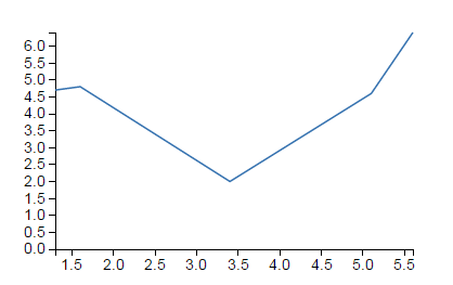
| X-axis value column | Temperature (Celcium degree) |
|---|---|
| Y-axis value column | Evaporation heat, Joule/kg |
| Type | Line |
| Logarithmic scale Y | Enabled |
| Temperature (Celcium degree) | Evaporation heat, Joule/kg |
|---|---|
| 0.5 | 2.500E+6 |
| 75.4 | 2.322E+6 |
| 142.9 | 2.137E+6 |
| 200.4 | 1.930E+6 |
| 270.0 | 1.605E+6 |
| 350 | 0.893E+6 |
| 374.15 | 0.001E+6 |