Analyze contributions made by everyone in your team
Evaluate efficiency of each contributor
Selecting time span and grouping criteria
Analyze contributions made by everyone in your team
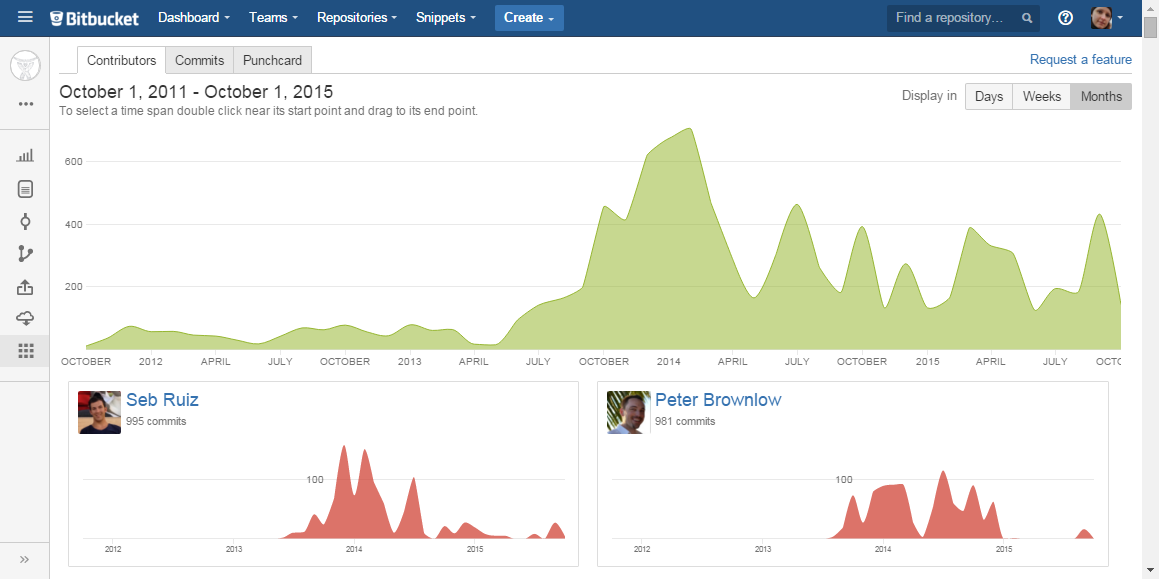
Now Graphs page has a new tab, Contributors.
On the top, Summary Graph represents the number of total contributions (commits) made by everyone to the repository over a certain time span grouped by day/week/month.
It allows you to visualize joined contributions made in the current repository.
Evaluate efficiency of each contributor
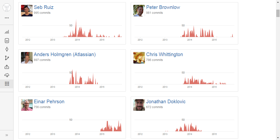
Below Summary Graph, you can see all repository contributors with their personal contribution graphs. This Contributors list represents individual contributions of each user filtered according to the current summary graph settings (time span; by day/week/month) and showing the total number of commits made by a user.
Contributors are ordered by the number of commits they made in the repository. So you can see the most active ones on the top.
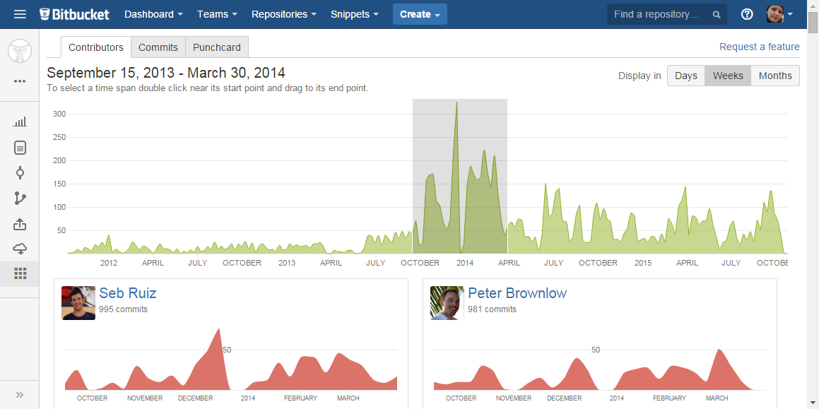
Selecting time span and grouping criteria
To select a time span for personal contribution graphs, go to the summary graph, click near the start point of your time span and drag to the end point. Once selected, your time span can be adjusted by moving the selection or dragging start or end points. To deselect, click anywhere outside the selected area in the graph.
To display contributions grouped by whether day, week or month, click one of the Display in buttons.
Cookie Notice
This website uses cookies for analytics, personalization and advertising. By continuing to browse, you agree to our use of cookies. Learn more